Perhaps this is a controversial statement, but I hate it when UI and UX designers are referred to interchangeably. To my mind, at least, they are different roles, with the clue being in the names.
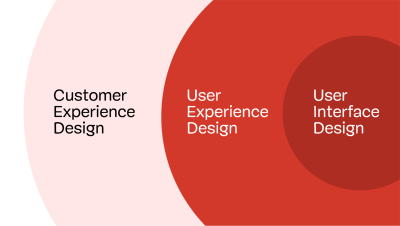
User Interface designers design the interface, while User Experience designers are concerned with the entirety of the user’s experience.
In most cases, that experience extends beyond a single interface, encompassing many touchpoints, both online and off. Nowhere is this more evident than in a business-to-business experience.
In this article, I want to explore some of the unique characteristics of a B2B sales experience and, hopefully, highlight how a UX designer would consider the entirety of the experience, not just the interface elements.
Let’s begin by exploring what makes B2B sales experiences an interesting challenge for us as UX designers.
Why B2B Is An Interesting UX Challenge
Although we must be wary of generalizing, in many cases, B2B experiences are more complicated than B2C.
This complexity is born out of the nature of B2B. Transactions between businesses tend to be:
- Higher in value.
- Involve more stakeholders.
- Take longer.
- Involve more interactions between parties.
- More highly regulated.
- Often include more complex products and services.
Take, for example, one of my enterprise clients. It is not uncommon for months to pass from them initially getting in touch about a project to me starting work.
Over that time, they may have:
- read one of my articles or heard me speak,
- viewed my website,
- reached out on LinkedIn,
- exchanged countless emails,
- spoken over Zoom,
- read my proposal,
- signed a contract.
Each of the above works together to shape the client’s experience, not to mention everything I do once work on their project begins.
While a UI designer may work on some of the above touchpoints, a UX designer cares about all of them and how they work collectively together to shape the experience.
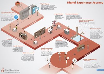
With so many potential interactions in a B2B sales journey over an extended period, it is vital to have a clear picture of how they fit together. That is why journey mapping is so popular among UX designers.

Map The Customer Journey
Even if a client commissions me to address a part of a B2B experience, I still favor starting with journey mapping (if they haven’t done so already). Understanding where a particular touchpoint fits into the bigger picture is essential for success.
For example, I work a lot on optimizing the conversion rate of landing pages. Where users have come from is a significant factor in ensuring the success of that landing page. For example, traffic that comes from ads will have different expectations from those that come from organic search.
I care equally about what the user will do next. Any landing page has to prepare the user for that experience. For example, if salespeople contact every lead and users are not expecting that call, this will lower their conversion rate on those calls.
Understanding where in their journey a user also helps me to tailor appropriate messaging and calls to action. Get this wrong, and the experience falls apart. Mapping a journey is an excellent way of designing a sales funnel that gently nudges the user through the process without undermining the experience.
Decide On Calls To Action And Relevant Touchpoints
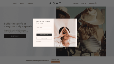
Have you ever visited a website that immediately displays an overlay when you arrive for the first time? Typically, they offer you a discount in return for signing up for their mailing list. The problem is that you haven’t seen their products yet, so you don’t know if you want the discount. This results in a poor conversion rate and a bad experience that alienates users.

If they displayed the overlay for returning visitors or showed it after they had time to look around the site, it would fit better into the journey. Doing so would increase conversion and leave the user feeling more positive about the experience.
A journey map doesn’t just show where to place a call to action. It also helps you shape the journey itself. For example, a typical B2B sales journey might be:
- Discover an organizational need.
- Research potential suppliers who could fulfill that need.
- Shortlist suppliers.
- Pick a preferred supplier.
- Sign contracts.
- Start work.
Once you understand that journey, you can start shaping the experience so that each stage is optimized, helping the user progress to the next stage. Knowing the stages in the funnel helps you identify the appropriate touchpoints, messaging, and calls to action.
For example, I use posts like this one, speaking slots, and organic search to reach prospective clients who are just discovering they might need help. This is not the moment for a hard sell but rather a chance to help them discover potential solutions to their need.
Often, my call to action at this early stage is to encourage them to subscribe to my mailing list to get more help. That allows me to nurture the relationship until they start looking for potential suppliers.
This is because there can often be a long gap between first discovering a need and securing a budget to find a supplier. It would be easy for them to forget me, and that lead would be lost.
This brings me to another crucial area that a UX designer needs to consider in the user journey: the gaps in the experience.
Mind The Gap
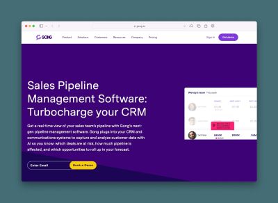
The user experience is not just about the touchpoints (website, email, etc.), but also about the gaps between these interactions. Gaps can be caused by time passing, switching channels, changing devices, or moving between business silos. These are dangerous moments when customers can easily be “dropped,” their experience undermined, and a sale lost. That’s why companies such as Gong.io use sales pipeline software and customer relationship management apps to ensure leads are not lost but instead nurtured over time.

But you still see examples of customers falling between these gaps all the time. Every time you’re put on hold while being transferred to another department, you have fallen into a gap. Or when you switch from a mobile device to your laptop to complete filling in a form, only to discover that all of your data has been lost and you have to start again.
A great UX designer will constantly be looking for these gaps to plug. For example, my banking app recently updated so that I no longer need to go through security to identify myself when I call them from the app. After all, I had already identified myself when I logged into the app, so why do I need to do so again on the call? That was a gap between systems that they had successfully plugged.
But while we strive as UX designers to plug gaps and design effortless digital experiences, there is one area we often overlook: human interactions.
Don’t Forget The Human Factor
At this point, you could argue we are straying into the realm of Customer Experience Design rather than User Experience, but it is still worth mentioning.

Throughout a customer journey (particularly in B2B), there will be interactions that are primarily between two people rather than a human and an interface. These interactions may use digital technology (such as webinars, Zoom meetings, emails, or chat) but are essentially one person speaking to another.
The B2B sales journey beautifully demonstrates these issues, as it has many digital communications between people.
As UX designers, we don’t have the luxury of ignoring these interactions, as they are crucial in shaping the user’s experience and the chance of a lead converting. For example, we have all had a frustrating experience with customer support teams who have emailed or messaged us a stock answer that fails to really address our question. Equally, we have encountered salespeople who have pushed too hard for a sale too early in our buying journey. And, of course, we have all read messages from organizations that have come across as impersonal, rude, or insensitive.
Technology makes these interactions feel worse, as we often cannot see or hear the person we are communicating with. Therefore, it falls to those of us seeking to improve the user experience to do at least something to try and mitigate these problems. That might be as simple as suggesting their sales team downloads a sales coaching plan template or something more ambitious, like running a workshop on how to communicate online better.
At this point, you might think all of this is way outside of your job description. But is it really?
Is This Outside Your Job Description?
We come full circle to where I started this article by saying that the role of UX designer is often mistaken for simply a more senior UI designer. It is not, and in fact, to suggest so is insulting to those who choose to specialize in UI.
If you have been hired as a UX designer and yet spend all of your time creating wireframes for websites, apps, and other interfaces, I would suggest your organization or clients are failing to utilize you to the full.
I would encourage you to break out of the box into which they have put you and start to look at the entire end-to-end user experience. Only then will you be fulfilling the role for which you have been hired.
It won’t happen overnight, and there will be some who would prefer to limit your role, but you cannot improve the user experience without considering the entirety of the journey.
(vf, il)
