


As designers, we are used to having a lot of creative freedom within our tools. We intuitively select, move and fine-tune things until they look just right. Once the work leaves the design tool, we give away this level of control to an unpredictable, diverse, and fluid browser environment. There, some of our decisions suddenly will need to be refined, and as we want to introduce changes, we need to dive into code. Or explain these changes clearly and unambiguously, to avoid misunderstandings down the line. The latter part can be frustrating for all parties involved.
While web builders have been around for a long time, it wasn’t until recently that they became practical for professional use. Closing the gap between design and code has become the north star for many companies, and often this issue is seen as the most critical pain point that every team attempts to solve in their own way.
In this article, we’ll look into Editor X, a sophisticated platform for professionals and agencies to build websites, driven by an ambitious goal to close the gap for good.
What’s Editor X?
Chances are high that you’ve stumbled upon web builders in the past — often with a grain of skepticism and doubt about the outcome of these tools. Many of such builders heavily rely on pre-made templates with some level of customization. Editor X goes far beyond that by providing a platform for professional designers and agencies to create web experiences with a wide variety of flexible components and a series of advanced features.
The best way to find out what Editor X is capable of would be to build something with it and in this article, we’ll create a website from scratch.
Getting Familiar With The Tool
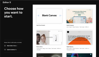
The first time we open Editor X, it will guide us through the first steps of creating a new site. We can either choose to start from scratch or select one of the many templates that the platform provides.
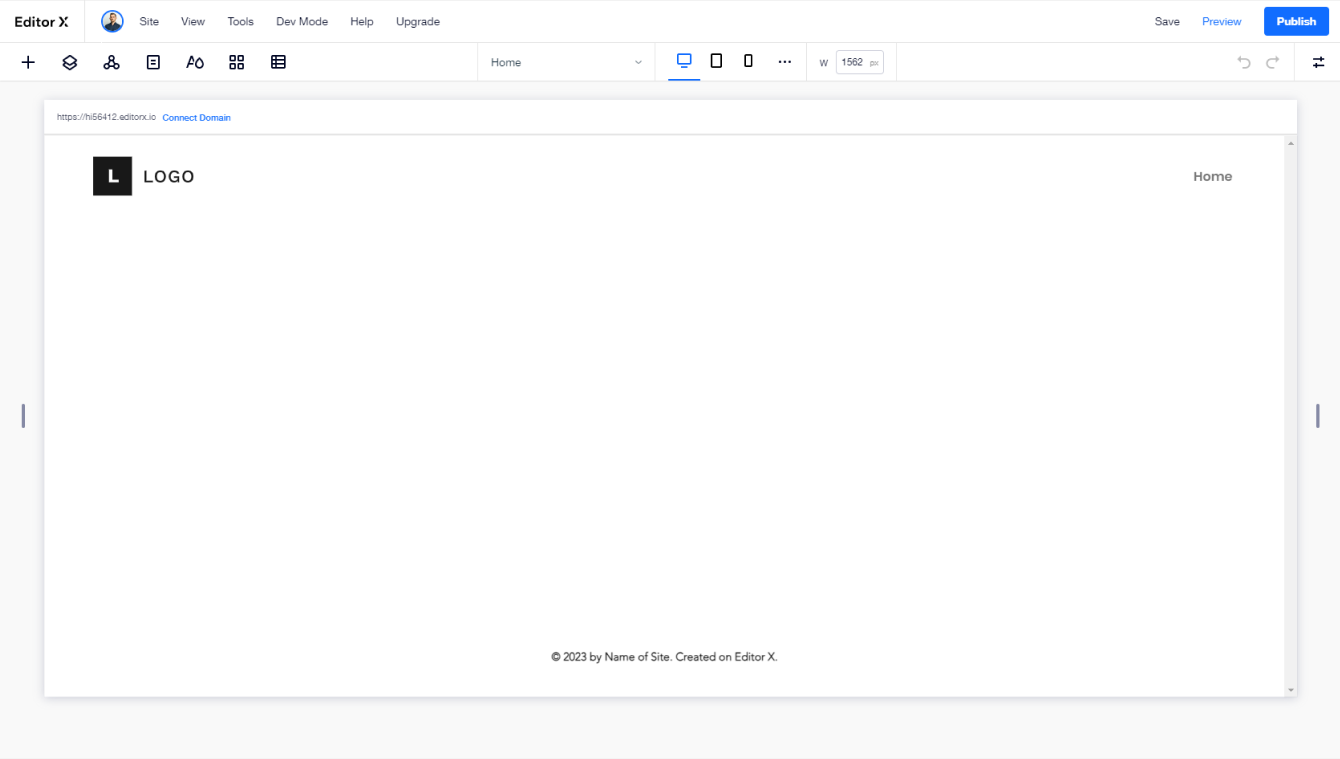
Editor X follows well-established patterns and anyone with design experience will feel comfortable with it within a few minutes. For the most part, we’ll repeat the same workflow of adding elements, moving them across the canvas, and adjusting their properties.
On the top left side, we have toggles for panels that will help us add elements, navigate layers and manage pages. Then at the center of our workspace is the canvas, where we’ll directly interact with the design of the page. You’ll notice that the canvas is also resizable, which allows us to easily experiment with different viewports. Whenever we select anything from the canvas, we’ll see the Inspector panel open on the right.
The earlier the entire team is involved in the conversation about a new design, the more issues can be resolved early. Often you’d need to take a screenshot and paste it on Slack, or use another tool to discuss a design via a clickable prototype. On Editor X, you can invite teammates to the project, and assign them individual roles and permissions. There’s also an option to communicate with your team in real-time by leaving comments on the page or on specific components.
Creating The Structure Of The Website
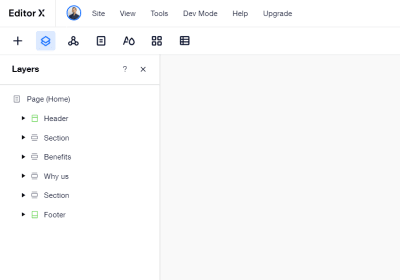
Before we start adding content, we’ll create sections that will serve as a skeleton for our page. Sections in Editor X are essentially large containers that hold our content. As soon as you create a new page, you’ll see a header and footer section already added to the canvas. To add new sections we can click on any existing one and we’ll see a blue “+” icon at the edge of it.
Every time we add a new section, we’ll be asked about the layout we’d like to use. For simple sections, we’d just select blank. Whenever we need anything more complex we can choose between a grid and a layouter. They both resemble the concepts of CSS grids and flexbox and if you need to understand the difference you can learn more here.
We can also explore some of the existing, pre-designed sections and use them if needed — they are responsive out-of-the-box, and will automatically adapt to your theme.
Adding Content And Styling Our Page
Adding elements in Editor X is straightforward. We open the “Add” panel and drag elements into the canvas. Within that panel, we have a wide range of elements, components and entire sections that will become the building blocks for our website.
Every element that we drop on the canvas can be easily moved and aligned. We can also control how elements react to changes in the screen size by using the “Docking” feature. When the screen is being resized, docking options will determine the vertical and horizontal position of elements within different types of containers.
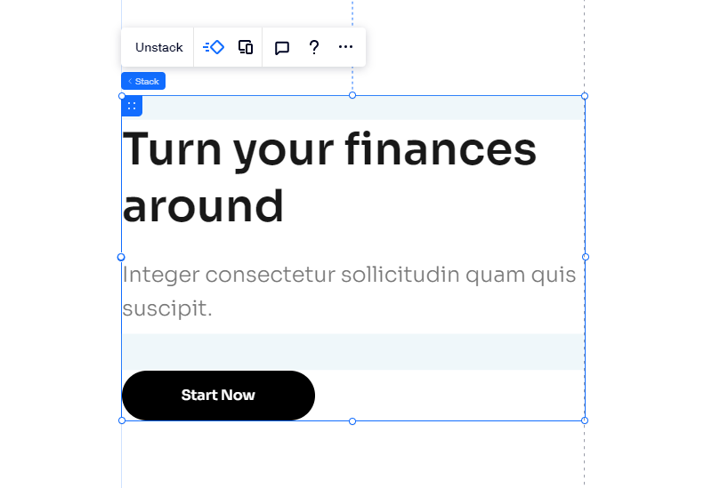
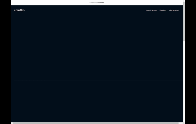
We’ll start working on the header section, by adding a title, paragraph, and a button. Once we have them on the canvas, we’ll turn them into a stack in order to prevent any overlaps on smaller screen sizes.
Stacking is an easy way to control the relationship between elements that are arranged above and below each other on the canvas. To stack a group of elements, you need to select them together and click on the “Stack” option that will appear on top.

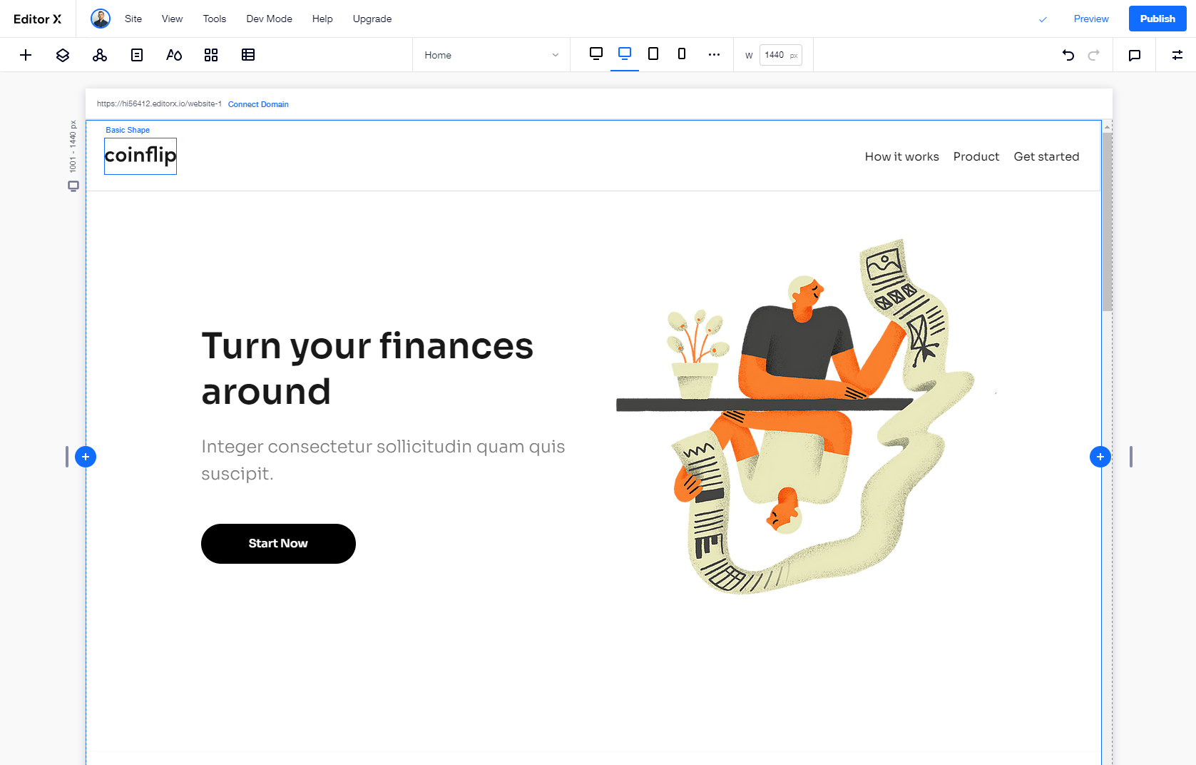
For the right side of our section, we’ll add an image that we’ll replace with our illustration. To make this work, we just need to click on “Change image” and then upload our assets to the media library. You’ll notice that apart from the assets we’ve added, you have direct access to a large library of free stock photos and pre-designed illustrations.

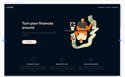
To implement the three steps of our “How it works” section, we’ll use a repeater element with three items and 20px space in between. The repeater is essentially a list of items where the style and layout of the first item are repeated automatically for the rest while the content can be different.
First, we’ll add the title and paragraph within the first item and see them repeat in realtime. Above them, we’ll add a container with a border and a text element inside the container by going to Quick add → Container → Inspector → Design → Corners.

Now that we have the content of our header, it’s time to start applying some styles to it. We could go the usual route and apply styles element by element, but we can also use the “Theme manager” to create global typography and color styles that will automatically define these changes everywhere. This goes beyond the scope of our page along, so we can use it to match the style across our entire site.

Click on the theme manager icon on the top bar of the editor. From there, we can manage the global text and color styles on the site. We’ll start by changing the background color to #030F1D and the color of our action items to #030F1D. Then we’ll change the headline fonts to Sora and also adjust the typography colors to fit our palette.
This concept goes even further as we can save our themes to a design library that can be used across all the websites we create with the tool. This makes it easy for teams to implement and manage their design systems. Also, imagine working on a series of themes and designs that you might want to reuse across a wide range of your products, or if you want to maintain a series of products for your clients. This could save quite an amount of time — and managed from one central place.
The next section will serve as a showcase of the product. First, we’ll add a headline, sub-headline, and an image element to the canvas and turn them into a stack. Then we’ll dock them to the center and increase the height of the section.

To achieve the overlapping effect we’ll add the particles in two separate image elements and arrange them to appear in the back.
Lastly, we’ll update the colors to match our palette, for the background we’d use #FFECE4, while the color of the sub-headline will be #836153.

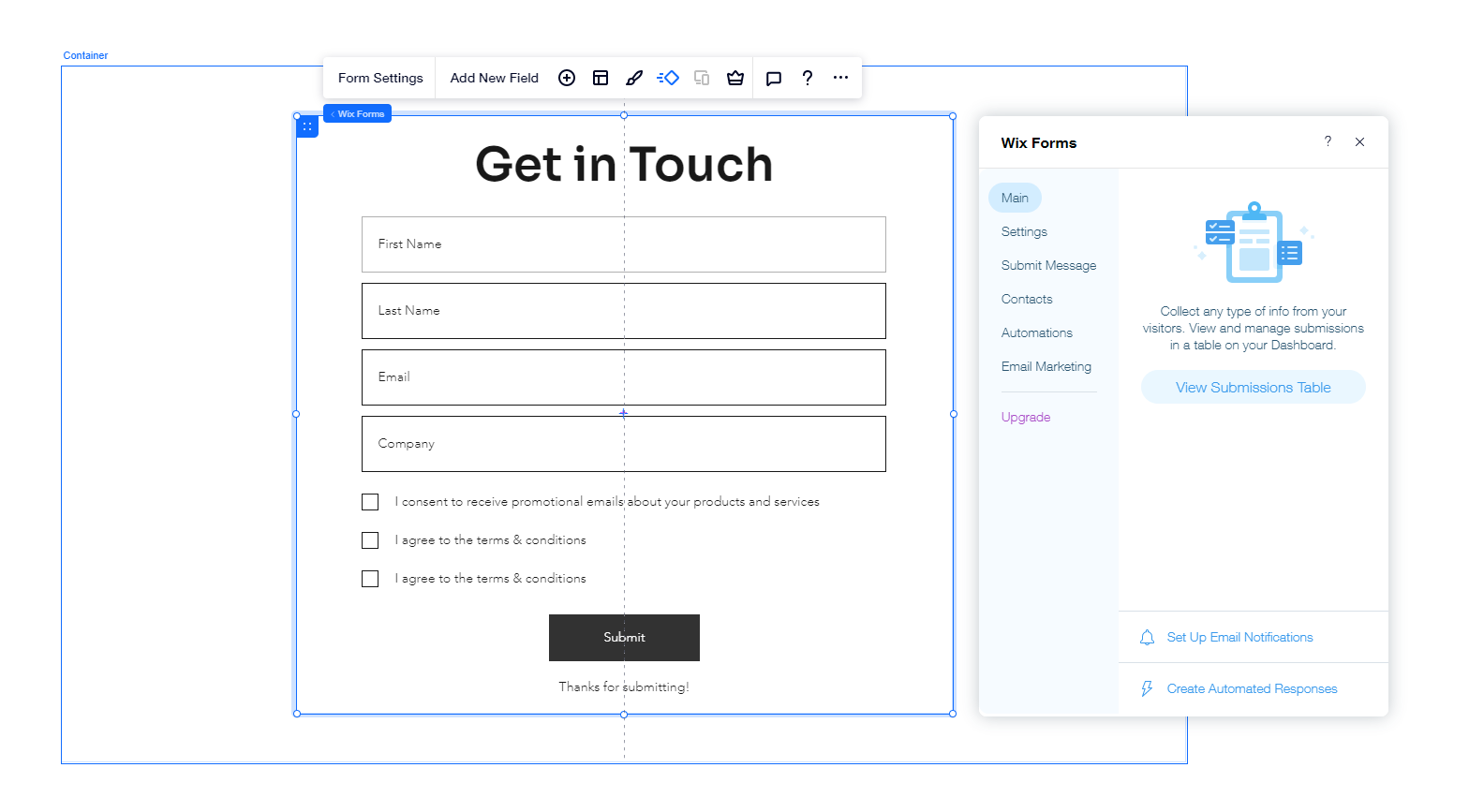
Forms are essential for most websites and in our case, we’ll need one to collect the contact information of visitors interested in our product.
To create a form we’ll need to go to the Add panel and select “Contact & Forms”, from there we can see a variety of templates that we can use as a starting point. For our page, we will choose the “contact form” by dragging it to the canvas.
We can customize it by selecting “form settings”. From there, we’ll edit the fields to first name, last name, email, and company. Lastly, we’ll add two consent checkboxes, by selecting the form and clicking on “Add new field”, then selecting “terms checkbox” from the list of contact fields. This will allow us to stay compliant with regulations such as GDPR.

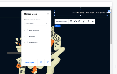
In the last step, we’ll add a menu to our website. With the tool, we can create complex websites with many pages tied together by seamless navigation, but in our case, we only need to navigate between the sections of this specific page. For this purpose, we’ll use a feature called “Anchors”. We’ll go over the sections that will be part of our menu and we’ll add an anchor that we’ll later use in the menu settings.
Select any element, then click the “Anchor” section in the Inspector panel on the right side of the editor. Then click on the toggle and simply name the anchor. We’ll repeat this for all sections we’d like to have in the navigation.
Now to add those in the menu, click “Manage menu” and then “Add link”. From there. we need to select the Anchor option and the anchor we want to link.
Making The Site Come To Life
One way to make the site more interactive and distinctive is to add animations to our elements. Of course, we can add animation on the platform as well, and apply it to any element or section on the canvas. To achieve that, we need to select the elements we want to animate, and then click on the Animation icon.

There are plenty of presets that we can use out of the box, but there’s also the option to fine-tune variables such as duration and delay.
In our case, we’d like to add a subtle fade-in animation to all of the headlines and images on the canvas.
Designing For Different Screen Sizes
It’s common to see mock-ups created for desktop first, or for mobile-first, but in practice, we actually need to be creating both at the same time. The priorities that we define for our content blocks might need to change from one screen size to another, but we need to explore how we can put the right emphasis on the right elements, and choose the right way to position them both on desktop and on mobile. With the tool, we can achieve that by designing for individual breakpoints and using fluid and relative size units of measure.
Obviously, it’s a good idea to add breakpoints only when we need them, so we can add our custom breakpoints as we are previewing the site growing from small to large viewports. Obviously, we can do that without leaving the tool. Whenever we need a breakpoint, we can add them (or edit already existing ones) by clicking on the three-dotted menu next to the breakpoints.
If you’ve used relative sizes till that point, many of the elements will already resize properly. For the rest, we’ll go through the different breakpoints and create design overrides to make sure that everything looks as expected. The changes that we make will be applied to the specific breakpoint range that we’ve selected, and they will cascade down, too.
Publishing And Testing Our Site In The Real World
We’re almost there! At this point, we need to click the “Publish” button to go live. From there, our page is assigned a domain name and is accessible for everybody. A free tier comes along with a banner at the top but it’s enough to experiment with the features that the tool provides. Of course, it disappears with a paid tier which would probably be a tier that most companies would go with.
Apart from that, the page is working well. There aren’t any noticeable performance drawbacks, but we’d need to give it a more profound stress test. For this purpose, we’ll use the Lighthouse audit by Google, which will give us an overview of characteristics such as speed, accessibility, and SEO performance.

It’s important to note that we don’t have to rely on the pre-made building blocks alone though. If you need to build in a complex functionality for your projects, you can do it as well. In fact, you can add your own JavaScript, connect to APIs, use npm packages and automate client-to-server interactions with web modules. These features are available via an integrated development platform called Velo.
But for the scope of this article, although we mostly combined a few elements without rewriting or fixing code, the results are quite solid compared to what one would normally expect from a website builder. Overall, the score is quite high on performance and accessibility, especially on desktop, although you might need to optimize your site more for mobile devices.
Wrapping Up
When it comes to web builders, it’s not unusual to be disappointed by the outcome — with plenty of accessibility and performance issues, along with bulky and messy markup, overly specific CSS, and slow JavaScript. When we look into the website creation process on Editor X, it appears to be a platform that has gone quite far to provide a straightforward environment for building good websites, while also including collaboration features, responsive testing, and some components that might need quite a bit of time to prototype or set up otherwise.
If you are working with agencies or organizations where you plan to reuse components, or if you need to set up and maintain sites quickly for a variety of your clients, Editor X could be an interesting option worth considering. It comes along with personal and business plans, support for online payments, eCommerce, domains and storage, online bookings, ticket and event management, as well as video monetization. Chances are high that you’ll find what you need — both for quick prototypes and extensive client work.
You can create an Editor X account for free and test all features, without any strings attached.
(vf, il)