When creating the information architecture of a website, users are often overlooked in favor of internal politics and organizational thinking. On larger websites, each departmental silo wants its own section of the site, and they often fight to ensure their section is featured in the main navigation. Even small sites suffer from problems with information architecture as business owners focus more on what they want to say rather than what users want to know.
In most cases, stakeholders are the worst people to decide on the information architecture, so I want to share an alternative process. However, before we can implement this process, we need to explain why our stakeholders should not be defining the site structure. To do that, we need to teach them about mental models.
Understanding And Explaining Mental Models
Mental models are used to explain how we organize pretty much anything in our world. For example, most of us would organize the following words into a group that we would probably refer to as “fruits”:
- Apple,
- Pear,
- Banana,
- Melon,
- Orange.
However, not all of us see the world in the same way. For example, if you are an expert in fruits, you would probably include tomatoes in this list. But, of course, most of us would probably associate tomatoes more with salads than we do fruits.

Lots of things can influence our mental models from previous experience to culture. However, one of the most significant influencing factors is our level of experience in the subject matter.
As we become more knowledgeable in a particular subject, our mental model diverges from the rest of the population. For example, an expert in birds will tell you that there is no such thing as a seagull, yet most of us would think otherwise.
It is precisely this issue of experts having a different mental model from the rest of us that means stakeholders are the worst people to be making decisions about a site’s information architecture. After all, most stakeholders are experts in their products or services and think about them differently from most people visiting the website.
This issue makes them bad at organizing content and can undermine the content itself.
Creating Relevant Content
Poor content choices can significantly impact how effective your information architecture is. Hence, creating an information architecture must begin by defining the content that needs to appear on the website.
Organizations typically make two common mistakes when deciding on the content for their website. First, many mindlessly migrate the content from their old website to the new one. They fail to ask whether this content is relevant.
However, the second and more significant issue is that stakeholders start from the wrong premise when creating content. They start by asking themselves, “what do we want to say” rather than “what does our audience want to know?”
The result of this wrong starting point is that any information architecture will fail because users won’t find answers to their questions. That is because the content doesn’t exist on the website.
The starting point for any information architecture project should not be to define what the organization wants to say, but what questions, objections, and tasks the user has in their mind as they come to the website. You can then build the site’s content and, by extension, the information architecture around these:
- Questions
They can range from general questions such as “what is this site about” or “how can this site help me” to more specific questions about the products or services the site provides. - Objections
They are the reasons that users might not take action. For example, if your call to action is to sign up for a newsletter, users might have concerns about spam, privacy, or how easy it will be to unsubscribe. If you don’t address these objections, people will not act. - Tasks
They relate to actions the user might want to take on the website. These might include booking an event, signing up for a newsletter, or contacting the organization behind the website.
On an e-commerce site, this would include finding a product, adding it to the cart, checking out, and managing the order.
You should use other elements such as social proof, or the companies value proposition to answer these questions and objections. However, the information architecture itself needs to be built around the user’s needs.
So, before we begin organizing content, we first need to gather a list of questions, objections and tasks. Now, depending on the breadth of what your organization does, this can turn into a huge list. But, that is okay, as our next step will be to identify which questions, objections, and tasks matter most to users.
Identify Your Top Content
Not all questions, objections, or tasks are equal. Some will be much more important to users or asked by many more people. It is, therefore, vital that we identify our top elements as we will want to ensure these are particularly easy to find.
Depending on time and budget, you could take a couple of approaches. I highly recommend identifying the critical elements using top task analysis if you have the time. This approach created by Gerry McGovern prioritizes content by surveying users and asking them what they most care about.
If you have limited time or budget, then a conversation with customer-facing staff such as sales representatives or call center staff is often enough to identify what questions, objections, and tasks come up the most.
In either case, you will find that a large percentage of user inquiries will revolve around a relatively small number of questions, objections, or tasks.
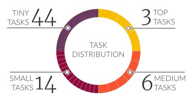
Now we know the top content, we can begin drafting our information architecture.
Create The First Draft With Open Card Sorting
To begin with, we are going to focus solely on organizing the top content and ignore the less important questions, objections, and tasks. That is to prevent ourselves and any users we involve from becoming overwhelmed. Ideally, you want to end up with no more than 30 to 60 cards.
Start by simplifying your top content. For example, if you have a question that reads “how much does it cost,” it could be simplified to “pricing.” You will also find similar content that is obvious enough to be grouped. For example, “how much does it cost” and “are there any extra charges” could be both displayed as “pricing.”
Once you have your simplified list of top content, you need to organize it into top-level sections. If the budget or timescales are tight, you could make an educated guess as we will be testing later. However, if you do, you will probably receive pushback from stakeholders and end up doing more rework. Therefore this route can often be a false economy.
A better approach is to do an open card sort. Traditionally, card sorting has been done in person. However, I prefer to do it online with a tool like UX Metrics, as it is quicker, easier to arrange, and makes analyzing results straightforward.
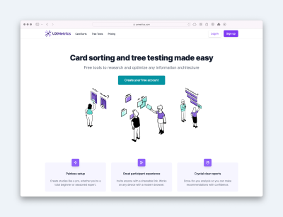
All you have to do within UX Metrics is create a separate ‘card’ for each of your simplified content areas. Then, UX Metrics will give you a URL to share with users via social media, email, or even your website.
Users who choose to complete the card sort will be asked to organize the content into any groupings that make sense to them and give each group a name. These groups will be their personal preference for sections on the website.
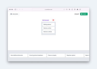
Note: I recommend getting as many people as possible to complete the card sort. However, as a minimum, you will need at least 13 users to weed out outliers.
Once the open card sort is finished, UX Metrics will provide you with a report showing you what groups users created and how often they occurred. You then need to merge similar groups and decide on a small number of top-level sections favoring often occurring groupings.
This process is not an exact science and takes experience. Try to keep the number of groups down as low as possible. Approximately four is ideal as we can only hold four pieces of information in our short-term memory at a time. Certainly avoid going above eight elements and when adding more sections, try chunking the groups into separate navigation.
For example, you could have a primary navigation bar and a secondary utility bar for sections such as help, log in or contact us. Don’t worry about getting it wrong at this stage, as we will test our structure later. You can also use the report to identify potential sub-sections underneath the primary navigation. However, these will be further defined when carrying out closed card sorting.
Ensure Your Information Architecture Scales With Closed Card Sorting
Closed card sorting is similar to open card sorting, with one difference. Instead of users organizing cards into their own set of groups, they organize them into a predefined set of sections that you give them.
In other words, we will ask users to organize cards into the top-level information architecture we have created:
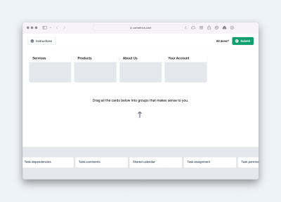
Because a closed card sort only requires people to put cards into predefined groups, we can ask users to sort considerably more cards than in an open card sort. Because of that, we can use closed card sorting as a way of discovering whether our first draft will accommodate all of our content, not just our top tasks, questions, and objections.
We can use UX Metrics to run closed card sorting, but I suggest adding an extra top-level section labeled “I don’t know.” This approach helps collect cards that the user has no idea where they should be placed. That will help us identify if our site structure fails in certain areas.
After reviewing the results, you should be able to assign most content to a top-level section. If you have a lot of content that doesn’t fit comfortably, you may have to revise your draft architecture and repeat the closed card sorting exercise.
However, we have yet to address the subsections within those top-level sections. You may well be wondering if you need to do this entire process for each top-level section of the website.
How Low Do You Go In Card Sorting?
Unless you are working on an extensive site with a healthy budget for information architecture, you will probably only run card sorting for the top-level sections. Below that, you will be forced to make educated guesses based on what content people have placed within each of those top-level sections. If that is the case, do not worry because the first navigational selection a user makes is the most important.
One of the most influential usability studies was “First Click Usability Testing” by Bob Bailey and Cari Wolfson. They explored the importance of the user’s first click being correct. They found that if the first click was correct, people had an 87% chance of finding the content they wanted instead of just 46% if the first click was wrong.
In other words, if you only run card sorting on the top level of your information architecture, you have still doubled the chance users will succeed.
Of course, if time and budget allow, it would be advisable to run open card sorting for each of the sections of your site to help determine the structure of the subsections. Also, if your website is extensive (such as a university or government body), you may wish to run closed card sorting as well to make sure all the content lower in the site sits comfortably within its sections.
Whatever approach you adopt, it is worth testing your final information architecture one last time to ensure it works successfully.
Test Your Information Architecture With Tree Testing
I would recommend running a simple tree test to test your final information architecture. Once again, you can do this through UX Metrics or whatever tool you settle on.
To create a tree test, you need to recreate your site’s information architecture as a hierarchical tree. Once you have done that, you can decide what you wish to test. First, select a small number of pages you want to check that users can find. For example, you may wish to ask users to find a page on the site that they believe will answer specific questions or complete a particular task.
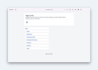
When considering what to test, I recommend focusing on three types of content:
- Content that is particularly important to the user or for the site’s success;
- Content that users placed in varying sections during the card sorting exercises;
- Content that you suspect may be hidden too deep in the information architecture.
Next, you will tell UX Metrics the fastest path for finding each piece of content.
Once you have done that, all that remains is to distribute the test as you did for card sorting. Users will be asked to find each piece of content, and then you will receive a report from UX Metrics. The report will show you how successful people were, how quickly they completed the task, and whether they took the best route.
If you are creating an entirely new information architecture, I recommend focusing on whether people can complete the task successfully within a reasonably short time. Whether they used the most direct route or not is a secondary consideration.
If your site structure has problems in your tree test, don’t panic, especially since users will probably only have trouble finding secondary content. It is important to remember that your information architecture does not exist in isolation.
Supplement Your Information Architecture
Navigating your site’s information architecture is just one method users can use to find content. For example, site search is also critical. However, the most crucial tool in your arsenal for improving findability is cross-linking.
When you view the results of your tree testing, probably the most significant issue you will find will be that users are unsure which of two or more sections a piece of content will be in. When faced with that situation, they often guess, and if they guess wrong, they may give up before exploring the other options.
To address this problem, you need to include links to the page in the alternative sections people look in. That way, they can recover even if they make an initial mistake.
You can identify pages for cross-linking by looking at your closed card sorting exercise. First, look for pages that are regularly placed in different sections by users. Then, make sure you include those links to that page from all those sections, even if it only sits in one of those sections in the hierarchy.
Also, don’t forget to highlight critical content that exists lower in the hierarchy than the page viewed. For example, a top-level section page should highlight the top content within that section of the site, and the homepage should provide quick access to the most important content across the entire site.
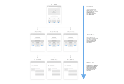
By combining a well-researched and tested information architecture with these other techniques, you will ensure that we can address users’ objections and questions as quickly as possible and complete any tasks they have.
