When it comes to UX, how often do you connect it to privacy?
It’s a big part of the design process. From connected apps to e-commerce to forms, data collection is happening all the time. Users are accustomed to it and generally ok with these practices unless something goes wrong.
It’s your job to include privacy checkpoints and best practices in the design architecture of every website project. Not only will these protections help users, but they can help you feel better about the digital products and services you provide.
Consider Privacy by Design as a Default

Privacy by Design is more than a concept, it’s an actual framework that can guide how you create digital experiences. The framework was developed in the 1990s by Dr. Ann Cavoukian (information and privacy commissioner in Canada) and is the foundation for current GDPR regulations.
The goal of privacy by default is to think about security from the start of projects, but not to create a trade-off between privacy and other parts of the design or usability. When using this framework, privacy is a consideration from the start of a project and at every step along the way; it is not applied after the fact or in response to a concern.
The seven principles of privacy by design are:
- Proactive not reactive; preventative not remedial
- Privacy as the default setting
- Privacy embedded into design
- Full functionality; positive sum, not zero-sum
- End-to-end security; full life cycle protection
- Visibility and transparency; keep it open
- Respect for user privacy; keep it user centric
The common theme you will see from every other tip and best practice in this list is that they are rooted in or connected to this framework. It’s hard to talk about any type of website design privacy practice without circling back to this information.
What’s great is that while the foundation hasn’t changed that much, it’s application has continued to evolve with technology changes to help designers make good choices that protect users while still creating engaging and functional designs.
Display Just in Time Notifications

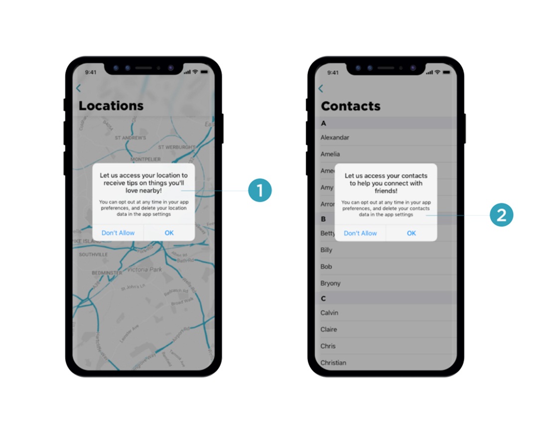
Just in time data collection and notifications happen when a website or app needs the information. (It is not just buried in a privacy policy.)
Using this method alerts a user when data is required, explains why it is necessary and includes information about how data will and will not be used.
Common practices for these notifications include simple pop-ups and info icons or tooltips next to each data request field to explain usage.
Think about it: Websites and apps often ask for access to things such as your contact list, location, or camera. Wouldn’t it make more sense to ask for these permissions when you need them, rather than as part of a bulk ask on install? Then you know how and why this is relevant to your actual user experience.
Don’t Preselect Options in Consent Checkboxes
Here’s an easy best practice to follow: Stop pre-selecting checkboxes for consent information in forms.
Bonus: Consent checkboxes should be to opt-in, not opt-out.
This combination of selection allows users to control what they do and don’t consent to. Even if consent is required to move forward, it causes the user to pause and think about the information or data collection they are opting in to.
You are asking for permission here, not assuming it. This might seem like a simple thing, but it can make a big difference as to how users perceive the ask for consent and data sharing.
Write (and Design) a Clear and Understandable Privacy Policy
Raise your hand if you are guilty of just putting any automatically-generated or default privacy policy on a website. It’s a bad habit.
Most privacy policies are just long blocks of text. There’s not much styling, other than a header here or there and design is a complete afterthought for the most part.
It’s something we are probably all guilty of.
Here’s the challenge:
- Write a clear privacy policy that works with your website or app and data collection procedures.
- Design the privacy policy page in a way that makes it usable, readable, and of value to the user if they need information.
While some of the default information in these policies isn’t bad or wrong, it can be cumbersome or difficult to understand. It is your challenge to make it understandable, from content and visual standpoints.
Google has taken it a step further with a highly usable design with plenty of dividers and icons to guide you through and video lessons that explain their privacy policy.
Save as Little Data as Possible
One of the best ways to prevent public privacy mishaps is to save as little data from users as possible.
Do an inventory of your website. Do you have old or unused forms with all of the user information just sitting in your website? What about user registration information?
How much of that data is necessary for how your website or app functions right now? If you don’t need it on an ongoing basis, don’t save it.
And then take all that older user data out of your web interface. Make it a regular habit to purge your database of data from inactive users.
The next two tips address some ways to keep you from having to ask for and retain user information.
Only Ask for What You Need
How much information do you really need? Streamline forms and data collectors to only ask for information that you actually need.
Use smarter tools that eliminate redundant information or ask for overly personal information.
An example of this best practice in action might be switching from a system that users personal security questions and answers to identify a user to 2-factor authentication that sends a text message or email for confirmation instead. (That’s a lot less user data to save.)
Data minimization might be tough at first because you never know what you might need later. But only ask for what you need now. (You can always ask for additional information from users in the future if you need it.)
Use Third-Party Services, Where Appropriate

Using secure, common third-party integrations and services can actually enhance the privacy you provide users.
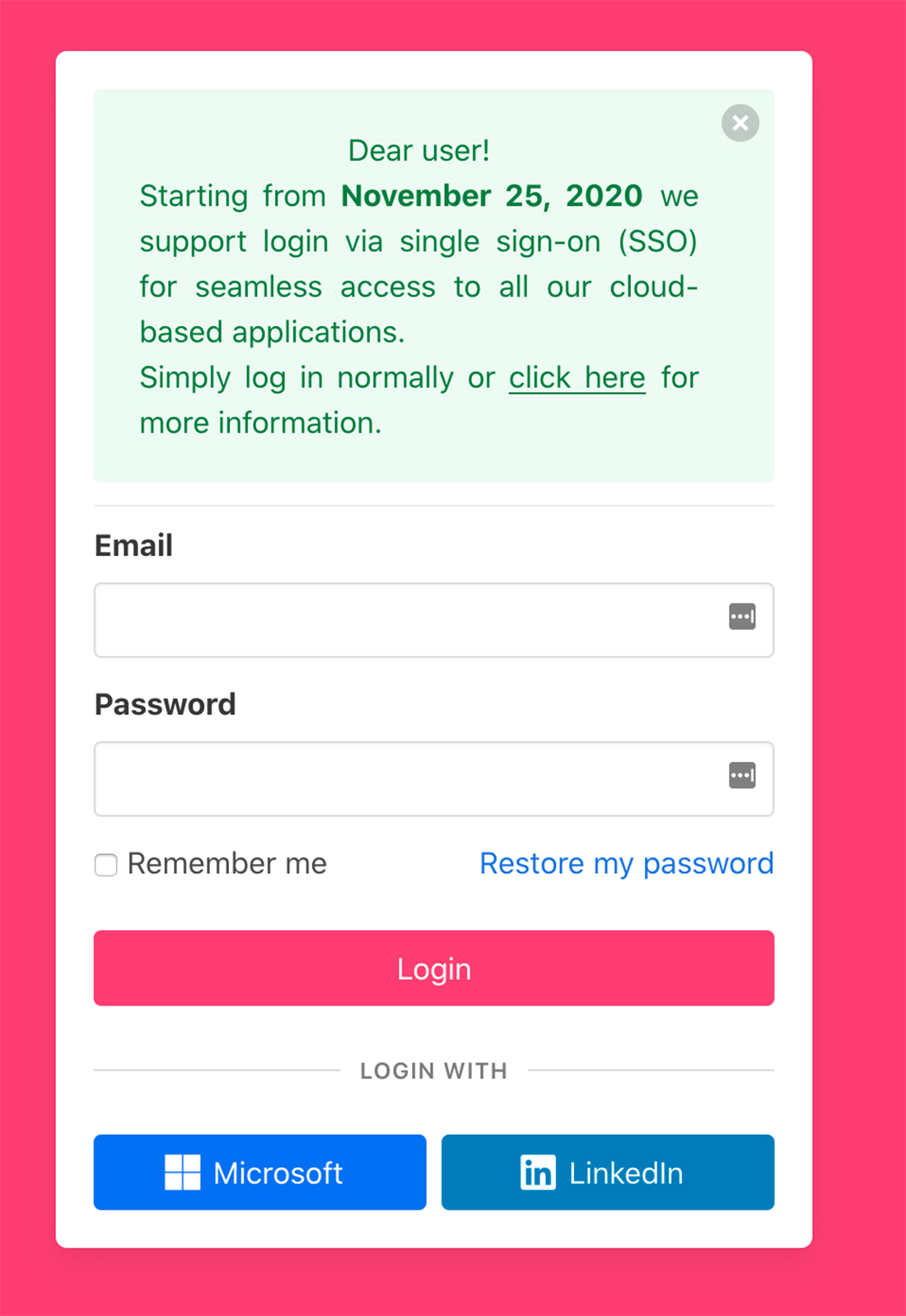
Offer the ability to connect or log in with tools users already have, such as Google. Less data is coming to you or connected to your interface and the user won’t have to create a new account login or provide new information to another interface (yours).
Users like the ease of connecting with tools they already know and trust, and there’s less to worry about from your end because no personal data will be stored within your website or app.
Using single sign-on (SSO) is a growing option that links with all kinds of other applications and products. Choose SSO options from tools that align with your data collection values.
Third-party services are also a great option – and almost a must at this point – for online sales and e-commerce. Using a payment platform and processor ensures that you never have payment data for users stored in your computer system.
Popular online payment processors have security tools built-in as well, instilling greater user trust. If you still have a PDF form online where users manually enter credit card information and return it to you via email, this is the time to stop that practice. Any type of payment or personal transaction information should be handled by a processing agent so you are not responsible for storing data.
Consider Data Pseudonyms for Users
More websites are considering and deploying masking user data using pseudonymization, which replaces personally identifiable information with an anonymous identifier or token.
This can get complicated quickly. PrivSec Report has a good breakdown on how it works and the relationship to GDPR.
The gist is to use data masking that keeps user data usable while it is de-identified. This is essentially how many types of website analytics function so that you know what type of users interact with the design, but not who they are. It generalizes information in a way that doesn’t strip out the usability of the data.
Be Transparent
The best privacy tip is the easiest: Be transparent.
Be open and honest with what data you need, what you do with it, and if any breaches occur with that information. Communicate changes and use language that’s understandable.
Telling users about security and privacy in a way they can’t understand isn’t very trustworthy or transparent. Write in layman’s terms so that anyone who reads your policies could explain what they mean.
Err on the side of overcommunication when it comes to privacy. Users will thank you.
Conclusion
User privacy is a growing area and aspect that impacts all digital and online projects. If it hasn’t been a part of your thinking and design strategy, you need to remedy that now.
