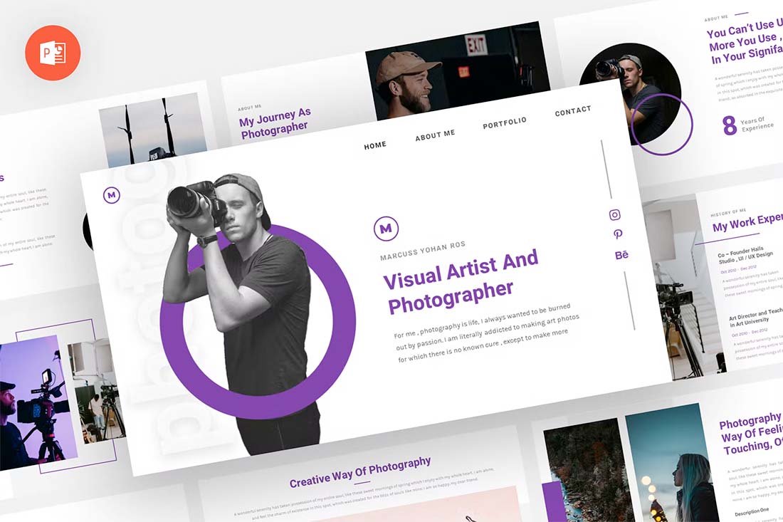
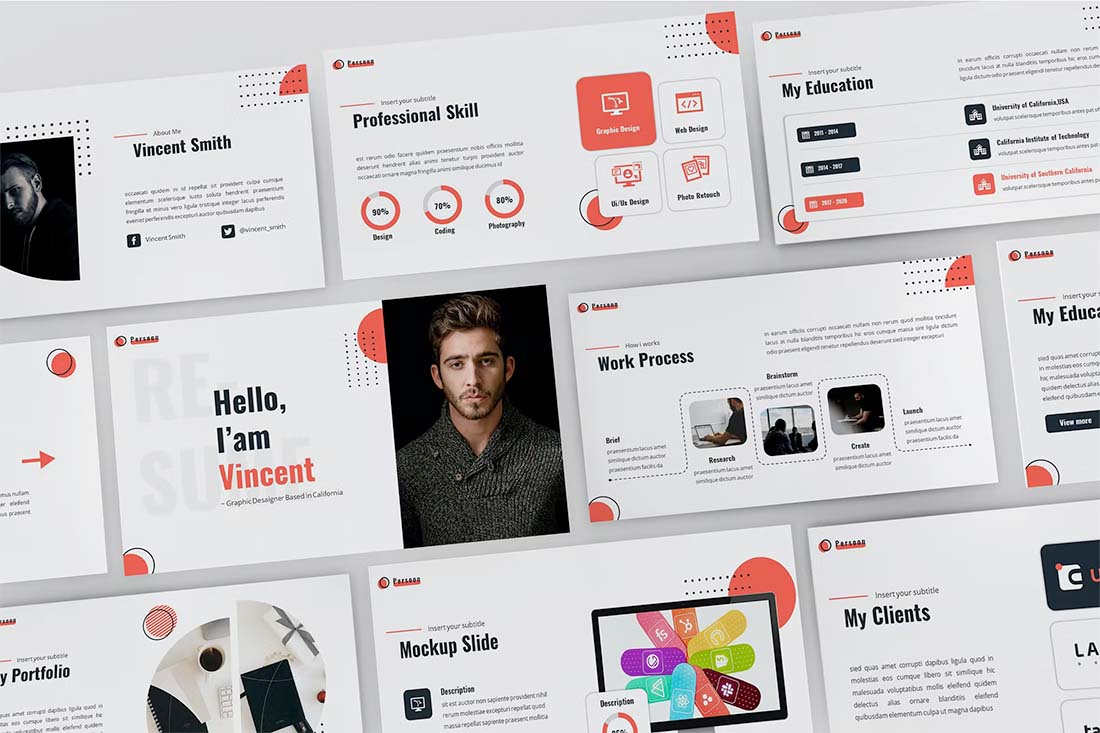
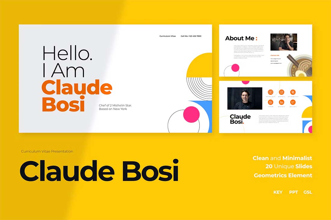
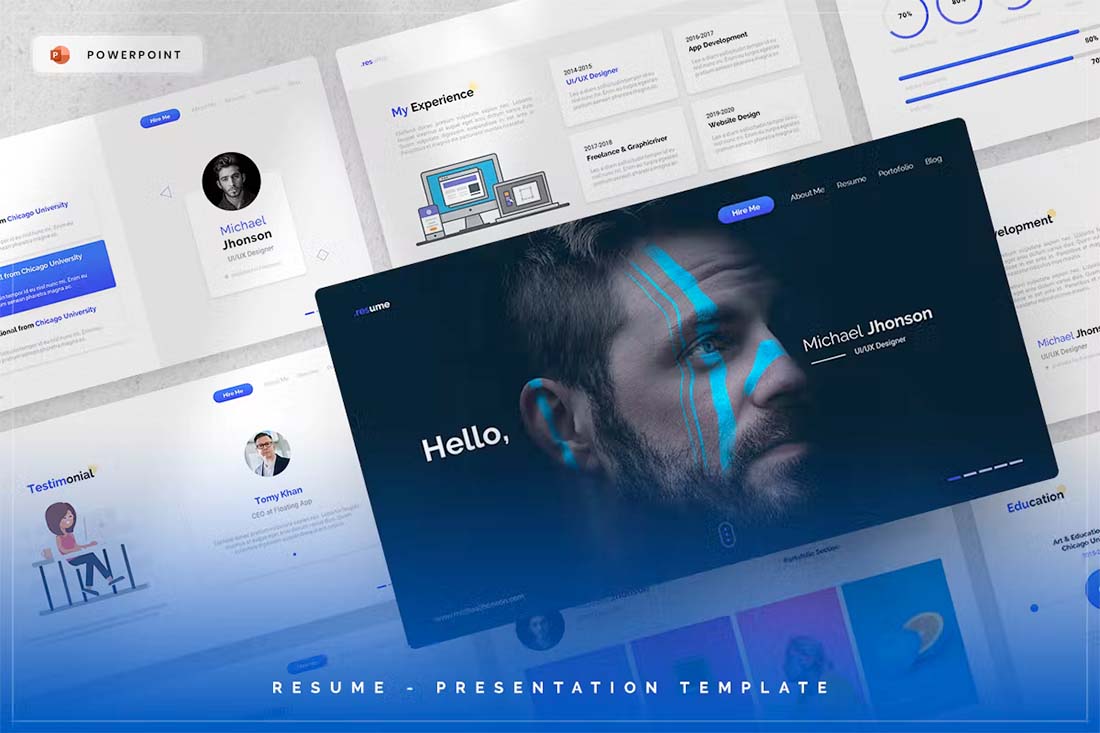
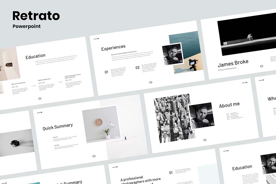
Making a resume or CV is one of those tasks that we all have to do. But did you know you can actually create one in PowerPoint?
If that’s the tool you are most comfortable with, it is possible. PowerPoint can also be a good option for a resume or CV if you need something highly visual in a presentation style.
You can then export it from PowerPoint to any other format you need so that you can share it online or with potential employers.
Here’s how to do it, with a few templates to help you get started (all with a super professional look-and-feel).
Determine if You Need a Visual Resume
Before you go down the path of creating a resume in PowerPoint, you need to figure out if it is the right choice for you. PowerPoint can be a good option if:
- It’s the only tool you have or know how to use
- You need a highly visual resume format for a presentation (we’ll focus on this one)
If you are presenting for a job interview, want to make a strong creative impression, or just show off your work in a style that marries your resume and portfolio, this option could be right for you.
Pick a Format
Once you have determined that PowerPoint is the tool you want to use for your resume, it’s time to think about formats and aspect ratios. How do you want to present or share the resume? What shape and size should it be?
If you are planning a presentation style, you’ll probably stick to the standard horizontal format. If you plan to export for more of a traditional look and feel, you can change the canvas size to a vertical 8.5 by 11 format.
The latter is great if you are using PowerPoint because you are comfortable with the tool, but want to export and save the resume for standard distribution.
Look for a Template (Or Create Your Own)
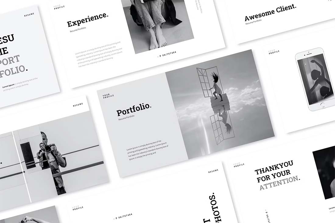
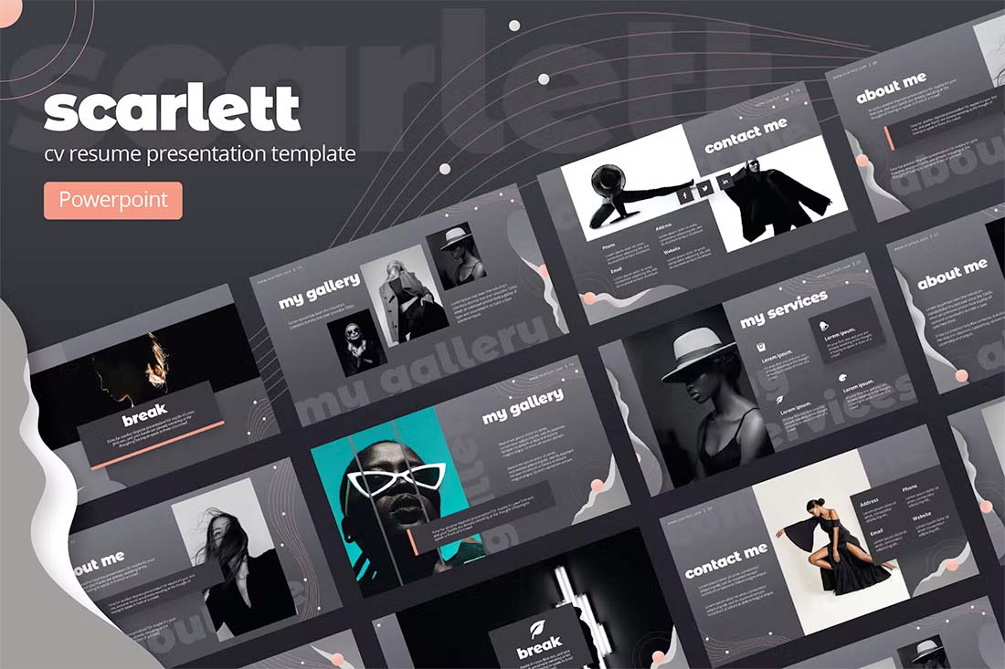
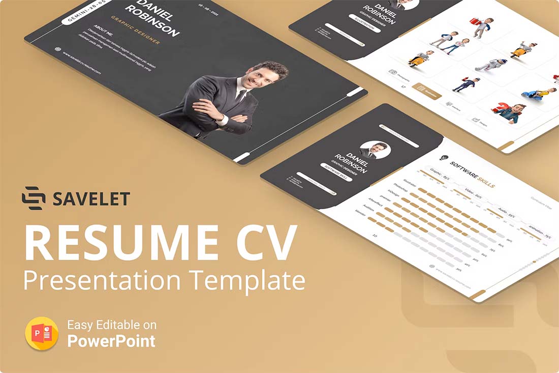
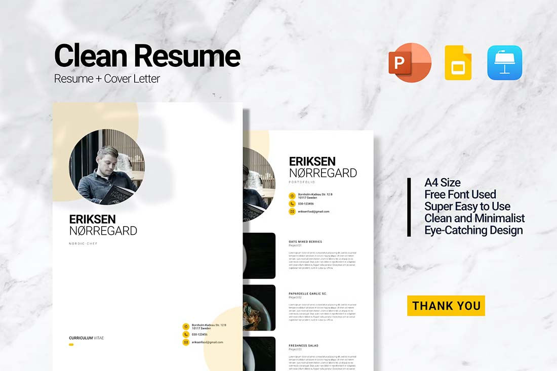
The quickest way to jumpstart a resume design project is with a template. A good PowerPoint resume or CV template will include slides in a style that appeals to you with elements for all of the standard resume content.
When looking for a template, you need one that matches the type of content you have to work with. (Don’t pick out a template packed with full-screen images if you don’t have them, or cut out photos if that’s not in your portfolio.)
The template should also have a visual style that’s similar to your own. You want the PowerPoint resume or CV to look like it belongs to you. It should show exactly who you are and what you do.
The other option is to create your own template. If you have a great idea, go for it!
Gather Visual Elements
If you are creating a visual resume, images are key. Gather what you plan to use in the resume design to get a feel for where you should go with the content.
- What types of images do you have to work with?
- What are the shapes and styles?
- How many images do you plan to use?
- Do you have a visual element to go with each section of the resume?
- Do you need to collect more visuals to complete this task?
- Are they in a format that will work with PowerPoint?
Once you have all the visuals together you can place them in the template to set the framework for your design.
Fill in Relevant Info
Once you have the concept of the PowerPoint resume design mapped out, you can start filling in all of your relevant information and details. Note that most templates will include way more slides than you need. Delete unnecessary ones to make the job quicker and easier.
Order the slide deck in a reverse chronological format with the newest and most relevant information first. It’s the same idea as if you were typing it out on paper.
Don’t forget an introduction slide with your name and contact details. (You’ll probably also want to repeat this slide at the end.)
Follow that with a quick summary or professional profile so that whoever looks at the resume gets a feel for who you are.
Then fill in work experience, education, and relevant skills.
Design for Key Details
Every important part of your PowerPoint resume should follow the format of one idea per slide.
If you are creating a visual resume, consider slides that pair a visual with the corresponding information. It’s a fact for your resume with a piece of visual supporting evidence.
Resumes can get long quickly, so try to design for key pieces of content and details with this format. Consider your most recent and best activity to be one slide each, and then all other supporting elements on a single slide.
It might look like this:
- One slide for current job
- One slide for relevant experience
- One slides for all other jobs
Finish with Achievements or Awards
Finally, wrap up the content in your PowerPoint resume or CV with a section that outlines awards or achievements. This is a great way to leave a strong impression at the end of the slide deck.
Things to include are certifications, awards, publications or grants, and key work-related honors. Even if you only have a few to share, this can add a lot of impact.
Proof Carefully
Edit your resume, ask someone else to proof your resume, and then edit it again. You can’t proofread too many times when it comes to this type of document. You want it to be flawless.
Export to Share
The last step is to export your PowerPoint resume or CV into a format for sharing. If you are giving a presentation, there’s nothing more to do than save.
If you plan to distribute the PowerPoint resume, it’s a good idea to export to a format that you know will maintain the integrity of the document no matter who opens it. A PDF format is recommended.
Conclusion
A resume or CV that’s designed in PowerPoint can be a lot different than the typical paper format. It will probably have a different shape and size (that’s made for screen viewing) and a much more visual format.
For a designer, this is almost a combination between a resume and a portfolio. Use this format to highlight your work with that in mind.
And if you like the examples here, head over to Envato Elements for these templates and more.

