Website personalization can help you create more amazing user experiences or turn into a total creep-fest. It’s all about how you use data, cookies, and other useful information to design something that’s of greater value to the person who sees it.
There’s a very fine line between outstanding and out of bounds, and most of it comes down to respecting your visitor’s privacy and expectations.
Here are a few ways to use website personalization and delight users without being (too) creepy.
Follow the Data

There’s an assumption that all website personalization comes from cookies or user preferences. While these are common sources of data and information about users, you can also go back to the basics. Use website analytics to help shape and create personalized experiences.
You can use page views and behavior flows to help visitors get to in-demand content quickly. A simple pop-up for your most in-demand content or shop items can help drive conversions to your website. And it makes users feel like you get them by making key content feel easy to find.
There are all different kinds of data that can be used for website personalization and none of these are creepy on their face.
- Location (for determining language or regional preferences)
- Technology (for dynamic content or responsive options)
- Behaviors (for logins, signups, or sales flow)
- Explicit data (for identifying known users)
- Time (for helping deliver content and notifications when users want them)
- Current page or history (for helping establish user flow)
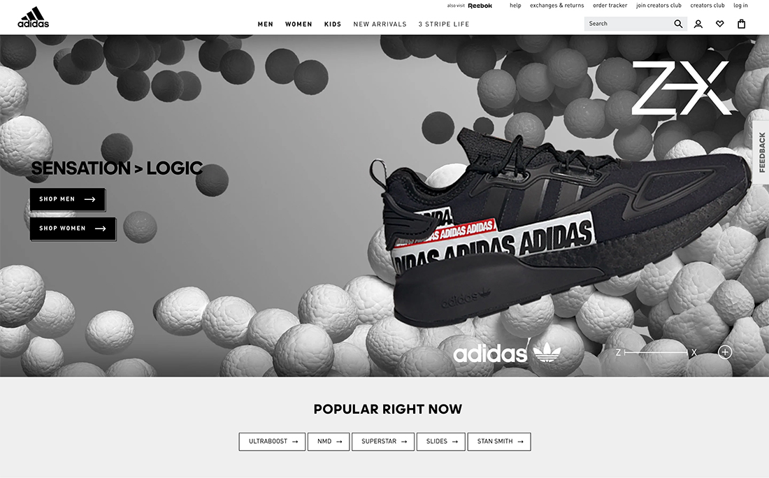
Note the way Adidas, above, uses website data to guide users to the most popular products on their website. That feels pretty useful and likely personalized because they have a good idea of what you are looking for.
Give Users Choices

Personalization also refers to the amount of control, or perceived control, a user has during a website visit.
The ability to interact and perform tasks with options adds a more personal touch to the design. This includes things like being able to toggle sound on or off, switch between light and dark mode, make a purchase without logging in, or set a preference through a data sorting function or search.
In return for the ability to choose content or experience, website visitors have a perception that the design is more for them. It can help increase engagement and time on site. (Just think about it, if users take the time to make design or content choices, they are likely to stick around longer.)
Consider Local APIs

A technology that can make every user feel like they are getting a personalized experience is through the use of local APIs. A local API can help your website make user-specific choices in the background to deliver just the right information to users.
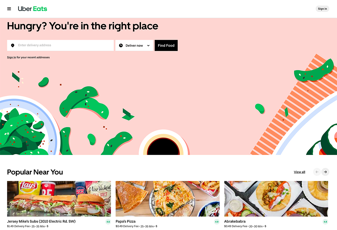
Uber Eats, above, can make a recommendation about what delivery is popular near you even before you log in.
- Location
- Time
- Language
- Currency
- Weather
- News
This data can then shape the type of content that shows, how users check out or even help pre-fill forms or checkboxes. Quite simply it allows your website to show text in French for users in Paris and English for users in London. It can even block sales to countries where you don’t ship products or add to your overall content with customized elements.
Using this data smartly makes all those little things happen without telling users about it. (You know you like going to a website where the language and currency are set correctly.)
On the other hand, it can get creepy in a hurry when you show users that you “know where they are” by noting the location or seemingly personal information right on the screen. The balance between useful and creepy is often less about what data you have, but how you display it.
Smart Shopping Can Boost Sales

It’s a formula that retail giant Amazon has used for years. Product recommendations based on your purchase history, searches, or other purchases similar to yours can help you find or buy just the right item.
The good news is that you can do this without a huge budget or the data collection of a major corporation. Offer similar products in another color, size, or with upgrades to get started.
Options will help users feel more in control of the shopping experience.
Other smart shopping options include “remembering” size or color preferences with a cookie during a visit to show more items in a similar fit and style. You can also ask users if they need items that work with something already in their cart to eliminate frustration later, such as buying an item and recommending the batteries that go with it.
Other technologies such as the ability to virtually try products using a webcam can also help shoppers feel more connected to an item and make a purchase.
Now think about how you can layer some of these personalization tactics for e-commerce. If you use a weather API, then you can deliver relevant items for the climate. Show more images of coats when and where it is cold or t-shirts for warmer climate users.
Use that same philosophy to close the sale with a popup that offers a discount based on the product category page where a user is looking. It feels personal and unique and can help the user move to checkout.
Dynamic Content
Dynamic content uses device data to shift what’s on the screen by device type. This can provide better user experiences in terms of the way a website looks, but can also impact what content shows.
Using dynamic content may involve not showing a video on mobile devices and using a photo instead to optimize load time. It might change the way long-form content “reads,” providing a short option with a toggle to the longer form.
You can create a custom mobile versus desktop experience that toggles almost any type of content you want so that you serve the right information to the right user.
Here’s another example of how dynamic content can work for you. If your website has an associated app, it may give users the choice to download it. If you are using a dynamic content pattern, it will show the correct app store to download from based on device type.
Leverage Logins and Known Users

Maximize opportunities to connect with website visitors by leveraging known information. Often this includes targeting logged-in users with follow-up or automated emails or ad campaigns based on their interactions.
This is a form of personalization in itself.
But there’s a lot more you can do with logged-in users as well and data collection.
- Send celebratory emails (birthday data, anniversary of a signup or purchase, reminder to donate annually)
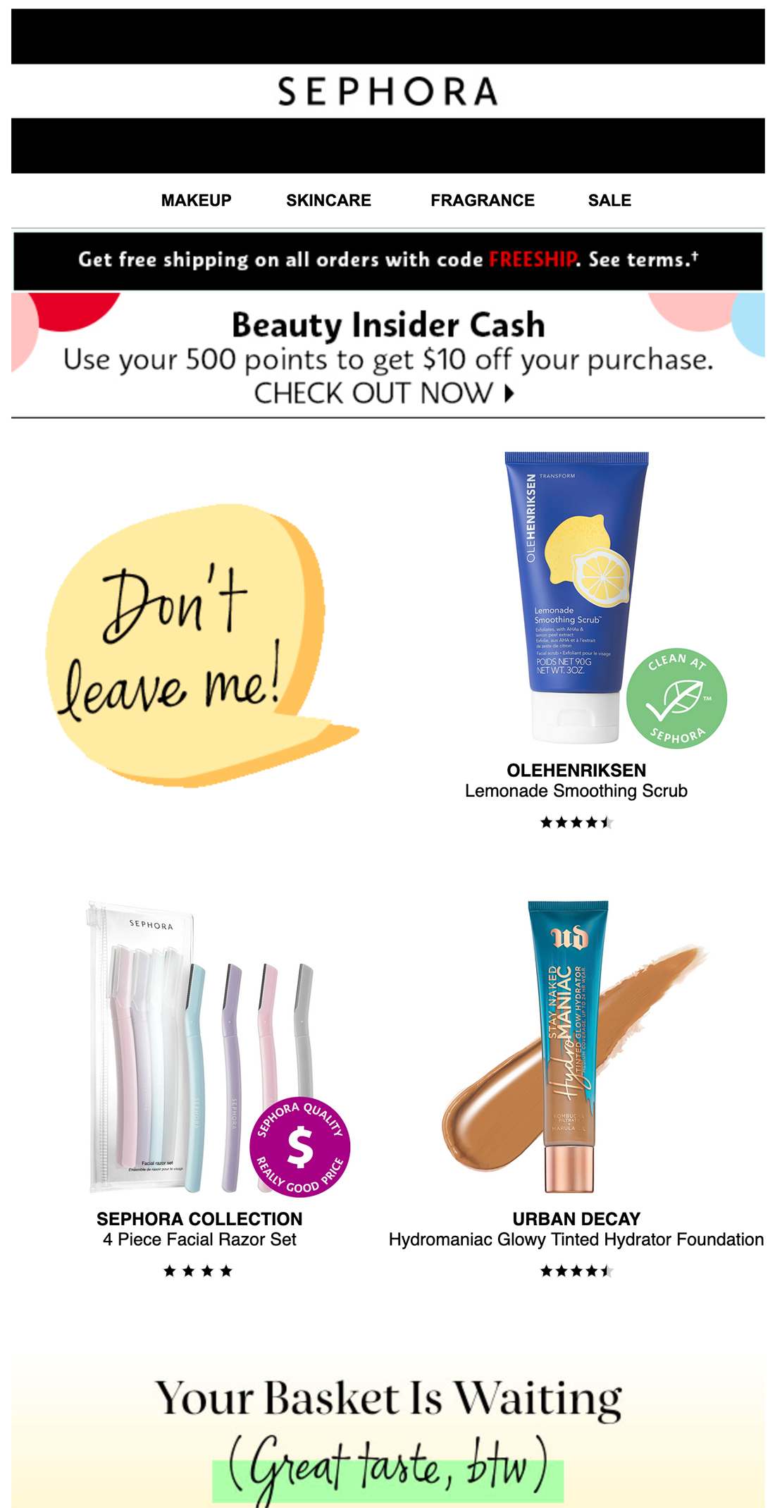
- Send the contents of an abandoned cart just in case they change their mind
- Offer solutions with content or products that might be of interest
- Use location or weather information for timely pitches
Those are just a few quick examples, but the list can go on with an almost limitless number of options. Again, the trick is to send the user something that’s designed for them but without announcing to the world that you know it.
A birthday email with your name in the subject line seems harmless. Landing on a website and balloons fall from the screen as “Happy Birthday” plays begins to feel creepy. (Even if it is based on the same data.)
Conclusion
There is an abundance of data available for every individual that visits your website. If you aggregate and use this information wisely, it can help you make better and more personalized choices that users will appreciate.
More people are accustomed to and expect a certain level of website personalization. The challenge always comes down to the creep factor. And it’s changing all the time.
Pay attention to what is and isn’t working when you use personalization tactics to get a feel for just how comfortable your target audience is with these tools. If you see better traffic counts, time on site, conversions, or purchases, the personalization gamble is paying off. This is a situation where an A/B test can provide a lot of insight into how your visitors feel about these specific techniques.
