“Why are my Core Web Vitals failing?” Many developers have been asking themselves that question lately. Sometimes it’s easy enough to find the answer to that question and the site just needs to invest in performance. Sometimes though, it’s a little trickier and, despite thinking your site was great on the performance for some reason it still fails. That’s what happened to our very own smashingmagazine.com and figuring out, and fixing, the issue took a bit of digging.
A Cry For Help
It all started with a series of tweets last March with a cry for help:

Well, this piqued my interest! I’m a big fan of Smashing Magazine and am very interested in web performance and the Core Web Vitals. I’ve written a few articles here before on Core Web Vitals, and am always interested to see what’s in their annual Web Performance Checklist. So, Smashing Magazine knows about web performance, and if they were struggling, then this could be an interesting test case to look at!
A few of us made some suggestions on that thread as to what the problem might be after using some of our favorite web performance analysis tools like WebPageTest or PageSpeed Insights.
Investigating The LCP Issue
The issue was that LCP was too slow on mobile. LCP, or Largest Contentful Paint, is one of the three Core Web Vitals that you must “pass” to get the full search ranking boost from Google as part of their Page Experience Update. As its name suggests, LCP aims to measure when the largest content of the page is drawn (or “painted”) to the screen. Often this is the hero image or the title text. It is intended to measure what the site visitor likely came here to see.
Previous metrics measured variations of the first paint to screen (often this was a header or background color); incidentally content that isn’t really what the user actually wants to get out of the page. The largest content is often a good indicator or what’s most important. And the “contentful” part of the name shows this metric is intended to ignore (e.g. background colors); they may be the largest content, but they are not “contentful”, so don’t count for LCP and instead the algorithm tries to find something better.
LCP only looks at the initial viewport. As soon as you scroll down or otherwise interact with the page the LCP element is fixed and we can calculate how long it took to draw that element from when the page first started loading — and that’s your LCP!
There are many ways of measuring your Core Web Vitals, but the definitive way — even if it’s not the best way, as we’ll see soon — is in Google Search Console (GSC). From an SEO perspective, it doesn’t really matter what other tools tell you, GSC is what Google Search sees. Of course, it matters what your users experience rather than what some search engine crawler sees, but one of the great things about the Core Web Vitals initiative is that it does measure real user experience rather than what Google Bot sees! So, if GSC says you have bad experiences, then you do have bad experiences according to your users.
Search Console told Smashing Magazine that their LCP on mobile for most of their pages needed improving. A standard enough output of that part of GSC and pretty easily addressed: just make your LCP element draw faster! This shouldn’t take too long. Certainly not six months (or so we thought). So, first up is finding out what the LCP element is.
Running a failing article page through WebPageTest highlighted the LCP element:

Improving The LCP Image
OK, so the article author photo is the LCP element. The first instinct is to ask what could we do to make that faster? This involves delving into waterfalls, seeing when the image is requested, how long it takes to download, and then deciding how to optimize that. Here, the image was well optimized in terms of size and format (usually the first, and easiest option for improving the performance of images!). The image was served from a separate assets domain (often bad for performance), but it wasn’t going to be possible to change that in the short term, and Smashing Magazine had already added a preconnect resource hint to speed that up as best they could.
As I mentioned before, Smashing Magazine knows about web performance, had only recently worked on improving their performance, and had done everything right here, but still were failing. Interesting…
Other suggestions rolled in, including reducing load, delaying the service worker (to avoid contention), or investigating HTTP/2 priorities, but they didn’t have the necessary impact on the LCP timing. So we had to reach into our web performance toolbag for all the tips and tricks to see what else we could do here.
If a resource is critical to the page load, you can inline it, so it’s included in the HTML itself. That way, the page includes everything necessary to do the initial paint without delays. For example, Smashing Magazine already inlines critical CSS to allow a quick first paint but did not inline the author’s image. Inlining is a double-edged sword and must be used with caution. It beefs up the page and means subsequent page views do not benefit from the fact that data is already downloaded. I’m not a fan of over-inlining because of this and think it must be used with caution.
So, it’s not normally recommended to inline images. However, here the image was causing us real problems, was reasonably small, and was directly linked to the page. Yes, if you read a lot of articles by that one author it’s a waste to redownload the same image multiple times instead of downloading the author’s image once and reusing it, but in all likelihood, you’re here to read different articles by different authors.
There have been a few advances in image formats recently, but AVIF is causing a stir as it’s here already (at least in Chrome and Firefox), and it has impressive compression results over the old JPEG formats traditionally used for photographs. Vitality didn’t want to inline the JPEG version of the author images, but investigated whether inlining the AVIF version would work. Compressing the author image using AVIF, and then base64-ing the image into the HTML led to a 3 KB increase to the HTML page weight — which is tiny and so was acceptable.
Since AVIF was only supported in Chrome at the time (it came to Firefox after all this), and since Core Web Vitals is a Google initiative, it did feel slightly “icky” optimizing for a Google browser because of a Google edict. Chrome is often at the forefront of new feature support and that’s to be commended, but it always feels a little off when those two sides of its business impact each other. Still, this was a new standard image format rather than some proprietary Chrome-only format (even if it was only supported in Chrome initially), and was a progressive enhancement for performance (Safari users still get the same content, just not quite as fast), so with the addition of the AVIF twist Smashing took the suggestion and inlined the image and did indeed see impressive results in lab tools. Problem solved!
An Alternative LCP
So, we let that bed in and waited the usual 28 days or so for the Core Web Vitals numbers to all turn green… but they didn’t. They flitted between green and amber so we’d certainly improved things, but hadn’t solved the issue completely. After staying a long stretch in the amber “needs improvement” section, Vitaly reached out to see if there were any other ideas.
The image was drawing quickly. Not quite instantly (it still takes time to process an image after all) but as near as it could be. To be honest, I was running out of ideas but took another look with fresh eyes. And then an alternative idea struck me — were we optimizing the right LCP element? Authors are important of course, but is that really what the reader came here to see? Much as our egos would like to say yes, and that our beautiful shining mugs are much more important than the content we write, the readers probably don’t think that (readers, huh — what can you do!).
The reader came for the article, not the author. So the LCP element should reflect that, which might also solve the LCP image drawing issue. To do that we just put the headline above the author image, and increased the font size on mobile a bit. This may sound like a sneaky trick to fool the Core Web Vital SEO Gods at the expense of the users, but in this case, it helps both! Although many sites do try to go for the quick and easy hack or optimize for GoogleBot over real users, this was not a case of that and we were quite comfortable with the decision here. In fact, further tweaks remove the author image completely on mobile view, where there’s limited space and that article currently looks like this on mobile, with the LCP element highlighted:

Here we show the title, the key information about the article and the start of the summary — much more useful to the user, than taking up all the precision mobile screen space with a big photo!
And that’s one of the main things I like about the Core Web Vitals: they are measuring user experience.
And NOW we were finally done. Text draws much quicker than images so that should sort out the LCP issue. Thank you all very much and good night!
I Hate That CWV Graph In Google Search Console…
Again we were disappointed. That didn’t solve the issue and it wasn’t long before the Google Search Console graph returned to amber:
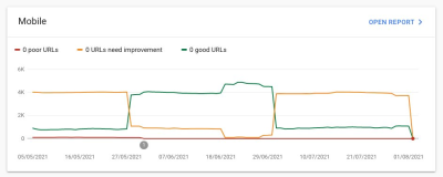
At this point, we should talk a little more about page groupings and Core Web Vitals. You might have noticed from the above graph that pretty much the whole graph swings at once. But there was also a core group of about 1,000 pages that stayed green most of the time. Why is that?
Well, Google Search Console categorizes pages into page groupings and measures the Core Web Vitals metrics of those page groupings. This is an attempt to fill in missing data for those pages that don’t get enough traffic to have meaningful user experience data. There’s a number of ways that they could have tackled this: they could have just not given any ranking boost to such pages, or maybe assumed the best and given a full boost to pages without any data. Or they could have fallen back to origin-level core web vitals data. Instead, they tried to do something more clever, which was an attempt to be helpful, but is in many ways also more confusing: Page groupings.
Basically, every page is assigned a page grouping. How they do this isn’t made clear, but URLs and technologies used on the page have been mentioned before. You also can’t see what groupings Google has chosen for each of your pages, and if their algorithm got it right, which is another frustrating thing for website owners, though they do give sample URLs for each different Core Web Vitals score below the graph in Google Search Console from which the grouping can sometimes be implied.
Page groupings can work well for sites like Smashing Magazine. For other sites, page groupings may be less clear, and many sites may just have one grouping. The Smashing site, however, has several different types of pages: articles, author pages, guides, and so on. If an article page is slow because the author image is the LCP image is slow to load, then that will likely be the case for all article pages. And the fix will likely be the same for all article pages. So grouping them together there makes sense (assuming Google can accurately figure out the page groupings).
However, where it can get confusing is when a page does get enough visitors to get its own Core Web Vitals score and it passes, but it’s lumped in with a failing group. You can call the CrUX API for all the pages in your site, see most of them are passing, then be confused when those same pages are showing as failing in Search Console because they’ve been lumped in a group with failing URLs and most of the traffic for that group is for failing. I still wonder if Search Console should use page-level Core Web Vital data when it has, rather than always using the grouping data.
Anyway, that accounts for the large swings. Basically, all the articles (of which there are about 3,000) appear to be in the same page grouping (not unreasonably!) and that page grouping is either passing or failing. When it switches, the graph moves dramatically.
You can also get more detailed data on the Core Web Vitals through the CrUX API. This is available at an origin-level (i.e. for the whole site), or for individual URLs (where enough data exists), but annoyingly not at the page grouping level. I’d been tracking the origin level LCP using the CrUX API to get a more precise measure of the LCP and it showed a depressing story too:
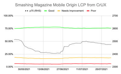
We can see we’ve never really “solved” the issue and the amount of “Good” pages (the green line above) still hovered too close to the 75% pass rate. Additionally the p75 LCP score (the dotted line which uses the right-hand axis) never really moved far enough away from the 2500 milliseconds threshold. It was no wonder the pages passing and failing were flipping back and forth. A bit of a bad day, with a few more slow page loads, was enough to flip the whole page grouping into the “needs improvement” category. We needed something more to give us some headroom to be able to absorb these “bad days”.
At this point, it was tempting to optimize further. We know the article title was the LCP element so what could we do to further improve that? Well, it uses a font, and fonts have always been a bane of web performance so we could look into that.
But hold up a minute. Smashing Magazine WAS a fast site. Running it through web performance tools like Lighthouse and WebPageTest showed that — even on slower network speeds. And it was doing everything right! It was built as a static site generator so didn’t require any server-side generation to occur, it inlined everything for the initial paint so there were no resource loading constraints other than the HTML itself, it was hosted by Netlify on a CDN so should be near its users.
Sure, we could look at removing the font, but if Smashing Magazine couldn’t deliver a fast experience given all that, then how could anyone else? Passing Core Web Vitals shouldn’t be impossible, nor require you to only be on a plain site with no fonts or images. Something else was up here and it was time to find out a bit more about what was going on instead of just blindly attempting another round of optimizations.
Digging A Little Deeper Into The Metrics
Smashing Magazine didn’t have a RUM solution so instead we delved into the Chrome User Experience Report (CrUX) data that Google collects for the top 8 million or so websites and then makes that data available to query in various forms. It’s this CrUX data that drives the Google Search Console data and ultimately the ranking impact. We’d already been using the CrUX API above but decided to delve into other CrUX resources.
We used the sitemap and a Google Sheets script to look at all the CrUX data for the whole site where it was available (Fabian Krumbholz has since created a much more comprehensive tool to make this easier!) and it showed mixed results for pages. Some pages passed, while others, particularly older pages, were failing.
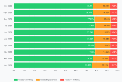
The CrUX dashboard didn’t really tell us much that we didn’t already know in this instance: the LCP was borderline, and unfortunately not trending down:
Digging into the other stats (TTFB, First Paint, Online, DOMContentLoaded) didn’t give us any hints. There was, however, a noticeable increase in mobile usage:
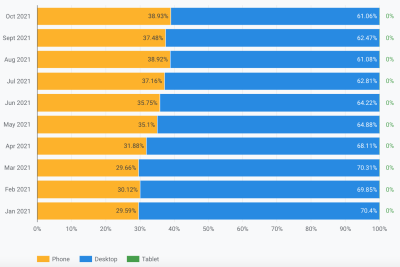
Was this part of a general trend in mobile adoption? Could that be what was affecting the mobile LCP despite the improvements we’d done? We had questions but no answers or solutions.
One thing I wanted to look at was the global distribution of the traffic. We’d noticed in Google Analytics a lot of traffic from India to old articles — could that be an issue?
The India Connection
Country-level CrUX data isn’t available in the CrUX dashboard but is available in the BigQuery CrUX dataset, and running a query in there at the www.smashingmagazine.com origin level shows a wide disparity in LCP values (the SQL is included on the second tab of that link btw in case you want to try the same thing on your own domain). Based on the top 10 countries in Google Analytics we have the following data:
| Country | Mobile p75 LCP value | % of traffic |
|---|---|---|
| United States | 88.34% | 23% |
| India | 74.48% | 16% |
| United Kingdom | 92.07% | 6% |
| Canada | 93.75% | 4% |
| Germany | 93.01% | 3% |
| Philippines | 57.21% | 3% |
| Australia | 85.88% | 3% |
| France | 88.53% | 2% |
| Pakistan | 56.32% | 2% |
| Russia | 77.27% | 2% |
India traffic is a big proportion for Smashing Magazine (16%) and it is not meeting the target for LCP at an origin level. That could be the problem and certainly was worth investigating further. There was also the Philippines and Pakistan data with very bad scores but that was a relatively small amount of traffic.
At this point, I had an inkling what might be going on here, and a potential solution so got Smashing Magazine to install the web-vitals library to collect RUM data and post it back to Google Analytics for analysis. After a few days of collecting, we used the Web Vitals Report to give us a lot at the data in ways we hadn’t been able to see before, in particular, the country-level breakdown:
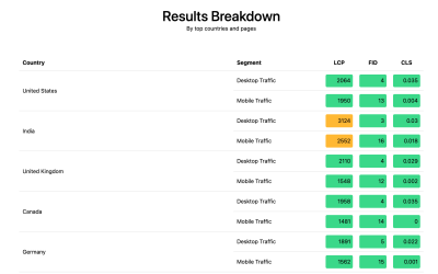
And there it was. All the top countries in the analytics did have very good LCP scores, except one: India. Smashing Magazine uses Netlify which is a global CDN and it does have a Mumbai presence, so it should be as performant as other countries, but some countries are just slower than others (more on this later).
However, the mobile traffic for India was only just outside the 2500 limit, and it was only the second most visited country. Surely the good USA scores should have been enough to offset that? Well, the above two graphs show the countries order by traffic. But CrUX counts mobile and desktop traffic separately (and tablet btw, but no one ever seems to care about that!). What happens if we filter the traffic to just mobile traffic? And one step further — just mobile Chrome traffic (since only Chrome feeds CrUX and so only Chrome counts towards CWV)? Well then we get a much more interesting picture:
| Country | Mobile p75 LCP value | % of mobile traffic |
|---|---|---|
| India | 74.48% | 31% |
| United States | 88.34% | 13% |
| Philippines | 57.21% | 8% |
| United Kingdom | 92.07% | 4% |
| Canada | 93.75% | 3% |
| Germany | 93.01% | 3% |
| Nigeria | 37.45% | 2% |
| Pakistan | 56.32% | 2% |
| Australia | 85.88% | 2% |
| Indonesia | 75.34% | 2% |
India is actually the top mobile Chrome visitor, by quite some way — nearly triple the next highest visitor (USA)! The Philippines, with its poor score has also shot up there to the number three spot, and Nigeria and Pakistan with their poor scores are also registering in the top 10. Now the bad overall LCP scores on mobile were starting to make sense.
While the mobile has overtaken desktop as the most popular way to access the Internet in the, so-called, Western world, there still is a fair mix of mobile and desktop here — often tied to our working hours where many of us are sat in front of a desktop. The next billion users may not be the same, and mobile plays a much bigger part in those countries. The above stats show this is even true for sites like Smashing Magazine that you might consider would get more traffic from designers and developers sitting in front of desktops while designing and developing!
Additionally because CrUX only measures from Chrome users, that means countries with more iPhones (like the USA) will have a much smaller proportion of their mobile users represented in CrUX and so in Core Web Vitals, so additionally amplifying the effect of those countries.
Core Web Vitals Are Global
Core Web Vitals don’t have a different threshold per country, and it doesn’t matter if your site is visited by different countries — it simply registers all Chrome users the same. Google has confirmed this before, so Smashing Magazine will not get the ranking boost for the good USA scores, and not get it for the India users. Instead, all users go into the melting pot, and if the score for those page groupings do not meet the threshold, then the ranking signal for all users is affected.
Unfortunately, the world is not an even place. And web performance does vary hugely by country, and shows a clear divide between richer and poorer countries. Technology costs money, and many countries are more focused on getting their populations online at all, rather than on continually upgrading infrastructure to the latest and greatest tech.
The lack of other browsers (like Firefox or iPhones) in CrUX has always been known, but we’ve always considered it more of a blind spot for measuring Firefox or iPhone performance. This example shows the impact is much bigger, and for sites with global traffic, it skews the results significantly in favor of Chrome users, which often means poor countries, which often means worse connectivity.
Should Core Web Vitals Be Split By Country?
On the one hand, it seems unfair to hold websites to the same standard if the infrastructure varies so much. Why should Smashing Magazine be penalized or held to a higher standard than a similar website that is only read by designers and developers from the Western world? Should Smashing Magazine block Indian users to keep the Core Web Vitals happy (I want to be quite clear here that this never came up in discussion, so please do take this as the author making the point and not a sleight on Smashing!).
On the other hand, “giving up” on some countries by accepting their slowness risks permanently relegating them to the lower tier many of them are in. It’s hardly the average Indian reader of Smashing Magazine’s fault that their infrastructure is slower and in many ways, these are the people that deserve more highlighting and effort, rather than less!
And it’s not just a rich country versus poor country debate. Let’s take the example of a French website which is aimed at readers in France, funded by advertising or sales from France, and has a fast website in that country. However, if the site is read by a lot of French Canadians, but suffers because the company does not use a global CDN, then should that company suffer in French Google Search because it’s not as fast to those Canadian users? Should the company be “held to ransom” by the threat of Core Web Vitals and have to invest in the global CDN to keep those Canadian readers, and so Google happy?
Well, if a significant enough proportion of your viewers are suffering then that’s exactly what the Core Web Vital’s initiative is supposed to surface. Still, it’s an interesting moral dilemma which is a side effect of the Core Web Vitals initiative being linked to SEO ranking boost: money always changes things!
One idea could be to keep the limits the same, but measure them per country. The French Google Search site could give a ranking boost to those users in French (because those users pass CWV for this site), while Google Search Canada might not (because they fail). That would level the playing field and measure sites to each country, even if the targets are the same.
Similarly, Smashing Magazine could rank well in the USA and other countries where they pass, but be ranked against other Indian sites (where the fact they are in the “needs improvement” segment might actually still be better than a lot of sites there, assuming they all suffer the same performance constraints).
Sadly, I think that would have a negative effect, with some countries again being ignored while sites only justify web performance investment for more lucrative countries. Plus, as this example already illustrates, the Core Web Vitals are already complicated enough without bringing nearly 200 additional dimensions into play by having one for every country in the world!
So How To Fix It?
So we now finally knew why Smashing Magazine was struggling to pass Core Web Vitals but what, if anything, could be done about it? The hosting provider (Netlify) already has the Mumbai CDN, which should therefore provide a fast access for Indian users, so was this a Netlify problem to improve that? We had optimized the site as much as possible so was this just something they were going to have to live with? Well no, we now return to our idea from earlier: optimizing the web fonts a bit more.
We could take the drastic option of not delivering fonts at all. Or perhaps not delivering fonts to certain locations (though that would be more complicated, given the SSG nature of Smashing Magazine’s website). Alternatively, we could wait and load fonts in the front end, based on certain criteria, but that risked slowing down fonts for others while we assessed that criteria. If only there was some easy-to-use browser signal for when we should take this drastic action. Something like the SaveData header, which is intended exactly for this!
SaveData And prefers-reduced-data
SaveData is a setting that users can turn on in their browser when they really want to… well save data. This can be useful for people on restricted data plans, for those traveling with expensive roaming charges, or for those in countries where the infrastructure isn’t quite as fast as we’d like.
Users can turn on this setting in browsers that support it, and then websites can then use this information to optimize their sites even more than usual. Perhaps returning lower quality images (or turning images off completely!), or not using fonts. And the best thing about this setting is that you are acting upon the user’s request, and not arbitrarily making a decision for them (many Indian users might have fast access and not want a restricted version of the website!).
The Save Data information is available in two (soon to be three!) ways:
- A
SaveDataheader is sent on each HTTP request. This allows dynamic backends to change the HTML returned. - The
NetworkInformation.saveDataJavaScript API. This allows front-end scripts to check this and act accordingly. - The upcoming
prefers-reduced-datamedia query, allowing CSS to set different options depending on this setting. This is available behind a flag in Chrome, but not yet on by default while it finishes standardization.
So the question is, do many of the Smashing Magazine readers (and particularly those in the countries struggling with Core Web Vitals) use this option and is this something we can therefore use to serve them a faster site? Well, when we added the web-vitals script mentioned above, we also decided to measure that, as well as the Effective Connection Type. You can see the full script here. After a bit of time allowing it to collect we could display the results in a simple /Google Analytics dashboard, along with the Chrome browser version:
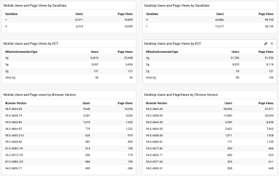
So, the good news was that a large proportion of mobile Indian users (about two-thirds) did have this setting set. The ECT was less useful with most showing as 4g. I’ve argued before that this API has gotten less and less useful as most users are classified under this 4g setting. Plus using this value effectively for initial loads is fraught with issues.
More good news as most users seem to be on an up-to-date Chrome so would benefit from newer features like the prefers-reduced-data media query when it becomes fully available.
Ilya from Smashing team applied the JavaScript API version to their font-loader script so additional fonts are not loaded for these users. Smashing folks also applied the prefers-reduce-data media query to their CSS so fallback fonts are used rather than custom web fonts for the initial render, but this will not be taking effect for most users until that setting moves out of the experimental stage.
I Love That Graph In Google Search Console
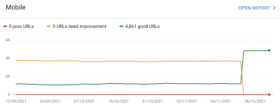
And did it work? Well, we’ll let Google Search Console tell that store as it showed us the good news a couple of weeks later:
Additionally, since this was introduced in mid-November, the original level LCP score has steadily ticked downwards:
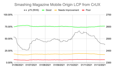
There’s still not nearly enough headroom to make me comfortable, but I’m hopeful that this will be enough for now, and will only improve when the prefers-reduced-data media query comes into play — hopefully soon.
Of course, a surge in traffic from mobile users with bad connectivity could easily be enough to flip the site back into the amber category, which is why you want that headroom, so I’m sure the Smashing team will be keeping a close eye on their Google Search Console graph for a bit longer, but I feel we’ve made the best efforts basis to improve the experience of users so I am hopeful it will be enough.
Impact Of The User Experience Ranking Factor
The User Experience ranking factor is supposed to be a small differentiator at the moment, and maybe we worried too much about a small issue that is, in many ways outside of our control? If Smashing Magazine is borderline, and the impact is small, then maybe the team should worry about other issues instead of obsessing over this one? But I can understand that and, as I said, Smashing Magazine are knowledgeable in performance and so understand why they wanted to solve — or at the very least understand! — this issue.
So, was there any impact? Interestingly we did see a large uptick in search impression in the last week at the same time as it flipped to green:
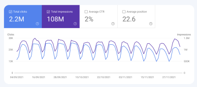
It’s since reverted back to normal, so this may have been an unrelated blip but interesting nonetheless!
Conclusions
So, an interesting case study with a few important points to take away:
- When RUM (including CrUX or Google Search Console) tells you there’s a problem, there probably is! It’s all too easy to try to compare your experiences and then blame the metric.
- Implementing your own RUM solution gives you access to much more valuable data than the high-level data CrUX is intended to provide, which can help you drill down into issues, plus also give you potentially more information about the devices your site visitors are using to visit your site.
- Core Web Vitals are global, and that causes some interesting challenges for global sites like Smashing Magazine. This can make it difficult to understand CrUX numbers unless you have a RUM solution and perhaps Google Search Console or CrUX could help surface this information more?
- Chrome usage also varies throughout the world, and on mobile is biased towards poorer countries where more expensive iPhones are less prevalent.
- Core Web Vitals are getting much better at measuring User Experience. But that doesn’t mean every user has to get the same user experience — especially if they are telling you (through things like the Save Data option) that they would actually prefer a different experience.
I hope that this case study helps others in a similar situation, who are struggling to understand their Core Web Vitals. And I hope you can use the information here to make the experience better for your website visitors.
Happy optimizing!
Note: It should be noted that Vitaly, Ilya and others at the Smashing team did all the work here, and a lot more performance improvements were not covered in the above article. I just answered a few queries for them on this specific problem over the last 6 months and then suggested this article might make an interesting case study for other readers to learn from.
