The dreaded refactor of old code can be challenging. Code evolves over time with more features, new or changing dependencies, or maybe a goal of performance improvements. When tackling a big refactor, what are the things you should focus on and what performance improvements can you expect?
I’ve been building Shopify themes for the better part of a decade. When I worked in-house at Shopify in 2013, themes were fairly simple in terms of code complexity. The hardest part was that Shopify required themes to support IE8, and up until late 2020, IE11. That meant there was a lot of modern JavaScript we couldn’t utilize without sometimes sizable polyfills.
Eight years later, in 2021, themes are infinitely more complex because Shopify has released a ton of new features (to go along with our in-house ideas at Archetype Themes). The problem is that building new performant features will only go so far when some of your codebase is so old that it has old IE polyfills or IE10 CSS hacks. Our themes had pretty good speed scores for how much they offered, but they were undoubtedly bloated.
Our Goal Was Simple
Better performance across the board. Faster time to first paint. Less blocking JS. Less code complexity.
Getting there was the hard part. It included:
- Remove jQuery and rewrite ~6k lines of JS per theme in Vanilla JS
- Remove Handlebars.js, as our templating needs were way too small for such a large package
- Standardizing code shared between themes (remove duplication)
Moving away from jQuery was a blessing, but a long process. Thankfully, Tobias Ahlin has a fantastic guide on some of the quick conversions away from jQuery. While going through these changes, it was the perfect time to rethink some more basic issues like how my JS was structured and how elements were initialized.
Remove jQuery
Writing Vanilla JS always seemed like a pipe dream. We had to support old IE, so it was just so easy to ignore any attempt at removing it. Then IE 11 support was dropped by Shopify and the clouds parted — it was our time.
Why remove jQuery anyway? I’ve heard lots of arguments about this, such as its package size isn’t that bad compared to a framework like React. Well, jQuery isn’t a framework like React so it’s a bit of a non-starter comparison. jQuery is a way of using CSS-like selectors and developer-friendly syntax for things like animations and Ajax requests. Most of all, it helped with cross-browser differences so developers didn’t have to think about it.
We wanted to remove it for a few reasons:
I’m one of those developers who were stuck in the past. I knew jQuery inside and out and could make it pull off nearly anything I tried. Was it perfect? No, of course not. But when you look at the lifecycle of some JS frameworks that flamed out, jQuery has always been steady and that was familiar and safe to me. Removing our reliance on it and untangling it from ~6k lines of code (for each theme) felt insurmountable — especially when I couldn’t know for sure my performance scores would benefit or by how much.
Our approach was to comment out each module we had, remove jQuery, and slowly add in each module or function one at a time while it was rewritten. We started with the simplest file, one with a few functions and a few selectors. Nice and easy, no errors in dev tools, time to move on.
We did this one by one, remembering the easy fixes from the early files when we got to the complex ones like refactoring all of the potential features associated with a product and its add-to-cart form (I counted, it’s 24 unique things). In the end, we got the product JS from 1600 lines of code to 1000. Along the way, we found better ways to do some things and would go back and refactor as needed.
We realized Vanilla JS isn’t scary, it’s just a bit more of an intentional way of writing code than jQuery. We also realized some ancient code was a mess — we needed to organize the JS to be more modular and remove duplicate code (more on that below). But before that, we wanted to play with some of the fun JS we’d only used in other projects.
Intersection Observer API
Shopify themes are powerful in that they let merchants move elements around the page however they want. That means, as the developer, you don’t know where the element is, whether it exists, or how many exist.
To initialize these elements, we had been using scroll events that continuously checked if an element was visible on the page with this function:
theme.isElementVisible = function($el, threshold) { var rect = $el[0].getBoundingClientRect(); var windowHeight = window.innerHeight || document.documentElement.clientHeight; threshold = threshold ? threshold : 0; // If offsetParent is null, it means the element is entirely hidden if ($el[0].offsetParent === null) { return false; } return ( rect.bottom >= (0 - (threshold / 1.5)) && rect.right >= 0 && rect.top <= (windowHeight + threshold) && rect.left <= (window.innerWidth || document.documentElement.clientWidth) );
};
Even though these scroll events were throttled, there was a lot of math being done by the browser all the time. It never really felt too sluggish, but it did take up a spot in the call stack which impacted other JS competing for priority. I wish we had done more performance research on this update specifically because I think it’s responsible for many of the improvements in Time to interactive and Total blocking time that you’ll see below.
In comes the Intersection Observer API. Now that IE11 support wasn’t required, I was so happy to be able to fully utilize this. In short, it’s an asynchronous way of knowing when an element is visible in the window. No more sluggish measurements and scroll events.
To initialize an element when it’s visible, we use something as simple as this:
theme.initWhenVisible({ element: document.querySelector('div'), callback: myCallback
});
All of the JS required for the element will be handled inside myCallback, preventing it from doing anything until it’s visible.
This sets up an observer for that element, and then removes the observer once it’s visible. It’s always good to clean up after yourself even if you think there might not be much impact without it. If there’s a callback, we run it and our module is ready to go.
theme.initWhenVisible = function(options) { var threshold = options.threshold ? options.threshold : 0; var observer = new IntersectionObserver((entries, observer) => { entries.forEach(entry => { if (entry.isIntersecting) { if (typeof options.callback === 'function') { options.callback(); observer.unobserve(entry.target); } } }); }, {rootMargin: '0px 0px '+ threshold +'px 0px'}); observer.observe(options.element);
};
You can pass a threshold to initialize the element before it’s on the screen too, which can be handy if you want to preload something like Google’s Map API slightly before the element is visible so it’s ready when it is.
Layzloading Images And object-fit
We use lazysizes for lazy-loading our images. It has some helpful plugins for also loading background images, but requires a lot more markup on your element. While the plugins are quite small, it’s one more thing that’s easily removed with pure CSS.
Using object-fit in CSS meant that we could position an image just like a background image, but as an <img> element and get all the benefits of normal lazy-loading without extra JS. The real benefit in this is we’re one step closer to using native browser lazy-loading (which doesn’t support background images). We’ll still have to load in lazysizes as a fallback when the native approach isn’t supported, but it means removing an entire dependency.
<script>
if ('loading' in HTMLImageElement.prototype) { // Browser supports `loading`
} else { // Fetch and initialize lazysizes
}
</script>
MatchMedia API
In the past, we used enquire.js to know when breakpoints changed. This is used when resizing elements, changing a module’s arguments for desktop vs mobile, or simply to show/hide elements that you can’t with CSS.
Instead of relying on another package, once again we can go with a native solution in matchMedia.
var query = 'screen and (max-width:769px)';
var isSmall = matchMedia(query).matches; matchMedia(query).addListener(function(mql) { if (mql.matches) { isSmall = true; document.dispatchEvent(new CustomEvent('matchSmall')); } else { isSmall = true; document.dispatchEvent(new CustomEvent('unmatchSmall')); } });
With just a few lines of code, we can listen for breakpoint changes and change a helpful variable that’s used elsewhere and trigger a custom event that specific modules can listen for.
document.addEventListener('matchSmall', function() { // destroy desktop-only features // initialize mobile-friendly JS
});
Hunting down duplicate code
As I mentioned at the beginning, we had slowly built features into our themes for years. It didn’t take long for some elements to be built out that were kind of like others, like a full-width homepage video and later videos on your product listing or a popup video modal.
YouTube’s API, for example, initialized differently three times and had nearly identical callbacks and accessibility features built out per-module. It was a bit embarrassing we didn’t build it smarter in the first place, but that’s how you know you’re growing as a developer.
We took this time to consolidate many of our modules to be standalone helpers. YouTube became its own method that all sections from all of our themes could use. It meant refactoring by breaking it down into the most basic parts:
- Default API arguments (overridable by the initializing module)
- A div ID to initialize the video onto
- ID of the YouTube video to load
- Events (API is ready, video state changed, etc)
- Play/pause when not in view
- Handle iOS low power mode when autoplay not supported
My approach was to do this all on paper before coding, which is something that always helps me sort out what’s integral to the module I’m building vs what’s custom by the parent that’s initializing it — a division of labor if you will.
Now our three themes that initialize YouTube videos a total of nine different ways use a single file. That’s a big code complexity win for us, and makes any future updates much easier for me and other developers that might touch the code. By using this same approach for other modules while converting to Vanilla JS, it allowed us to move nearly half of each theme’s JS to a single shared module across them all.
This is something that was invaluable to our team and our multi-project setup and might not be useful to your projects exactly, but I believe the process is. Thinking about simplicity and avoiding duplication will always benefit your project.
We did the same for slideshow modules (image slideshows, testimonials, product page images, announcement bars), drawers and modals (mobile menus, cart drawers, newsletter popups), and many more. One module has one purpose and will share back to the parent only what is required. This meant less code shipped, and cleaner code to develop with.
Performance Stats
Finally, the good stuff. Was this all worth it? Most of this was done blindly with the assumption that less JS, smarter initializing, and more modern approaches would result in faster themes. We weren’t disappointed.
We started all of this work with Motion, our first theme. It had the most bloated JS and the biggest room for improvement.
- 52% less JS shipped
- Desktop home page speeds (with heavy elements like multiple videos, featured products, slideshows with large images)
| Desktop home page | Before | After | Change |
|---|---|---|---|
| Lighthouse score | 57 | 76 | +33 |
| Total blocking time | 310ms | 50ms | -83.8% |
| Time to interactive | 2.4s | 2.0s | -16% |
| Largest contentful paint | 3.8s | 2.6s | -31.5% |
- Mobile product pages
| Mobile product page | Before | After | Change |
|---|---|---|---|
| Lighthouse score | 26 | 65 | +150% |
| Total blocking time | 1440ms | 310ms | -78% |
| Time to interactive | 11.3s | 6.1s | -46% |
| Largest contentful paint | 13s | 4.2s | -67.6% |
Then we moved on to Impulse, our second and most feature-heavy theme.
- 40% less JS shipped
- 28% faster mobile home page speeds
| Desktop home page | Before | After | Change |
|---|---|---|---|
| Lighthouse score | 58 | 81 | +39.6% |
| Total blocking time | 470ms | 290ms | -38% |
| Time to interactive | 6.1s | 5.6s | -8% |
| Largest contentful paint | 6s | 2.9s | -51.6% |
- 30% faster mobile home page and product page speeds
| Mobile product page | Before | After | Change |
|---|---|---|---|
| Lighthouse score | 32 | 45 | +40.6% |
| Total blocking time | 1490ms | 780ms | -47.6% |
| Time to interactive | 10.1s | 8.3s | -17.8% |
| Largest contentful paint | 10.4s | 8.6s | -17.3% |
While you may notice these numbers got a lot better, they’re still not great. Shopify themes are handcuffed by the platform so our starting point is already challenging. That could be an entirely separate article, but here’s the overview:
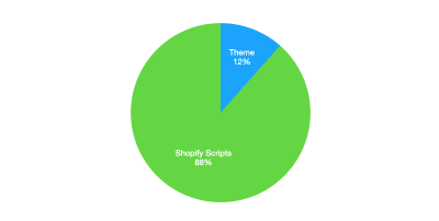
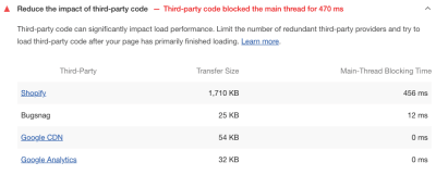
- Shopify has a lot of overhead: feature detection, tracking, and payment buttons (Apple Pay, Google Pay, ShopPay). If you’re on a product page with dynamic payment buttons you can be looking at about 187kb of Shopify scripts vs. 24.5kb theme files. Most sites will have Google Analytics, and maybe a Facebook Pixel or other tracking scripts loaded on top of all this.

The good news is that these scripts are loaded fairly efficiently and most don’t block the page rendering much. The bad news is that there’s still a lot of JavaScript loading on those pages that are out of the theme’s control and cause some flags on Lighthouse scores.

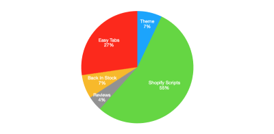
- Apps are a huge bottleneck and store owners, generally, have no idea. We routinely see shops with 20+ apps installed, and even a simple app can drop your Shopify speed score by 10+ points. Here’s the breakdown of our Impulse theme with three apps installed.

Note: Here’s a great case study on apps and their effect on performance.
We’re still in the process of finishing these updates to our third theme, Streamline. Streamline also has some other performance features built in that we’re exploring adding to our other themes, such as loadCSS by Filament Group to prevent the CSS from being a render-blocking resource.
These numbers aren’t insignificant. It’s widely reported that speed matters and even small changes can make big impacts. So while we are happy with all of this progress, it’s not the end. Performance will continue to be a dominant part of our builds and we won’t stop looking for more ways to simplify code.
What’s Next?
Performance is an ongoing challenge, one we’re excited to keep pushing on. A few things on our list are:
Resources For Shopify Developers
If you’re building on Shopify, or want to get started, here are some helpful resources for you:
(vf, il)


