Love is in the air, and the whole world now turns lovely red with all those heart-shaped outlines, doves, the figure of the winged cupid, chocolate boxes, roses, and the rest of the love symbols and motifs! Wondering how we could create a deep spell in your hearts, we’ve thought of compiling a list of some stylish Valentine web design solutions with useful features and catchy UI elements regarding St. Valentine’s Day. And though everything becomes bright and shining with love this day, today’s web trends mostly consist of more restrained designs. How to combine it with a shining atmosphere of love? Here are 15 simple but stunning ways to make your website Valentine-ready.
Giraffe.net
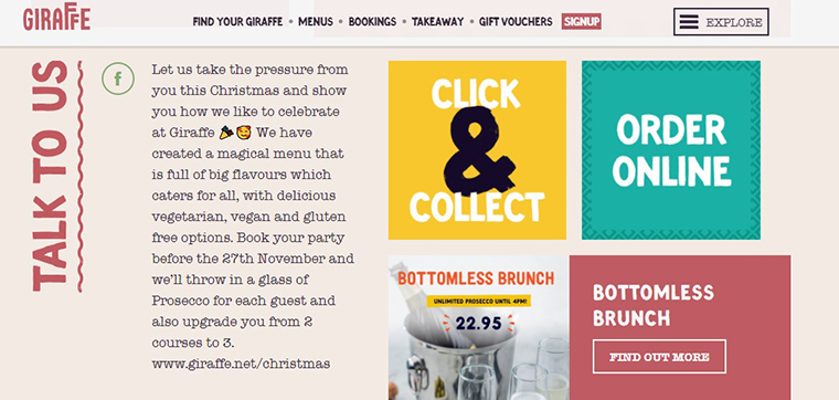
When it comes to Valentine’s web design, it is not only about kisses and heart-shaped UI elements. Today’s webspace collects tons of strikingly-colored online projects, so everyone is looking for new ways to stand out from the crowd. Modern customers get used to comfy, user-friendly websites with multiple trendy features, making it harder to craft something inimitable. How to succeed? The thing is that you don’t have to focus on cupids, hearts, or chocolate boxes to make the website Valentine-like. There are many other things people associate with love, like red and pink colors. Any designer knows how critical a website’s color schemes are, as they can quickly awake the needed emotions. That is why we started the selection with Giraffe’s romantic design solution. It is clean, easy-to-navigate, and Valentine-like without any heart-shaped objects or anything like this.
Phuler
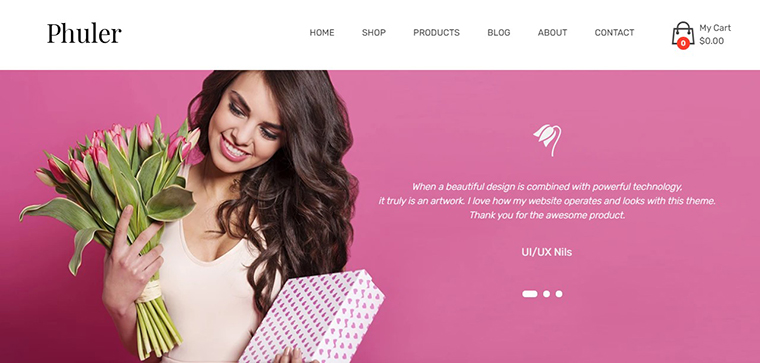
Here is another worthy example of smartly used color schemes for a romantic Valentine’s gifts website. It comes with soft pink shades used for banners, pop-ups, homepage, and other essentials, making the whole online appearance look harmonious and brand-recognizable. However, there is another trendy feature you might want to use for the future St. Valentine web design – flat icons. Thanks to a clean, simple-to-recognize look, flat icons remain one of the most popular web design solutions suitable for numerous business niches, including eCommerce projects. Would you like to get a beautifully-looking website with a visitor-friendly design? You will need to take care of all of its elements in this case, and here is what you can start with. Due to a simple yet identifiable design, your website’s visitors would easily find the needed page, product, or section.
Tiffany.com
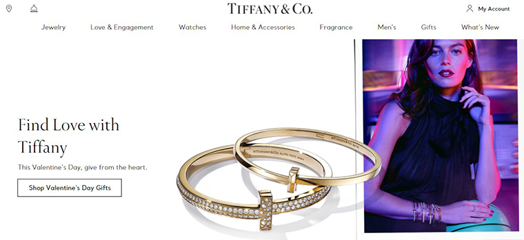
Valentine-oriented Call-to-actions are the next thing you might want to use both for personal and commercial projects. Although these elements are small, CTAs are one of the essential website’s parts. Thanks to a properly designed CTA button, you make a visitor perform specific actions, like visiting a page, purchasing, downloading free items, etc. Tiffany’s website is an excellent example of what holiday-oriented CTAs should look like. Just look at the screenshot above: 3 consecutive love-related texts still don’t overload the design. Would you like to try using Valentine CTAs to boost sales this winter? Then make sure your readers offer something instead of demanding. The most extensive section’s part (‘Find love with Tiffany’) is what a visitor sees before all else. That is why it offers something personal and cherished to get prospects’ attention.
Love Story
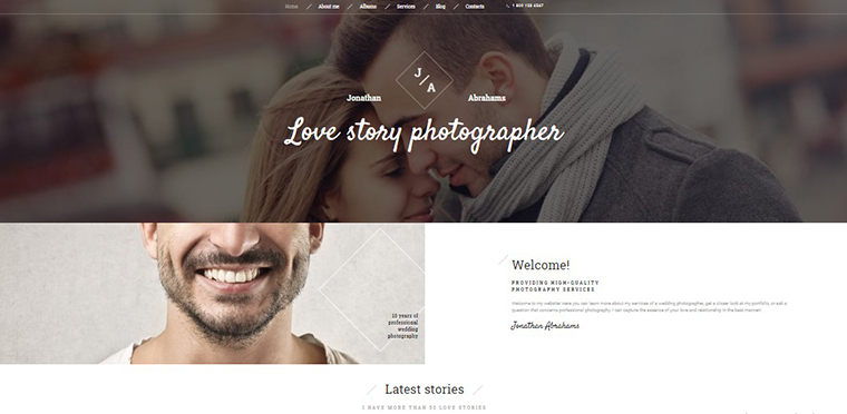
What else can help you to prepare a website for Valentine’s day? MegaMenu is another popular design feature suitable for every business, topic, and project type. It provides you with a clean, easy-to-navigate design that helps sort a websites’ content with categories and subcategories. These days, premium website templates come with the feature in the pack. It also allows adding images right in the menu’s design, but it is not the only option to make your site valentinable. You may also try using customizable headers for love-related backgrounds.
Sallybeauty.com
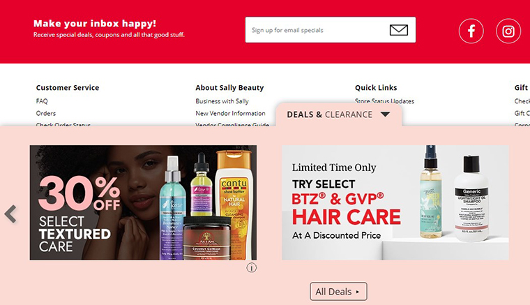
As you can see, even big players prefer minimalist designs to be vast and bizarre web design solutions. We have already told you that the colors you choose for a project’s look influence visitors’ feelings and associate your brand with some memories. Sally Beauty content is an example of how to do it right without saying a word about Valentine’s day or relations in general. They have a minimalist design with only one bright and 2 primary colors. One of the red’s hues, soft pink color, highlights the best deals and promo banners when red takes the prospect’s gaze to CTA.
Wedbook
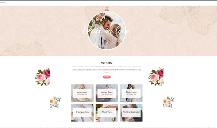
Back to associations, color palettes are not the only thing to play with when getting ready for Valentine’s. The Wedbook’s design has neat floral elements almost everywhere, but it remains clean and even minimalist. If you would like to do the same, we recommend looking for vectors, cliparts, and other graphics depicting something customers would associate with love. You don’t have to use one style only to keep the design minimalist. Wedbook has pale header and footer vector unicolored images combined with multicolored vintage graphics.
Chictopia.com
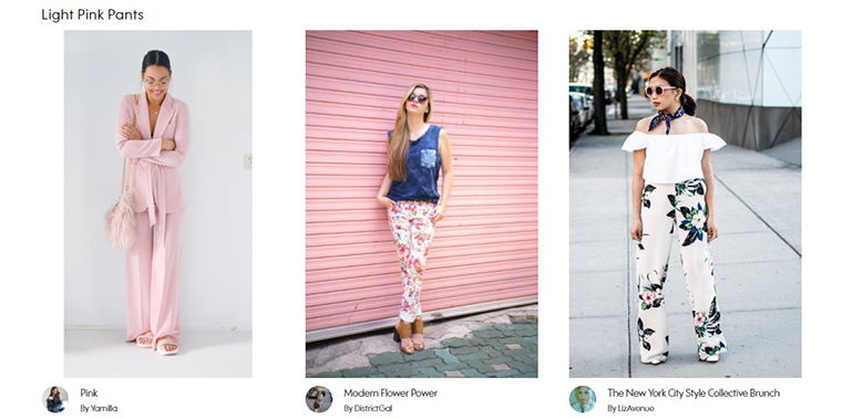
Would you like to prepare for the lovers’ day without changing the website appearance? Take a closer look at Chictopia’s homepage. Talking about minimalist design, the company went even further and avoided using any special web design components at all. However, when visiting their website, you would see pink clothes selections right on the main page, and not without reason. Here is how you can play with shades and associations without editing the website’s pages.
GO
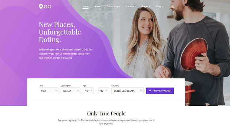
When asked what the best or the worst web design solution is, we can’t give you one and only answer. It usually depends on business type and other aspects, so the same thing comes for minimalist Valentine designs. Even such banal UI elements as heart-shaped objects would look memorizable and unique when they are not overused. This dating agency website design shows a brilliant example of how you can use love elements for the brand logo. You can open the product’s live demo to see more variations of smartly-created Valentine CTAs.
Urbanoutfitters.com
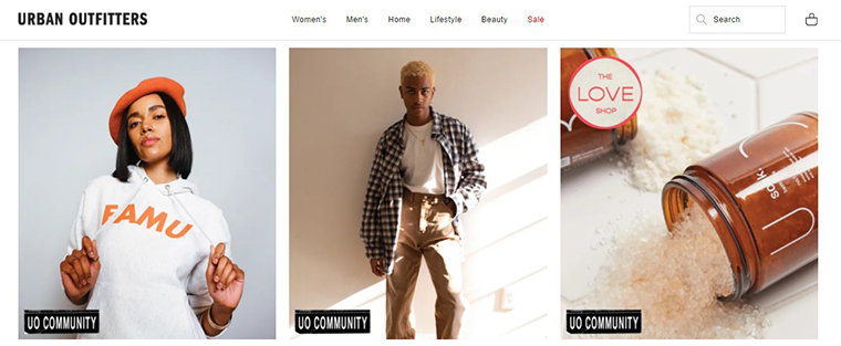
Fortunately, the modern digital market offers numerous trendy features to make the website Valentine-like and keep it minimalist. Urban Outfitters uses the Smart Labels feature for some of its items. Basically, it helps the website owner sort their goods by some prominent features, like brand, exclusive products, country, price, sale, etc. It furthers the searching process and improves the on-site experience. More critical is that labels would help you highlight the needed products or offers, just like you can see on the screenshot above. The feature is essential for eCommerce site owners. It is suitable for many occasions, from St. Valentine’s Day, Christmas, or Mother’s Day to new arrivals and upcoming sales.
Wedding Planner
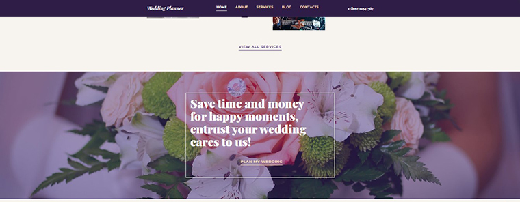
Sometimes you don’t need to reinvent the wheel to make the website Valentine-ready. Sometimes it would be enough to place a catchy banner on the home page. Wedding Planner has high-resolution bridal bouquet images for banners and headers with interactive CTAs. Here you can see another web design trend – the Parallax effect, which provides 3D beautiful scrolling. The feature is suitable for any content you may want to showcase interactively.
Datelletto
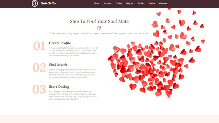
If you still can’t imagine a Valentine web design without classic hearts in it, take a closer look at the next solution. Thanks to highly clean website navigation, Datelletto’s appearance remains neat with a bright heart background. You can also see properly combined colors used for counters and other design components. More importantly, Datelletto has stylish heart-shaped dividers – another elegant way to make your online child Valentine-oriented right away.
First Dating
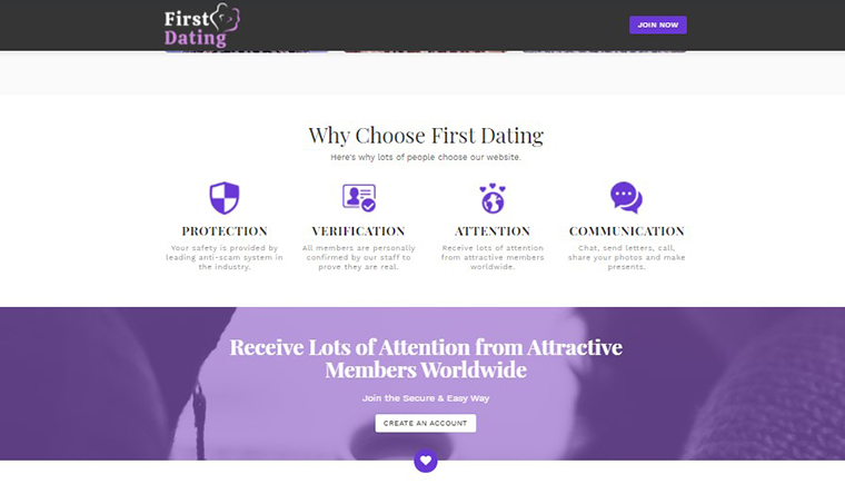
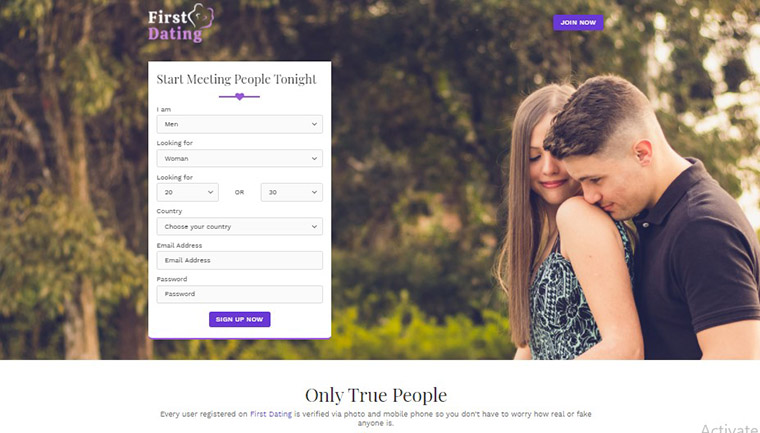
The animated heart-shaped back-to-top button is the feature to look for to improve website navigation and make it Valentine-ready simultaneously. It fits any topic or website and shows people you take care of their time, so we recommend you consider adding the button to the website design. You can follow the creators of First Dating and go further. It has a tiny animated button that navigates visitors right to the header’s quick contact form with another heart-shaped divider.
Cavyalia
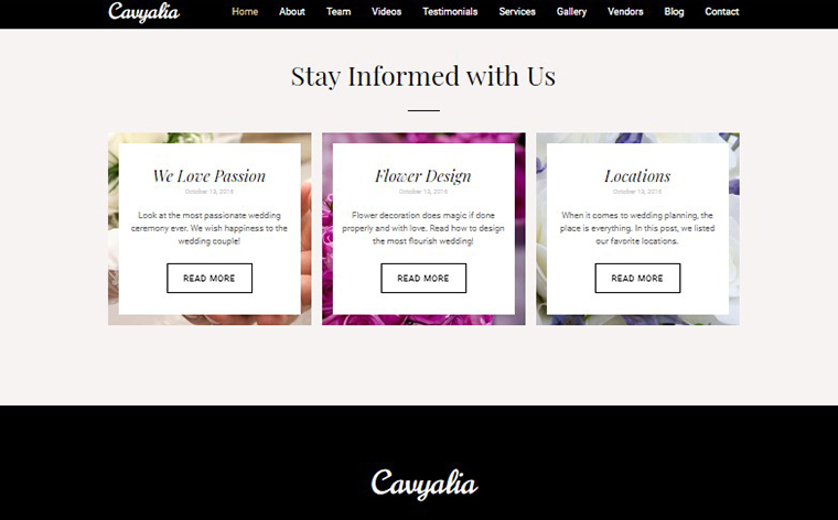
Now you know how lucrative using CTAs and testimonials for a Valentine web design can be. So why not combine both features and create something 100% unique? Cavyalia has minimalist testimonials with a charming floral image background and classic CTAs. The last ones lead to the most visitable website pages, like a gallery, projects, contacts, story, etc. This informative clickable block would improve your site navi and make it Valentine-like.
Goldenframe
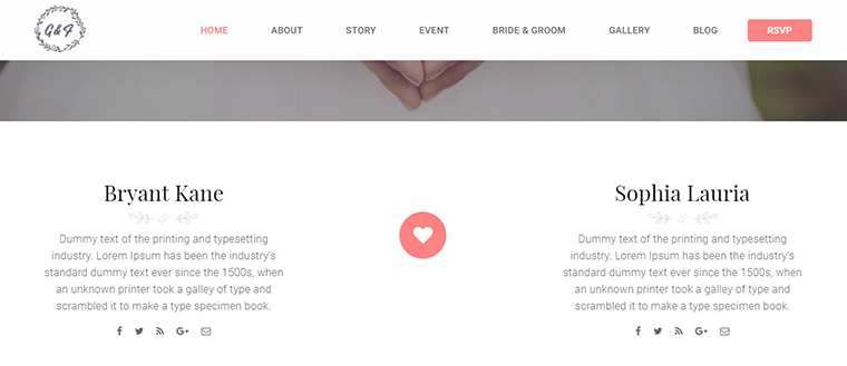
Let’s finish the selection with this sweet wedding and love web design. Golden Frame shows the simplest yet eye-pleasing way to make a page look Valentine-ready without changing anything. You can simply enrich white space with a cute icon when looking for a quick Valentine web design solution.
Giftmania Handmade Souvenirs and Gift Shop Website Template
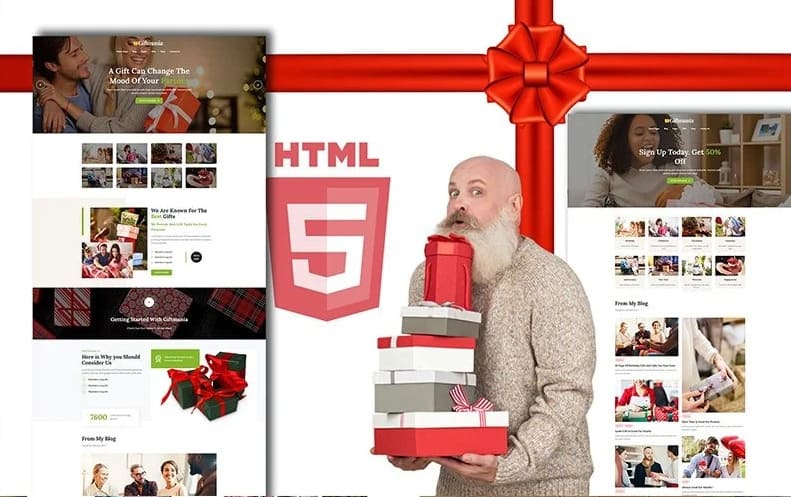
Giftmania Handmade Souvenirs and Gift Shop website that includes testimonials options. They are another useful and good-looking web design trend that remains popular for years. It allows you to highlight whatever you want to highlight beautifully and without overloading the page’s look. No website won’t look better with this feature so that you can add it to any project. Giftmania is an excellent example of how you can use testimonials for love-related quotes or customer feedback.
The post Minimalist Valentine Web Design Solutions appeared first on MonstersPost.
