If you’re a front-end developer, you may have come across horizontal scrollbar issues, especially on mobile. Because there are many causes of scrollbar problems, there is no straightforward solution. Some issues can be fixed quickly, and some need a little debugging skill.
What Is an Overflow Issue?
Before discussing overflow issues, we should ascertain what one is. An overflow issue occurs when a horizontal scrollbar unintentionally appears on a web page, allowing the user to scroll horizontally. It can be caused by different factors.

It could occur because of unexpectedly wide content or a fixed-width element that is wider than the viewport. We will explore all of the causes in this article.
How to Spot Overflow
An important part of solving this issue is noticing it in the first place. If we know when and where it happens, we can home in on that part of a web page. There are different ways to detect overflow, from manually scrolling to the left or right or by using JavaScript.
Let’s explore the ways to detect overflow.
Scrolling to the Left or Right
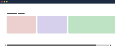
The first way to discover an overflow issue is by scrolling the page horizontally. If you’re able to scroll, this is a warning that something is wrong with the page.
Using JavaScript to Find Elements Wider Than the Body
We can add a snippet to the browser console to show any elements wider than the body. This is handy for pages with a lot of elements.
var docWidth = document.documentElement.offsetWidth; [].forEach.call( document.querySelectorAll('*'), function(el) { if (el.offsetWidth > docWidth) { console.log(el); } }
);
CSS Outline to the Rescue
Applying CSS’ outline to all elements on the page gives us a hint about elements that go beyond the page’s body.
* { outline: solid 1px red;
}

Even better, Addy Osmani has a script that adds an outline to each element on the page with a random color.
[].forEach.call($$("*"),function(a){a.style.outline="1px solid #"+(~~(Math.random()*(124))).toString(16)})
Overflow Label in Firefox
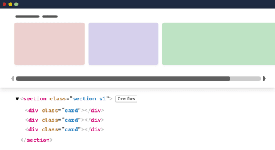
Firefox has a helpful feature that tells you which elements are causing overflow. Hopefully, other browsers will add this!
Deleting Page Elements
Another common way is to open the browser’s DevTools and start deleting elements one by one. Once the issue disappears, then the section you’ve just deleted is probably the cause. I found this method useful in cases where you’ve identified the issue but don’t know why it’s happening.
Once you’ve found where the overflow is happening, then it will be easier to make a reduced test case for further debugging.
Common Overflow Issues
Fixed-Width Elements
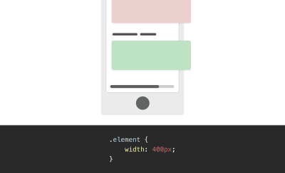
One of the most common causes of overflow is fixed-width elements. Generally speaking, don’t fix the width of any element that should work at multiple viewport sizes.
.element { /* Don’t do this */ width: 400px;
}
Using Flexbox Without Wrapping
As useful as Flexbox is, not allowing items to wrap to a new line when no space is available is risky.
.parent { display: flex;
}
Here, flex items might cause horizontal overflow in case the space isn’t enough to fit them all in one line:

Make sure to use flex-wrap: wrap when the flex parent is supposed to work at different viewport sizes.
.parent { display: flex; /* Do this */ flex-wrap: wrap;
}
CSS Grid
When you’re using CSS grid, designing responsively is important. Take the following grid:
.wrapper { display: grid; grid-template-columns: 1fr 300px 1fr; grid-gap: 1rem;
}
The example above will work great unless the viewport is narrower than 300 pixels. If it is, then overflow will occur.
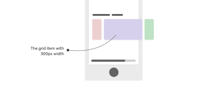
To avoid such an issue, use grid only when enough space is available. We can use a CSS media query like so:
.wrapper { display: grid; grid-template-columns: 1fr; grid-gap: 1rem;
} @media (min-width: 400px) { .wrapper { grid-template-columns: 1fr 300px 1fr; }
}
Long Words
Another common reason for overflow is a long word that doesn’t fit in the viewport. This happens more on mobile because of the viewport’s width.
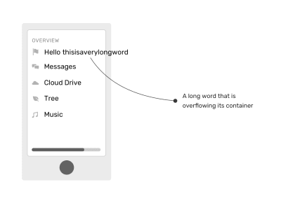
To fix this, we need to use the overflow-wrap property.
.article-content p { overflow-wrap: break-word;
}
I’ve written a detailed article on handling both short and long content with CSS.
This fix is particularly useful with user-generated content. A perfect example of this is a comments thread. A user might paste a long URL in their comment, and this should be handled with the overflow-wrap property.
Minimum Content Size in CSS Flexbox
Another interesting cause of overflow is the minimum content size in Flexbox. What does this mean?
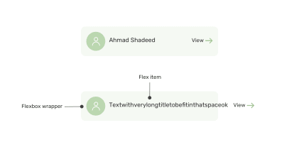
According to the specification:
“By default, flex items won’t shrink below their minimum content size (the length of the longest word or fixed-size element). To change this, set the
min-widthormin-heightproperty.”
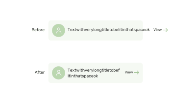
This means that a flex item with a long word won’t shrink below its minimum content size.
To fix this, we can either use an overflow value other than visible, or we can set min-width: 0 on the flex item.
.card__name { min-width: 0; overflow-wrap: break-word;
}
Minimum Content Size in CSS Grid
As with Flexbox, we have the same concept of minimum content size with CSS Grid. However, the solution is a bit different. CSS-Tricks refers to it as “grid blowout”.
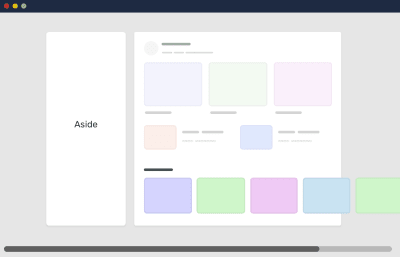
Let’s explore the issue. Suppose we have a wrapper with an aside and a main section laid out with CSS grid.
.wrapper { display: grid; grid-template-columns: 248px 1fr; grid-gap: 40px;
}
Also, we have a scrolling section in the main section, for which I’ve used flexbox.
.section { display: flex; gap: 1rem; overflow-x: auto;
}
Notice that I didn’t add flex-wrap, because I want the flex items to be on the same line. This didn’t work, however, and it’s causing horizontal overflow.
To fix this, we need to use minmax() instead of 1fr. This way, the main element’s minimum content size won’t be auto.
.wrapper { display: grid; grid-template-columns: 248px minmax(0, 1fr); grid-gap: 40px;
}
Negative Margins
An element positioned off screen can cause overflow. Usually, that is because the element has a negative margin.
In the following example, we have an element with a negative margin, and the document’s language is English (i.e. left to right).
.element { position: absolute; right: -100px;
}
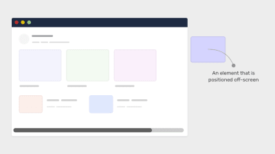
Interestingly, when the element is positioned on the opposite side, there is no overflow. Why is that?
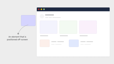
I faced this issue lately and wrote about it. It turns out that this behavior is intentional. According to the CSS specification:
“UAs must clip the scrollable overflow area of scroll containers on the block-start and inline-start sides of the box (thereby behaving as if they had no scrollable overflow on that side).”
For an English document, the inline-start side is the left side, so any element positioned off-screen on the left will be clipped, and thus there will be no overflow.
If positioning an element off screen is really necessary, make sure to apply overflow: hidden to the parent to avoid any overflow.
Images Without max-width
If you don’t take care of large images ahead of time, you will see overflow. Make sure to set max-width: 100% on all images.
img { max-width: 100%;
}
Viewport Units
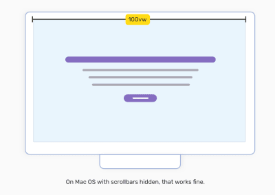
Using 100vw does have a downside, which is that it can cause overflow when the scrollbar is visible. On macOS, 100vw is fine and won’t cause horizontal scroll.
On Windows, scrollbars are always visible by default, so overflow will occur.
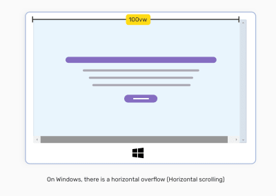
The reason for this is that with the value 100vw, there is no awareness of the width of the browser’s vertical scrollbar. As a result, the width will be equal to 100vw plus the scrollbar’s width. Unfortunately, there is no CSS fix to that.

However, we can use JavaScript to measure the viewport’s width excluding the scrollbar.
function handleFullWidthSizing() { const scrollbarWidth = window.innerWidth - document.body.clientWidth document.querySelector('myElement').style.width = `calc(100vw - ${scrollbarWidth}px)`
}
Injected Ads
Ads injected on page load can cause overflow if they’re wider than their parent. Add overflow-x: hidden to the parent element to prevent this.
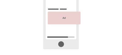
Double-check every ad on the website to ensure that it’s not causing overflow.
Is Applying overflow-x: hidden to body a Good Idea?
Opting for overflow-x: hidden is like putting on a bandage without addressing the problem. If you have overflow, then it’s better to solve the root issue.
Moreover, applying overflow-x: hidden to the body element is not a good idea because position: sticky won’t work if a parent has overflow-x: hidden.
How to Avoid Overflow in CSS
Below are things to check to reduce overflow issues in CSS. I hope you find it useful!
Test With Real Content
Nothing beats testing with real content on a website. In doing so, you ensure that the layout can handle different varieties of content.
Account for User-Generated Content
For a component like a comments thread, account for cases in which the user will paste a long URL or type a long word, as explained above.
Use CSS Grid and Flexbox Carefully
As useful as CSS grid and flexbox are, they can easily cause overflow if used incorrectly. As we discussed, not using flex-wrap: wrap can cause overflow, as can grid-template-columns: 1fr 350px when the screen is narrower than 350 pixels.
Further Reading on SmashingMag:
(vf, il, al)


