There is no need to deny the usefulness of the grid for (web) design, at least it would be silly. Any photoshop grid template is capable to simplify the work of a designer, and omit questions like: “I think I should move it a bit to the right…“
Photoshop grid is needed for a harmonious arrangement of elements on the page. Every website or an app you have seen was designed using the grid, even in a drag-and-drop interface you’re arranging content blocks using the grid.
Not a single design can be created without the grid. No matter how advanced your designing skills are, you will need it to arrange all the content blocks pixel to pixel.
If you’re not using grids (for some reason) you need to try them on, and you will see how much time you will save on your designs.
So why do you need to use grids?
- The grid allows you to organize information in proper order.
- The grid can save time you spend searching for free or a suitable place in the layout.
- The grid allows you to add new information, which will not violate overall graphics design concept.
- The grid can become the basis for building sub-pages on your site.
- Grids ease perception of the material, and help find the right information much quicker.
Ok, now you know why using the grid is important, time to get some. Below you will find number or resources where you can download free photoshop grid templates.
GuideGuide
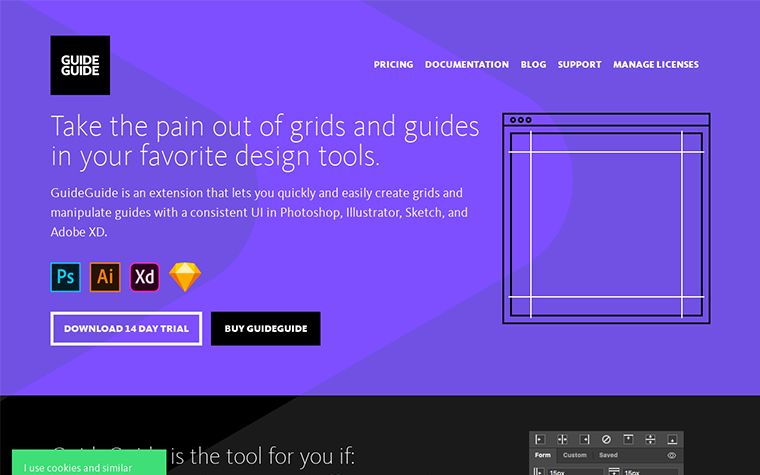
GuideGuide makes designers work less painful. Pixel accurate columns, rows, midpoints, and baselines can be created according to your document or selected with the click of a button. Frequently used guide sets can be saved for further use. Grids can use multiple types of measurements. Honestly, if you haven’t started downloading it by now, you’re probably a masochist.
Modular Grid Pattern
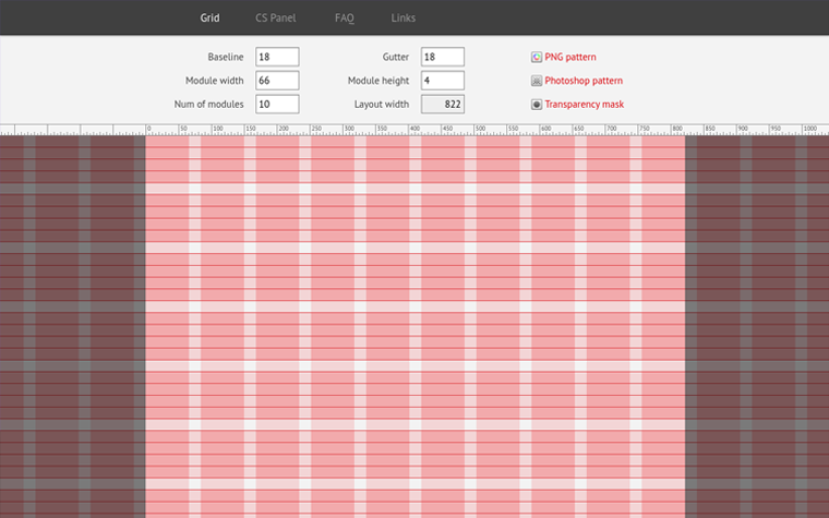
The tool for a quick design modular grid in Adobe Photoshop, Adobe Fireworks, GIMP, Microsoft Expression Design and other. You just follow the link and download it as a PNG file, Photoshop pattern or transparency mask. Simple, convenient and useful for any web developer or designer.
1200px grid

All modern screens are at least 1200 pixels wide, so a 1200px grid is a necessity for every developer. You can download it as a Photoshop, Illustrator or CSS file and get a flexible and convenient 15-columns grid. You will able to use just after downloading, in a blink of an eye.
Bootstrap responsive grid PSD – Mobile, Tablet, Web – Free

This set of responsive grids are based on a classy Twitter combination of column/gutter width. You can use it for all types of screens: mobile, tablets and PCs.
Used sizes:
- Web: 1280px width – 70px columns – 30px gutter
- Tablet: 1024px width – 60px columns – 20px gutter
- Mobile: 320px width – 10px columns – 10px gutter
iPad Retina Wireframe Grid
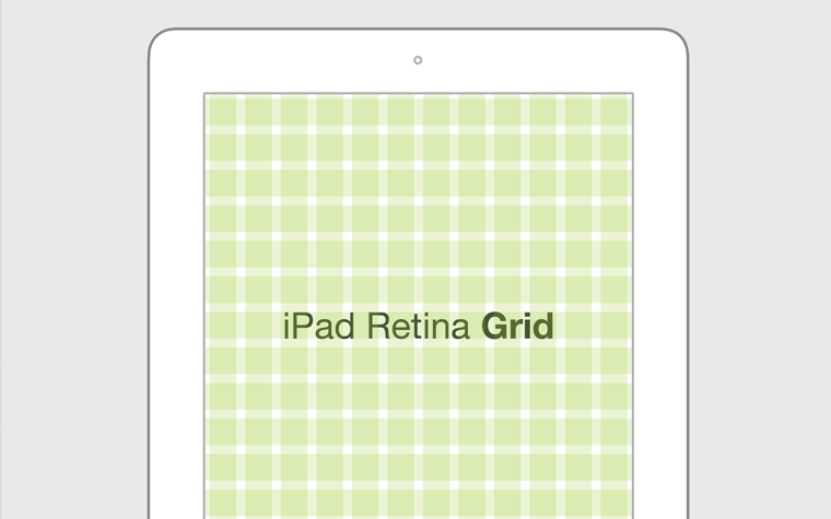
If you were looking for an IPad grid – here it is. Some really great person also didn’t find a Retina grid, so he created it and now shares it with everyone completely for free. You can download it as a PSD template. Its dimensions are: 2048x1536px.
1200px Grid Template
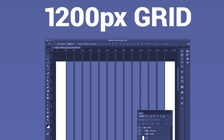
Here’s 1200px Photoshop grid for free made by Piotr Wilk for his project. The grid consists of 12 columns, 10px gutter, 80px per column. Enjoy!
Bootstrap 4 Grid PSD
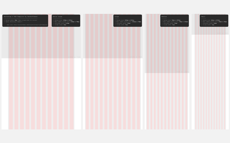
Many Bootstrap websites start their life as a mockup in Photoshop. When designing for Bootstrap, it comes in handy to have the targeted column sizes available in some form, so objects and text can be aligned to the grid easily. For Bootstrap 3, there’s a myriad of good templates, but for the upcoming Bootstrap 4 there is not much around yet. This is why I created this Bootstrap 4 Grid PSD as a foundation to quickly mockup a theme or website. Here’s a quick overview of the features I’ve included. For a more detailed rundown, see further down.
Phoshop Grid Template FAQ
There’s no need to spend your time on predesigned assets, feel free to download various PSD grid templates from our compilation.
Photoshop grid template can ease design process of a responsive layout.
Grids ease perception of the material, and help find the right information much quicker.
The grid allows you to add new information, which will not violate overall design concept.
If you’re familiar with other resources or types of grids, you’re free to add them in the comments below.
The post Photoshop Grid Template: Designing Through the Line appeared first on MonsterPost.
