accent-color property makes it quick and easy to roll out our brand colors to certain form inputs by leveraging user agent styles. In this article we’ll take a look at what it does and how to use it alongside color-scheme for simple, accessible checkboxes and radio buttons — and imagine how we might use it in the future.
I don’t know about you, but I love it when new CSS properties arrive that make our daily lives as developers simpler and enable us to remove a whole lot of redundant code. aspect-ratio is one such property (recently eliminating the need for the padding hack). accent-color just might be the next.

accent-color. (Large preview) Styling Form Inputs
Let’s take checkboxes. In every browser, these are styled differently by the user agent stylesheet (responsible for the browser’s default styles).

Historically there hasn’t been any real way to style these inputs. Instead, many web developers resort to a well-known hack, which involves visually (but accessibly) hiding the input itself, then styling a pseudo-element on the label. (All this applies to radio buttons too.)
See the Pen [Old skool custom checkbox styling](https://codepen.io/smashingmag/pen/QWgrrKp) by Michelle Barker.
This is actually less verbose than past solutions. ModernCSS has a detailed tutorial on how to implement custom checkboxes and radio buttons using this technique.
This technique works cross-browser, and will still be necessary if checkboxes need to be fully custom (with animations, and so on). But in many cases we don’t need any fancy styling — we simply need to be able to apply a brand color and move on. Wouldn’t it be great to get rid of all that clunky CSS? Enter accent-color!
Simple Use
For the simplest use case, we can set the accent-color property on the :root element and have it apply everywhere on our webpage:
:root { accent-color: rgba(250, 15, 117);
}
This applies the chosen color to (at the time of writing) checkboxes, radio buttons, range and progress elements.

Accessibility
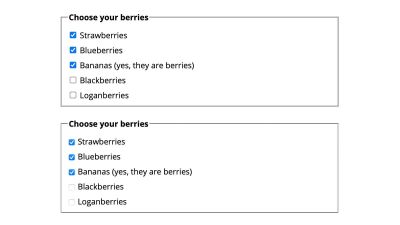
A pretty cool feature is that the browser will automatically determine the best color for the checkmark to ensure sufficient color contrast, using its own internal algorithms. That means no extra code styling is required to ensure our checkboxes are as accessible as they can be.
In the following demo, we’re applying two different accent colors. If you view this in Chrome, you should see that the checkmark of the one on the left is white, while the one on the right is black. Browsers use different algorithms for this, so you may experience different results in Chrome versus Firefox.
See the Pen [accent-color – showing two different colours](https://codepen.io/smashingmag/pen/jOwxxVm) by Michelle Barker.
Custom Properties
If we want to apply the same color to other UI elements, we could use a custom property. We can set our color as a custom property on the root element, then apply it to (for example) headings, or other form elements:
:root { --brand: rgba(250, 15, 117); accent-color: var(--brand);
}
See the Pen [accent-color with custom property](https://codepen.io/smashingmag/pen/YzQLLpm) by Michelle Barker.
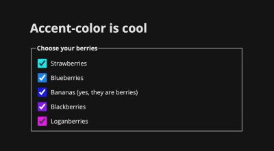
We can even create some fun effects. In the following demo, we’re assigning each checkbox group a custom property that corresponds to the element’s index (--i) using the style attribute in the HTML. Then we’re using it in our CSS to calculate the hue value in an HSL color function to determine the accent color. Rainbow checkboxes!
See the Pen [accent-color w/custom properties](https://codepen.io/smashingmag/pen/yLXjjgP) by Michelle Barker.
Other Form Elements
Unfortunately accent-color isn’t applied to other elements that we might expect, like select dropdowns. We might want to apply our chosen color to already-styleable form elements, like buttons and text inputs too. The custom property comes in useful here, as we can apply it to the border of our text inputs, and the background of buttons, for example:
See the Pen [accent-color with custom property](https://codepen.io/smashingmag/pen/VwWxxPJ) by Michelle Barker.
The Web.dev documentation on accent-color includes this handy snippet by Adam Argyle for styling other elements not exclusive to forms, including list markers, text selection highlights and the focus ring:
html { --brand: hotpink; scrollbar-color: hotpink Canvas;
} :root { accent-color: var(--brand); }
:focus-visible { outline-color: var(--brand); }
::selection { background-color: var(--brand); }
::marker { color: var(--brand); } :is( ::-webkit-calendar-picker-indicator, ::-webkit-clear-button, ::-webkit-inner-spin-button, ::-webkit-outer-spin-button
) { color: var(--brand);
}
Color Schemes
To tailor our form elements further, the color-scheme property can assist us with styling them according to the user’s preference for light or dark mode. At the moment, we can provide dark mode styles according to the user’s system preferences with the prefers-color-scheme media query:
/* If the user's preference is set to 'dark', this renders white text on a black background
*/
@media (prefers-color-scheme: dark) { body { background-color: #000000; color: #ffffff; }
}
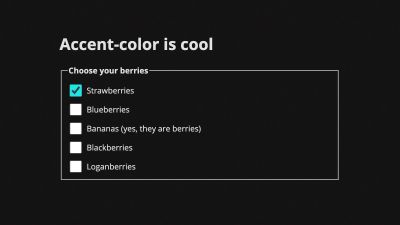
If we leave it at that, our checkboxes will still have a light background in their unchecked state.

We can use color-scheme to ensure that our checkboxes take on a light or dark style according to preference. Setting it on the root element in our CSS ensures that it applies to the whole page:
:root { color-scheme: light dark;
}
This expresses the color schemes in order of preference. Alternatively we could implement it using a meta tag in our HTML:
<meta name="color-scheme" content="light dark">This is actually preferable, as it will be read by the browser immediately before the CSS file is parsed and executed — therefore could help us avoid a flash of unstyled content (FOUC).
In our rainbow checkbox demo, you might notice that the browser also adjusts the color of some of the checkmarks when we switch the color scheme, while still maintaining sufficient contrast. Pretty cool!
color-scheme affects the user agent styles. If we use it without providing other background color or text color styles for the page, the default colors of the page will be inverted if the user selects a dark color scheme — so the default background color will be black, and the text color will be white. In practice, it’s quite likely we’ll want to override these with CSS. We can use color-scheme alongside the prefers-color-scheme media query. In this demo, I’m using prefers-color-scheme to set the text color only when a dark scheme is preferred.
See the Pen [accent-color with color-scheme](https://codepen.io/smashingmag/pen/NWgMMpd) by Michelle Barker.
color-scheme can also be set on individual elements, which is useful if there are some areas in our design that we want to retain a specified color scheme, regardless of whether light or dark mode is toggled. In this demo, we have a form with a dark background even when the overall color scheme is light. We can specify a dark color scheme, to ensure our checkboxes are styled with a dark color at all times:
.dark-form { color-scheme: dark;
}
See the Pen [accent-color – showing two different colours](https://codepen.io/smashingmag/pen/JjJvvWw) by Michelle Barker.
Limitations
As mentioned, there are several elements that are not currently affected by accent-color, for which this functionality would be useful. Another consideration is that we’re currently limited to only styling the checked state of the checkbox or radio button — aside from using color-scheme, which has some effect on the checkbox border, but doesn’t allow for full customization. It would be great to be able to style the border color and thickness for the input in its unchecked state or implement even more custom styling, such as changing the overall shape, but we’re not quite there yet. At the very least, allowing the checkbox border to inherit the body text color would be preferable.
It would also be useful to be able to extend the use of accent-color to other elements beyond forms, such as video controls. Currently for a developer to create custom controls entails a significant amount of work in order to re-create the accessibility of native ones. This excellent article by Stephanie Stimac details the work being done by Open UI to standardize UI elements in order to make it easier for developers to style them.
Alternatives
An alternative way to style a checkbox or radio button is to hide default styling with -webkit-appearance: none and replace it with a background image. (See this demo.) Modern browsers support this pretty well, but it has its limitations when compared to the first method of using a pseudo-element (described at the start of this article), as we can’t directly manipulate the background image with CSS (e.g. changing its color or opacity), or transition the image.
The CSS Paint API — part of the Houdini set of CSS APIs — opens up more options for customization, allowing us to pass in custom properties to manipulate a background image. Check out this lovely demo (and accompanying worklet) by Matteo. Support is currently limited to Chromium browsers.
Accessibility
We should take care to provide accessible focus styles when using hiding the default appearance of form controls. An advantage of accent-color is that it doesn’t hide the browser defaults, preserving accessibility.
Browser Support
accent-color is currently supported in the latest versions of Chrome and Edge. It can be enabled in Firefox with the layout.css.accent-color.enabled flag, and is due to be supported in the next release. Unfortunately, there is no Safari support at present. That’s not to say you can’t start using it right away — browsers that don’t support accent-color will simply get the browser defaults, so it works great as progressive enhancement.
Conclusion
We’ve mostly talked about checkboxes and radio buttons here, as they’re among the most common form elements requiring customization. But accent-color has the potential to provide quick and easy styling for many of our form elements, especially where extensive customization isn’t needed, as well as allowing the browser to pick the best options for accessibility.
Further Reading
Some resources on accent-color, color-scheme, and styling form inputs:
