Before we start with a deep dive into the details and the anatomy of a component, let’s start at a higher level and see what we’re working on within our design system.
Laying It All Out
Whether we’re at the beginning of our design systems journey or working on improving what we have, audits are a useful process to get clarity on what is actually used in our websites or apps. At the beginning of a design system, assuming it’s for an existing product, an audit of what design artifacts we have helps get an appreciation of the current state of play. You might use an online collaboration tool or walls in your office with printouts and post-its. Laying out what exists where and grouping and categorizing them helps to quantify what’s used ‘in the wild.’
From this, we can zoom in a little, picking one component at a time, and ask some questions about it: What is the purpose of this component? What is it for? Early on, this engages us with a line of questioning that seeks out the intent of a given component, giving clarity to the problem which is there to solve. Our components are a collection of solved problems, after all.
There may be a lot to go at, and there may be many variants of the same or similar-looking components out there already, so how do we rationalize them and go deeper into what they are?
Pick A Component
Let’s pick a component to dive into a little more. I’ll use our sign-up form on zeroheight for this example.
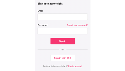
It’s a pretty simple form with simple elements, such as text, form inputs, buttons, links, and some kind of divider. There are many properties that we can already assume might be reusable. There’s some limited typography in here, some colors, and some interactive elements.
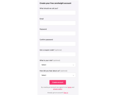
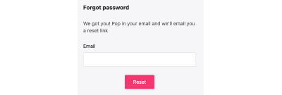
The use case for this form is quite clear: it enables you to sign in to your account. Is this the only component like this? I did a very quick audit and found a few others, such as our account creation and forgotten password forms. What’s their purpose? As we don’t yet have any other components, I’ll call this Form, but I know that in the future, that might change as the audit brings up other kinds of forms.
Systems Thinking, Breaking It Down, And Finding An Archetype
Part of the process is to abstract a component from a user journey and try to look at it from a system perspective:
- What is it?
- What use cases does it have?
- How might people use it in their work?
This abstraction is also useful when we think about naming. This sign-in form isn’t called “account sign-in” or something so specific as that would make reuse clumsy in other contexts. Now, “sign in” becomes a use case for the Form component — an implementation of the generic properties to satisfy a user need and business challenges.
As we break down the constituent parts of these forms, we have some smaller elements that will, over time, have many use cases. We can’t predict at this stage what they might all be or their requirements, but we can start by being opinionated — do one job based on what we know and plan how we can make good changes as we learn more. This theme will come up more in the future as the design system matures as initial assumptions are challenged.
At its most abstract, we now have a collection of things that can be used together to make bigger things that can all relate to each other in various ways. We have a system map under the surface. If we break the instances of what will be our form component down a little further, we can look at its constituent parts.
Label


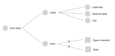
I’ve used two ways to visualize the form label, which I now feel should be a Label component as it has a few things going on: it has an additional part of the label to show if it should say it’s optional, and it may contain a link. Based on the audit, I don’t currently have a scenario where both of these things are present at once, but I should document that assumption as I go, as, by the looks of it, that may involve some more work on the layout.
I’ve used a simple red outline just to demark where the line height creates the space, but I can go further with this if I find it useful to show spacing between the label text and the optional copy.

This is where we get right into the anatomy of what these components are composed of: they’re described through various design decisions or parameters. As we zoomed in on our innocuous form label, we found that aside from the typography and color for the label text, it has some optional elements and potentially some internal logic (not showing these both at the same time).
We can map out how these things relate to each other:
Buttons
So far in the audit, I found two instances of buttons that we’ll call primary and secondary based on what I perceive their use cases to be. Both have subtle changes for their hover/focus states.
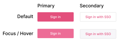
We can do more with these in the future in terms of giving a clearer sense of state, and as we look across other components, there may be other treatments or use cases of buttons to consider. For now, this helps us keep things simple and have something to break down and understand. Based on how these first instances of the buttons are today, I’ve redlined them to give some clarity and transparency to their composition.
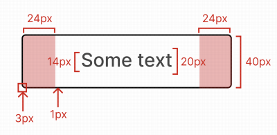
Roughly examined, we have some properties we can play more with:
- Text: font size and line height;
- Spacing units;
- Border: radius and width;
- Height;
- Fixed and full-width options.
This gives us our architectural or base instance of the button that we can not only create variants from but, later on, apply themes to. Documenting this generic abstraction or archetype of our button can be helpful as we question properties and wonder why things are a certain way. The initial audit gives us a view of how they are today; changes from this benefit from that additional context.
This kind of annotation helps critique an object or composition outside of its use cases and becomes a valuable stage of collaboration and challenging assumptions. While we’re often used to interrogating designs to extract values, annotations are far more explicit and get to the core of what a given component’s visuals are.
While we cite pixel values, that doesn’t imply that’s what the output is. At this stage, we’re working on a design tool and measuring in a consistent unit of measurement how it is rendered. In our live code, we might use a mix of px, %, ems/rems, and so on. We have many more choices that are appropriate for the medium we output to.
Inputs
From the audit, I found that our form field has a label (now a Label component with various properties) and the input element itself.

This similar presentation is used for text input as well as a select/drop-down element, and on focus, it changes the border color to highlight it for the user. By bringing these elements together, we can look at the overall composition of the Form Field component we want to build.
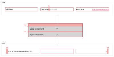
What we have here is a structure that we can work with: the overall composition of the Form Field with the Label and Input components with the spacing units we want to include. We’ve baked in some initial assumptions based on our audit:
- There will be a label with these optional elements;
- The input would also be a drop-down;
- There will be no supplementary text;
- Our spacing should be at the top (based on how it is today).
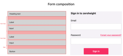
Adding this to a broader composition for the first part of our sign-in form. We stack some heading text with two instances of our Form Field component, a spacing unit, and a Button. For many of the other instances of the forms from our audit, we’re adding or subtracting the number of Form Fields or adding the divider with a secondary Button.
This is why a hierarchy of components helps with composition, and why Atomic Design became a great vehicle for describing it. Here, our layers could be described as follows:
- Atoms: Label, Input, and Button;
- Molecule: Form Field;
- Organism: Sign-up Form, Sign-in Form, or Forgot Password Form.
Dependent on how much logic you’re comfortable with in your components, you might either have one User Access Form (for want of a better name) or create one per use case. Each use case could either live in the design system or be composed within the app that product teams work in. Again this comes back to what the scope of the design system is considered to be and the workflow of the team or teams in the organization.
Aside from being about visual properties, it’s also an opportunity to consider presentational logic: What should be a toggleable property such as showing/hiding? This basic logic being established early helps with knitting both our design tools with our coded component. An example of this could be how close Storybook’s visualization of “controls” is very similar to the component properties we now have in Figma.
Properties
From working up our composition and describing what it’s made of, I’ve abstracted a number of properties that we can use as part of the broader audit. From these components, I’ve found some uses of typography, some colors, spacing, and a border-radius, which tally with what we’d found in the button.
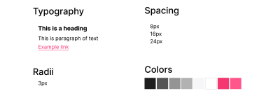
These are the smallest building blocks we currently have. When we lay them out like this, they’re kind of abstract. In that broader audit, what we will start to notice is the use of each of these categories of properties site-wide. Seeing each category like this helps us to ask questions: Do we have too many shades of grey? What should our typographic hierarchy be? Do we have use cases for our colors?
Many of these questions can be answered over time. Focusing on this first component, we can exploit these properties in a very literal sense as we create them in our design tool and in code — through design tokens.
Each of these categories and their value can be encoded in this way to give us a shared abstraction that we can work with across our specialisms. Tokens can bring us together through we name things and talk about them because they have shared values rather than those that need to be inspected or translated from one place to another.
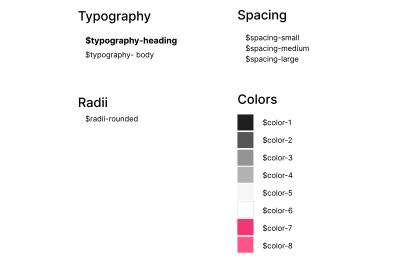
Assigning some unique values to these properties, we can abstract the values and treat these as placeholders. This now means we have flexibility in our component should any of these change. It also enables us to plan some fun stuff for the future.
Themes
I like to think about themes as an application of brand — groups of properties that describe that implementation for a purpose or particular outcome. All of the properties we’ve looked at already could be described in different ways across themes, as well as others we haven’t attributed yet (such as border width on the input).
In this instance, we have a single brand and a single theme, but we can give ourselves options for future changes by setting up some relationships between these values we have and their current use case. This is where it really gets fun!
With design tokens, though a prescribed format is on its way from the W3C community group, there are a lot of different ways that people structure them. Nathan Curtis does a great job of diving into some of these strategies, which you should check out. For the purpose of the journey we’re on, I’m going to explore a few concepts, such as core, semantic, and component-level tokens. Brad Frost has a great blog post that goes into greater depth about this aspect of our journey, looking at how you can structure your tokens for multiple brands with multiple themes.
Look at the tokens we’ve abstracted so far; we have a bunch of values. It’s not clear through all of them what their intent is. You can see core tokens often expressed very much like $color-pink-500 to define a mid-hued pink. Core tokens tend to be very specific and so aren’t all that flexible in the system, but they can be useful.
When we look at theming, having a semantic layer can be really important because these are placeholders for values that have a clear use case. You may see $color-action used for links or buttons, for example. You may either want to use semantic token naming directly to store your values or want to make references between tokens. Token aliases are ways of pointing the value of a token at a different design token. Here, $color-action would just refer to $color-pink-500. Our system could use the semantically named token, and we’re free to change the relationship to a core token (or its direct value) and see massive change. If you’re stuck for semantic names for your colors, you could always try Color Parrot (as is often the case, naming isn’t easy).
This becomes really powerful when we create a theme. Within our theme, we would have a collection of these references so that with a quick switch between token sets in our themes, many of these relationships would change from color to typography, spacing units, and so on. Pointing our design files or code at a new collection of tokens can evoke a lot of very broad change, very simply. It’s worth having a play with Token Zen Garden to play with themed token sets and see how powerful they can be.
It’s worth taking a look at Danny Banks and Lukas Oppermann’s posts on ways you can tackle dark mode, but there are many ways to think about this as a concept. You might often see “dark mode” described as a theme, which can be totally valid. I tend to think of either it as a sub-theme or mode. This, more often than not, just describes a color palette change. So when defining a theme structure, would we want to apply dark mode or any other we devise across our themes? This terminology then gives us the ability to think about hierarchy: in our given context, is a mode within a theme or a layer up from it in terms of how we structure our tokens and theme?
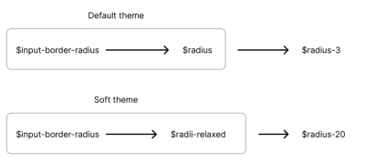
For the purposes of the journey on which we’re on, I’ll have our current look and feel stored as “default” and create a second theme called “soft.” The intent of this second theme would be to make a more fun, welcoming feel to the UI and keep it fun. Our structure might look a bit like this:

We can make more of the themes by being able to change the nature of our token relationships across them. We can do this by having tokens for our component’s properties. This might mean that your button background color becomes a design token, which points to a semantic color value within our current theme. In our “soft” theme, we may have an expanded range of colors available to us, so we want to change the relationships between some of our tokens.
A better example might be that in our “soft theme,” we want to make things more rounded. In our original theme, we so far had only one radius, but in “soft,” we might have many. This first difference in our themes might play out like this:

Tokenize As You Go
Through making changes across themes, we may find we want to enable more changes to our layout than we originally anticipated. Here the work is tokenizing a design decision within the component and adding the relationships or storing values for this new property to each theme. Our default theme would store the current value and abstract it from code or the design tool into a design token; our “soft” theme, in this instance, would then be free to do something different with it.
In our example, we may want to indent the label’s text to align with the content within the input field. We add a token for the component of $label-indent, and in the default theme, store a value of zero as the current layout is left aligned. In our “soft” theme, we can now create a relationship between this token and a spacing unit we already have defined.

I believe that in many of these things, we’re unlikely to get an ideal configuration from the start. We can follow some great articles and case studies but knowing how we can and should evolve our systems is really fundamental to maturing a design system. If we start with core tokens and get to a point where using semantic tokens makes sense, then introduce them and find a migration path. If you want a second theme, then we can make it a little easier by creating component-level design tokens and having sets of relationships between them.
Each new design change or challenge may then boil down to these tiniest of values within a sprawling system but in creating this network effect through our token relationships is where we get the real power. Who would’ve thought?
What Output Is Needed And By Who…When?
All of this process becomes quite academic if it’s not actually used in some kind of output from the system. On the whole, we should aim for the contents of our design tokens to be relatively platform agnostic as they’re describing design decisions, not how they may be output in code. For web-centric projects, it’s only natural to lean towards CSS.
Using a project such as Style Dictionary, you can take your tokens and run them through a process to generate the necessary outputs. For the web, that could be anything from vanilla CSS, Sass, LESS, or something more suited for CSS-in-JS. All of your tokens are collated into a single object and then run through some templating. It’s also possible to transform values at this point to change what’s stored to a format more desirable for the type of output you need. That may mean that you take a hex code color value and transform it to rgba or even UIColor for Swift when working with output for native iOS apps. The great thing about it is that you can get something generating really quickly but have the scope to create your own workflow from the API it exposes.
Very often, audits are started from what we can see on the live site or app, which makes total sense. Another dimension you can add to that is to do an audit of what exists in the code. This gives a more rounded view of the ecosystem you’re working with and also helps to plot what an evolutionary path might look like. Proving out a concept quickly with a single component and finding any pain points or room for improvements when it comes to workflow early can be invaluable.
Depending on the team or org structure, you might have multiple codebases. Here, scoping what you consider to be in your design system can help inform the rest of your process. If the scope of the system ends at documentation, it’s useful to agree on that early. Likewise, if it encapsulates live code, that can inform how processes need to work to enable that and empower the people using it. When we look at the output from our design tokens, these early scoping decisions may help determine what output(s) are needed to be consumed by what teams in what format.
The opportunity to bring the power that tokens can enable to be talking about and working with the same thing over copying values is massive.
Zoom Back Out
From our initial audit, we’ve gone pretty deep into the details and looked at this very atom-like structure. Looking at our layouts, spotting patterns, and use cases through to how we describe the properties and capabilities of these details and then make use of them through relationships.
As we zoom back out to look at our site or app, it’s more apparent how many properties these designs may have in common. With a different perspective, we can better appreciate similarities and differences and consider purpose and intent in our naming and structures. This gives us a network of objects that we pull together to solve user and business needs. The way that our tokens form this graph-like presentation in the minutiae is also often present and the very high level between people, teams, and organizations.
We can also look at these abstracted components in different ways to give them more attention than we might with a single use case and to consider their responsive behavior independent of the layout.
All of these layers matter to different people at different times, but they are all interconnected and need to work as part of a cohesive whole to really provide value and a great experience for everyone working with it. That can be pretty overwhelming. Take a deep breath. Start at something simple like a printout of an important user journey; break down and down again. Learn a lot as you go. Document it. Do the next one and the next. Spot the patterns, challenge your initial assumptions, and revise, improve and evolve the system.
Further Reading on Smashing Magazine
(vf, yk, il)
