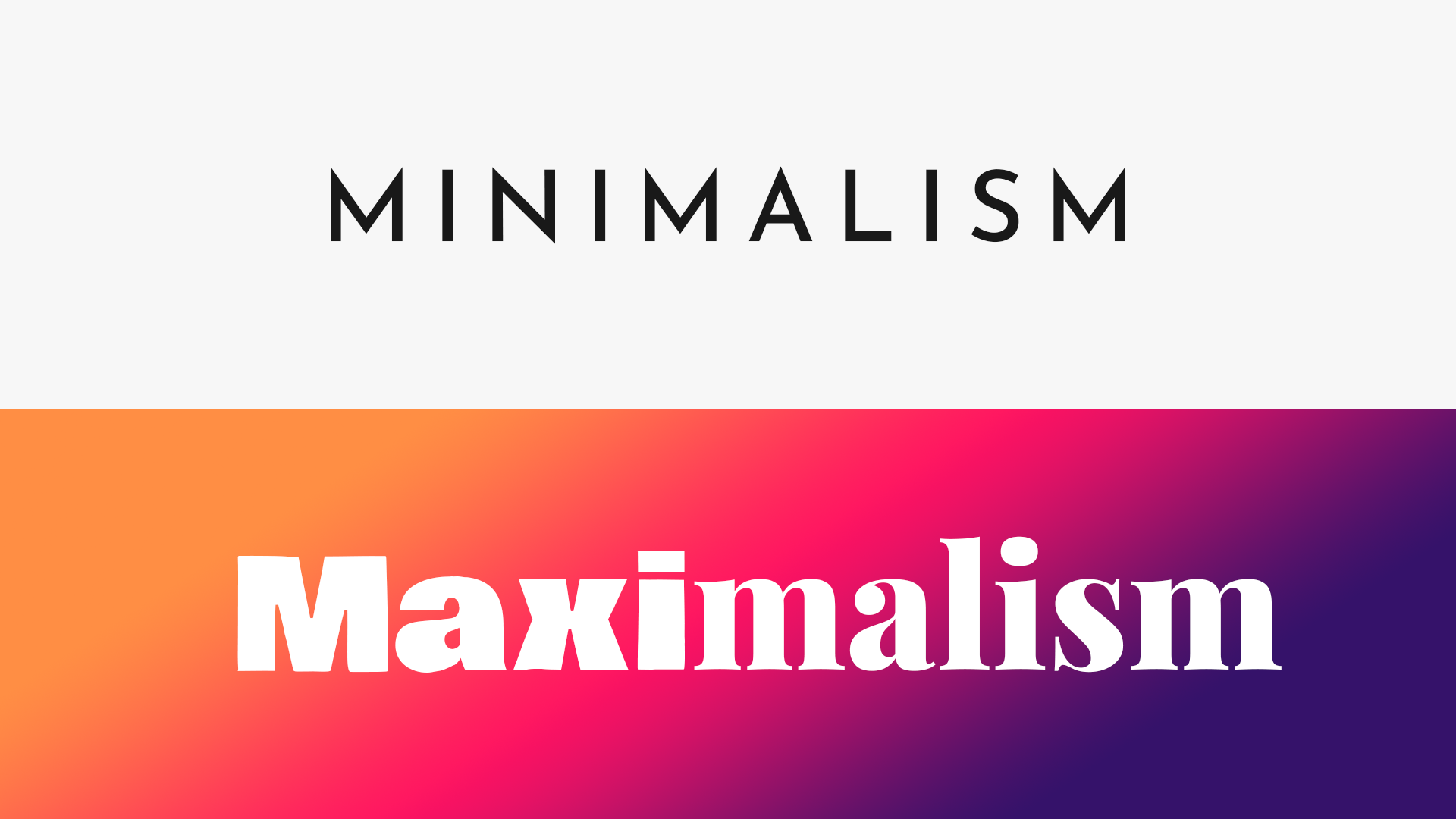
When designing a website for your brand, keeping the ongoing trends in mind is essential. For example, there was a time when minimal, chic websites were all the rage. These websites featured toned-down colors, static images, and minimal elements, on the website. But now, times have changed, and maximalism has come back into fashion. Maximalism is all about extravagance – bold colors, loads of videos and images, elements in motion – and everything that’s boisterous and loud!
If you’re inclined towards ‘less is more, here’s what you need to know – with the advent of maximalism, ‘the more, the better is trending. While it may seem overwhelming for many, it’s essential to know that when done right, maximalism can help you create a stunning, eye-catchy, and appealing website.
Let’s have a quick look at Minimalism vs. Maximalism in web designing trends:
Minimalism vs Maximalism
Minimalism

In this approach, the emphasis is on basic textures, neutral colors, and clean lines. It is about reducing the number of elements in your web design and bringing the best of the minimal elements. Typically, minimalism is associated with monochrome schemes – but that’s not always the case!
Minimal designs combine simple elements such as pastel colors, simple fonts, and static images to create a simple yet stunning website. You can, to an extent, divert the viewers’ focus to elements of your choice. Modern, sophisticated, and elegant, the prime focus of minimalism is keeping things simple.
Maximalism

On the other hand, maximalism is all about glorifying elements in your design by blending colors, tones, fonts, and styles. The whole idea of maximalism is to add a ‘wow’ factor to your website. Maximalism welcomes quirky, cool designs as well as mix-and-match of different elements. In a minimalist design, you would be apprehensive about experimenting, as you have a set of creative rules to stick to – but that’s not the case with maximalism!
Maximalism gives you the liberty to introduce funky elements, different fonts, flashy colors, and animated elements to your website. It encapsulates the bold and beautiful vibe impressively. With a maximalist design, you create a one-of-its-kind design with no constraints. It also helps you portray your brand message loud and clear, compared to minimalism, which is more of a soft, serious tone.
What a Maximalist Comeback Could Mean for Web Design?

For those who love minimalism, the transition towards maximalism may get overwhelming. But the truth is that maximalism gives you a lot of creative freedom. It is easier to let the creativity flow when you don’t have any rules and restrictions – you can go wild and free with your designs without bothering about creative constraints. So, let’s have a look at some essential elements in a maximalist website design:
Colorful Graphics and Fonts
Maximalism calls for flashy, bright colors that would instantly grab the viewer’s attention. You also have the liberty to mix-and-match fonts – in one word, you can have different fonts, text colors, and font sizes. In a minimalist website design, colorful graphics form an essential part. They add an element of funk to the web design, instantly enhancing its relaxed vibe.
Looping Backgrounds
Why settle for static backgrounds when you can level up your web design with looping or animated backgrounds? Looping backgrounds are super easy to add to your website – all you have to do is find the right background that matches the vibe of your website and brand and incorporate it into your website.
You can either opt to shoot a video clip for your website or pick an animated backdrop from websites that offer stock videos for free. Videvo is one such website that features a fantastic collection of loop videos. These videos are completely in sync with the maximalist vibe – they feature bold colors and elements in motion. You can set these loop videos as a background for your website, against which you can feature text you wish to display on it.
Music
Instagram posts with music sound great, but a website with music? While most of us must not have heard of this concept before, the maximalist website design allows you to incorporate music into your websites too! Pick a track that goes well with your brand’s voice and add the soundtrack to your website. Websites with music may not work well for all brands, but for some (song websites, streaming platforms) they work wonders.
Bold Color Schemes
Bright colors, whacky color combinations – that’s what maximalism is all about! With maximalism, you can chuck the color scheme rules and pick bold colors that instantly glamorize your website. Against the funky color scheme, the text you add can also be of a contrasting color. So you can easily add the ‘organized chaos’ vibe to your website with eccentric hues.
Things to Keep In Mind When Creating a Maximalist Web Design

Think out of the Box
Just because a specific design works for a particular brand doesn’t mean it would work for yours. Think different, think unique. Come up with ideas that resonate with your brand and its voice. Merely copy-pasting website designs isn’t the way; look for fresh ideas that would add value to your website and your brand.
Know Where to Draw the Line
If not done right, maximalism will not be accessible to the eyes. However, you can have a maximalist website design and still ensure it’s not cluttered. Instead, pick elements that will blend in effortlessly and create a web design that’s both maximalist and attractive.
Summing Up
As brands, we must be up-to-date with market trends to stay ahead of the race. So, if you have a minimalist website design, switch to maximalism today. Create a brand-new website that is a beautiful blend of different maximalist elements that perfectly encapsulates your brand’s vibe!
Featured image credit: Hibiscus photo created by rawpixel.com – www.freepik.com
The post The Comeback of Maximalism and What it Could Mean for Web Design appeared first on Codrops.
