
An icon is a picture, image, or representation of another thing. So if you are looking to create a great icon, it needs to have a visual presence that’s understandable.
There’s more to designing a great icon than just a quick visual element. You have to think about shape, color, usage, and even what device or operating system it might appear on.
Here, we have 10 tips to help you make the most of icon design.
1. Readability (Clarity)
The most important element of icon design is readability or clarity. In an instant, anyone looking at the icon should know what it is and what it means or represents.
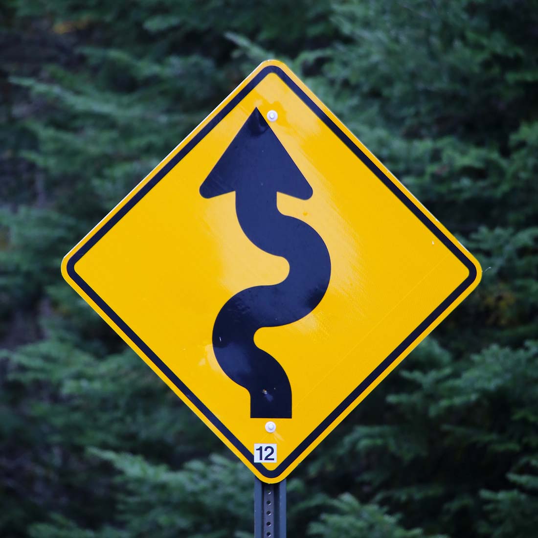
Some of the most classic examples of readable icons are traffic signs. You know immediately what’s ahead when you see these markers. The same should be true of icons with any other placement. That same level of readability and clarity is important.
Icons earn readability and clarity with use over time or with understanding graphic representations. The “print” icon has become familiarized over time so that when you see it, there’s quick recognition and comprehension.
The opposite can also be true. Have you ever opened a new app to see icons that didn’t have meaning to you? What did you think? Did you stick with it or abandon usage?
If you develop a new icon from a graphical element that may be unfamiliar, consider an educational component to help users, such as a tooltip or instructions.
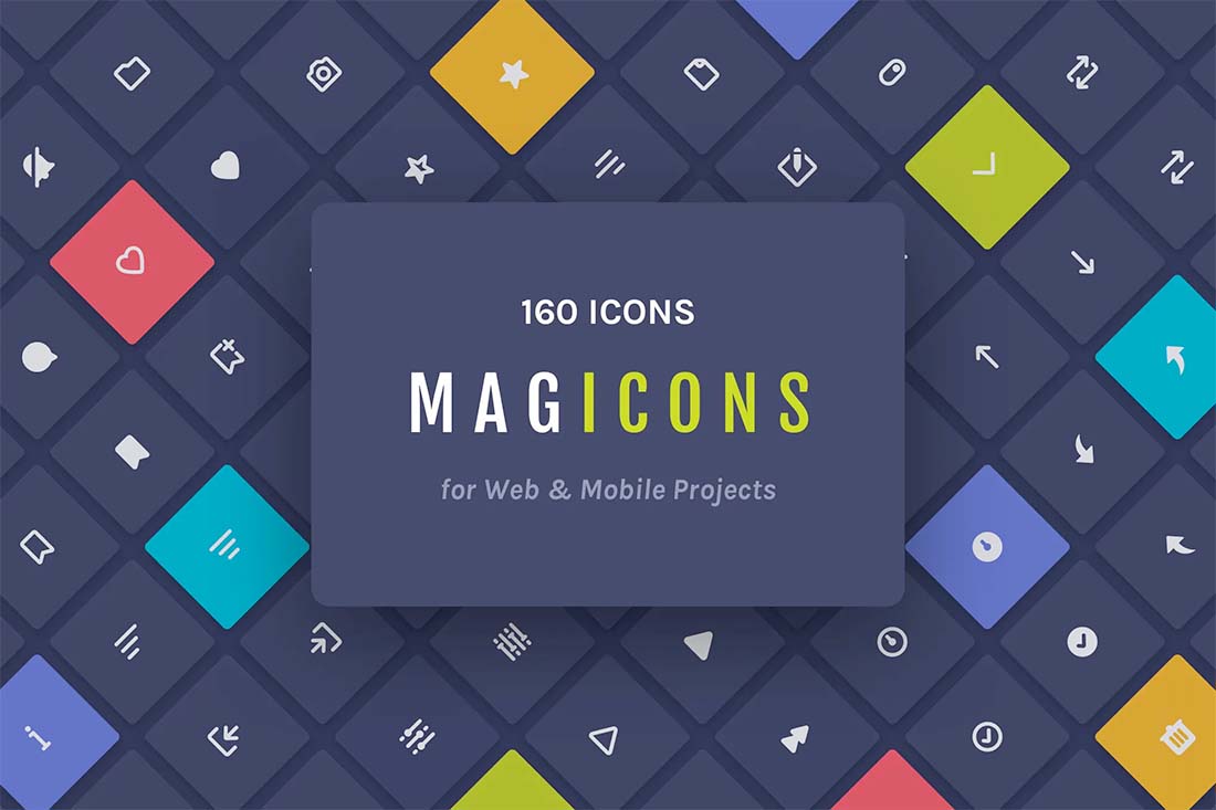
2. Consistency
Consistent icons have three distinct commonalities. These common design elements ensure that icons of the same set look and feel like they go together.
- Shapes and fills: The overall look of icons should be in the same basic shape – square or vertical or horizontally-oriented – and should have a consistent fill. Many icon designers will stick with a single shape and offer filled and outline icon options for varying uses.
- Edges: Also related to shape, what do the corners of icons look like? Sharp or rounded? If they are rounded, it is important to use the same degree of roundness consistently.
- Strokes: The thickness of lines and shapes is important when it comes to consistency. Think how odd it might look if one icon has a 2-point stroke and the one next to it only used a .5-point stroke. They would not feel like they should be together in the design.
In the example above, Amtrak has a custom set of icons with a very consistent look and feel. Each icon matches the others on the screen.
3. Simplicity
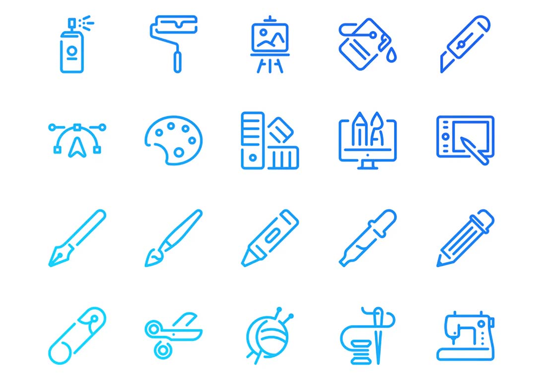
A simple icon is easier to understand than one that is complex.
Much of the reason for this is size. Icons, for the most part, are small in size. Too much “design” or detail can make them complex cognitively when you are trying to understand them at a glance.
A simple icon should accurately represent the item – you can tell the difference between a pencil and paintbrush in the example above – and not overcomplicate the shape and details that bring it together.
Simplicity does not mean “design-less.” A simple design can still have color and detail. If you want to test the simplicity of an icon, ask someone what it is. The quickness of the answer shows how simple the design is (fast responses are simpler and easier to understand).
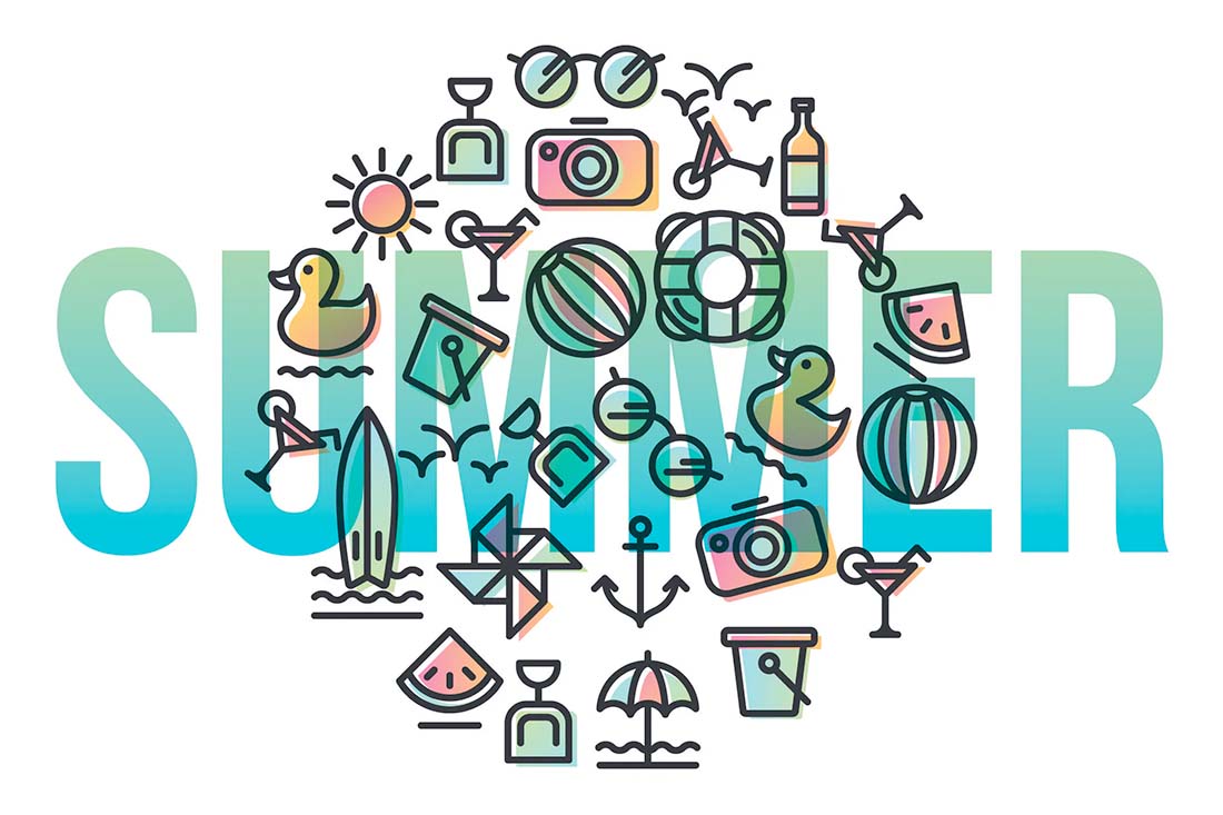
4. Color
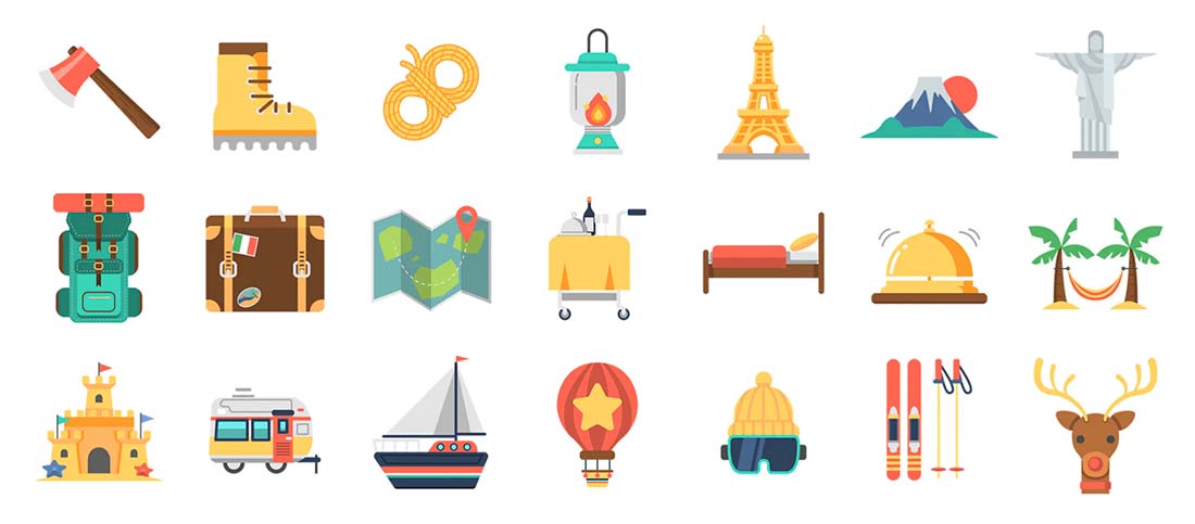
Color can bring an icon to life and compliment the rest of the design. On the other hand, it can be distracting if there is too much happening at once or the elements aren’t complimentary.
When designing multiple icons that are intended to go together, try to create a color palette for the design. Use some of the same rules you would with any other color palette – stick to a handful of options and base it in color theory – so that your set is harmonious.
Consider how these colors play into the location where icons will be used. Do they work together?
On the example of the travel icon set above, you can see a base color for the design – golden yellow. Then each icon may have one or two other colors that work with that hue to pull them together. This palette helps create consistency among the icons. Also note, that in a few of the graphic representations, golden yellow wasn’t appropriate and the designer didn’t force it.
5. Alignment
When using icons together, arguably the most important thing you can do as a designer is to align them properly. Even icons that don’t have other things in common will look like a unit when aligned on the same axis.
Think about alignments in two ways:
- Horizontally, so that every icon has the same vertical center on the plane when they are positioned horizontally in a row
- Vertically, such that each icon is in the same position in its container, even if the shape or size is slightly different
6. Grids
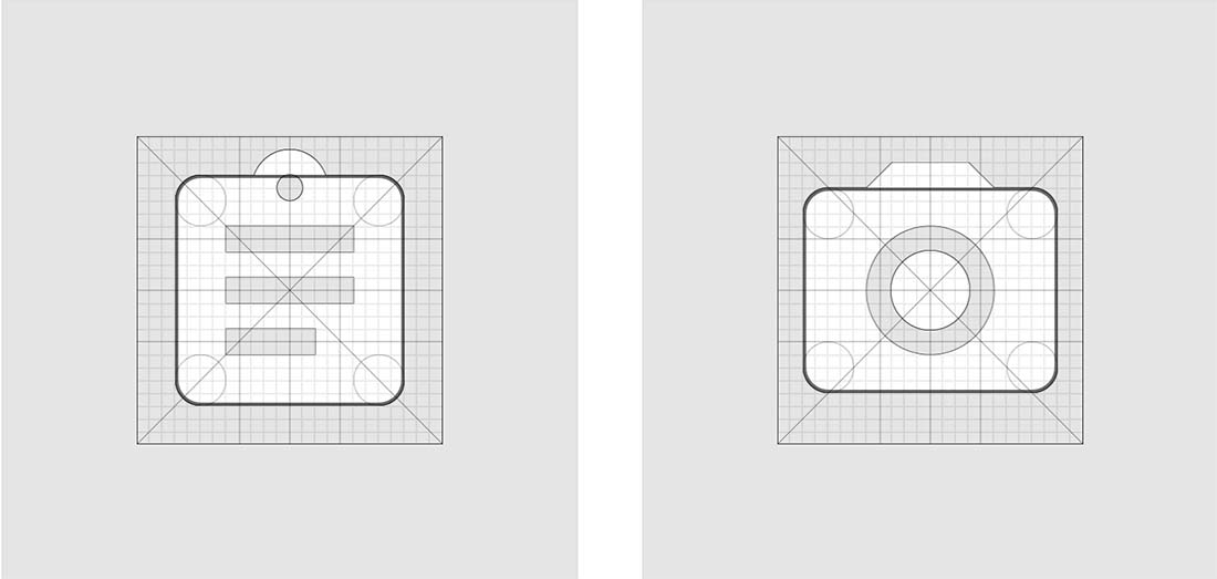
According to the rules of Material Design, “the icon grid establishes clear rules for the consistent, but flexible, positioning of graphic elements.”
An icon grid works like any other type of design grid, giving you some constraints to work in that almost force an element of consistency. The key difference in an icon grid is that it is often a square grid (inside a square shape due to the use of app icons) with square gridlines therein.
Take it a step further and turn that square grid into a pixel grid for that pixel-perfect icon design.
7. Avoid Words
This is an easy tip for icon design. Avoid words and letters.
Sometimes you can make a letter icon work – think the Facebook “f” but more often than not, it just gets complex and difficult to read. Use a graphic element if you can.
8. Style
Incorporate your brand or design style into icons to make them your own. While you don’t have a lot of control over what a print or download icon should look like conceptually, you can adjust colors or lines or feel to make it unique.
In the example above, the icon designer uses an offset color block behind a line style to create a customized feel. This adds extra style and personality to the icon design without detracting from the root of what each icon is supposed to visually represent.
9. Purpose
Good icon design can do various things for a project.
Generally, icons should:
- Generate attention
- Facilitate understanding
- Imply action or activity
In online and app environments, as opposed to print, icons can have an even greater purpose with active and hover states that can add even more meaning to the three elements above.
Change in the state of an icon can be with color, animation, or other effects. Remember, that any effect you add to an icon should maintain the integrity of that design and stay in line with the overall meaning and aesthetic.
10. OS or Device Specific
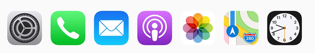
Good icon design is more than just visual, it also follows the rules so that it works seamlessly for users. While this tip might not be a lot of fun, it can be the obvious difference between a functional design and one that falls flat.
Consider specifications for the places where your icon might appear – this includes different operating systems, devices, or size/scale requirements.
Both Apple and Google have different specifications for icons. Did you know only one of them allows for transparency? (Hint: It’s not Apple’s iOS.)
Shape is another factor. The reason we mentioned the square grid, is because a square is the most common shape for uploading to many platforms, from app icons to website favicons.
Think about how the icon will fill the element where it will appear as well. While you are often uploading a full square, they often appear with curved corners, making it important to understand corner radius and know how much of the design that will eradicate.