We all see it every day. That box, that wrapper, those bottles, jars, and cans. Food packaging is something that permeates our lives, and yet most people don’t ever stop to consider how it actually affects the decisions we make when we purchase our food.
From the moment you make a selection in the store to the moment you get your groceries home and open them, food package designers have carefully engineered each step of your eating experience to make sure you make the choices that are right for you.
As designers, it’s always worth considering how others in different parts of the design industry tackle their own special problems and challenges. So today, we’ll be taking a “field trip” into the design process behind some of the industry’s most successful and effective food packaging designs.
Confidence is Delicious
Here’s a little experiment you can try the next time you’re shopping for food at the store: pick a packaged item. Bread, cheese, yogurt – anything you like. Find a low-priced version of it, and hold it in your hands.
Examine the design, the quality of the materials used to make it. Make a mental note of how it makes you feel to hold it. Do you feel calm? Hungry? Intrigued? Slightly nauseated? Now put it back and do the same thing with a higher-priced version. How do you feel now? Is there a difference in your level of engagement with the product?
One of the most important things food packaging designers consider when creating a package design is the way it will feel in your hands when you hold it in a store. For many consumers, something that doesn’t feel right in their hands can mean the difference between making a purchase and leaving something on the shelf.

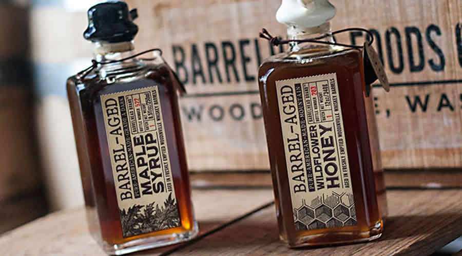
Barrelhead Foods by David Cole Creative
You want your users (in this case, food shoppers) to feel confident holding your packaging in their hands, because that sends the subconscious message that “this is a trustworthy food item I can confidently serve to my family.”
If you’re a web or print designer, you can create the same sense of confidence in your own users by being consistent and committing to a uniform standard of quality across every aspect of your project.
Quality design seems to be something most people recognize when they see it, even if they don’t exactly know why. When people purchase something with quality design, it sends a little subliminal message that they’ve made a good decision, and actually increases their opinion of the product regardless of how good it actually is.
You want to encourage your users’ confidence by subtly telling them that purchasing your product (or consuming your content, in whatever form it might come) is, to quote Martha Stewart, a Good Thing. You can do just that by adhering to the highest design standards possible.

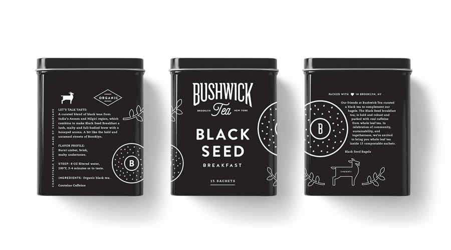
Bushwick Tea X Black Seed Bagels by Salih Küçükağa
Smile For the Camera
I don’t know the exact percentage of food packaging which incorporates photography versus that which does not, but just from browsing the store aisles where I live in the US, I’d say that photographic designs are in the minority.
However, there are benefits to this kind of food packaging, which I personally thing some food packaging designers could make better use of. Obviously, the biggest benefit to including a photo is that the consumer can see the actual product that they’re buying without opening the package.
Nowadays, this can be a tricky way to sell food, since people are more cynical than they used to be. You know, for example, that the food-styled photography you see in television ads is usually not what you’re going to get at the store or the drive-thru window. So seeing a photo of perfectly styled food can actually lead to disappointment.
However, there’s an interesting thing that happens the majority of the time, and it’s why food stylists are able to stay employed. It’s related, in part, to the feeling of confidence I mentioned before. When people see something of quality, they’re more inclined to feel they made a good decision, and – here’s the important part – they’re more likely to be charitable in their opinion of the product they’ve purchased. Simply put, presentation is everything.
When I was in culinary school, our chef instructors always used to stress how important it was that we make our plates look as delicious as we possibly could, even if the food was mediocre. Why? Because it’s common knowledge that the better something looks, the more positively people respond – especially if they’re going to be putting it in their mouths.
In design school, I heard and witnessed the same phenomenon – the students who presented “blah” ideas exceptionally well almost always outperformed those who presented awesome ideas poorly.
Of course, presenting an awesome idea well is ideal, but it’s less important to make every single thing pixel perfect. Putting a perfectly styled photo on a food package (or in an advertisement) counts as good presentation, and consumers generally respond with confidence.
When you take on a customer-facing design project, you are making a presentation. You can directly control how most of your users will respond to your product or content by presenting it well, even if it’s not perfect.

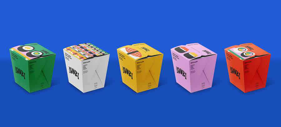
Nori Takeout Sushi by María Luisa Castro
The Food Gods Have Spoken
According to the very accurate, scientific research of, um, me browsing through the grocery aisle, the vast majority of food packaging design does not use photography. Rather, they use graphic elements to hint at a specific set of values which strike a chord with the consumers who are most likely to buy that item.
The Clif brand of energy bars, for example, includes several different types of packaging in their multiple varieties of products. Believe it or not, each of these different packages is designed to appeal to a slightly different sub-market of consumer. The majority of the product line of energy bars feature no photography on their opaque wrappers – just a simple design and vector illustrations of a guy rock climbing or doing some other type of extreme sport.
That has nothing to do with the actual food item itself, but it does suggest to the customer the kind of lifestyle they can aspire to if they eat Clif bars. The “Builder’s” line of protein bars features photography, for a certain type of consumer who tends to be more practical and serious about living an active, health-conscious lifestyle. The people at Clif know this – they target specific segments of their market in different ways, in order to appeal to all their consumers effectively.
When you connect with your target audience – when you really explore what they want and how to reach them, you can create their world with your designs. It sounds kind of godlike, but it’s true. Creating products and content for a specific group of users allows you to zoom in on their likes and dislikes; their hopes and fears.
Using this information, you can engineer the experience they have with your content or product by catering directly to the type of person they are.
Once you know your users’ ideal lifestyle, you can then create it for them, suggesting it to them whether they’re in the grocery store buying ingredients for dinner, or whether they’re reading the summary for an ebook online. Food packaging designers know this when they cater to the “lifestyle” of their target market.

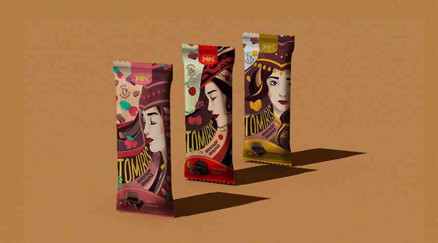
Tomiris by Svetlana Nikolayeva
Narrowing It Down
Everyone is different. Contrary to popular opinion, there is no such thing as a “general audience.” There are only different microcosms of people who have many different tastes and preferences. Many designers think this makes their job more difficult, but in fact, if you learn to embrace it, it can make design much more straightforward.
Not necessarily easier, but knowing your specific audience can take much of the guesswork out of figuring out what will sell. It takes a bit of work to pinpoint your exact type of user, and what he or she really wants (partly because people tend to be horrible at articulating what they actually want), but it’s definitely worth it.
The post The Secret to Successful Food Packaging Design appeared first on Speckyboy Design Magazine.
