Hard as it may be to fathom, the web has been a part of our world since CERN placed it into the public domain in 1993. And if you were building or browsing websites during that era, you might not have imagined how much design and functionality would evolve decades later.
Using this new and experimental medium, web designers repeatedly innovated and pushed boundaries. There were risks involved – but that’s also what made things fun. It seemed like everybody wanted to play a part in helping the web reach its potential.
In reality, most experiments didn’t work out. Some faltered just as quickly as they launched. At the very least, they could be considered good learning experiences for a young industry.
Yet there were a few trends, tools, and techniques that were groundbreaking – even if it took years to see them that way. Viewing the web through today’s lens, you might say they were a precursor of what was to come. Without them, we might not have some of the slick features we now take for granted.
With that, let’s take a look at some web design concepts that were ahead of their time.
HTML Frames
Here’s how the W3C describes HTML frames:
HTML frames allow authors to present documents in multiple views, which may be independent windows or subwindows. Multiple views offer designers a way to keep certain information visible, while other views are scrolled or replaced.
In practice, frames made it possible to display multiple HTML documents simultaneously. As you might expect, this led to some unique implementations. Some ended up being more useful in the real world than others.
Navigation was one of the more popular uses. For example, a designer could create a vertical navigation UI within a frame located on the side of the screen. Clicking a navigational item would then load the content into a larger frame in the middle.
Headers were also a natural fit for frames. The element could stay in place while the user scrolled through the main content area.
In all, these were attempts at making websites a bit more user-friendly. There was also potential for improved performance, as clever usage could result in images only loading once per session in static frames, rather than each page view. This was a big deal in the days before caching was commonplace.
Looking back, frames offered an early way to create “sticky” elements that stay in a fixed position upon scroll. And while the old HTML spec has been deprecated, we can now use CSS to build these features.

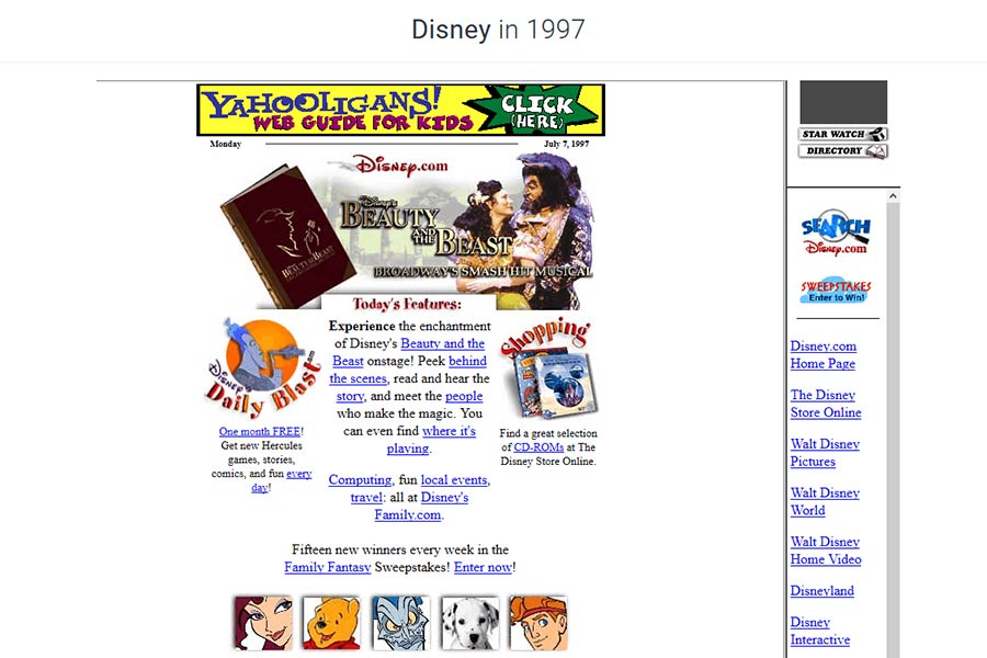
In 1997, Disney’s website used a navigation frame.
Flash Animation
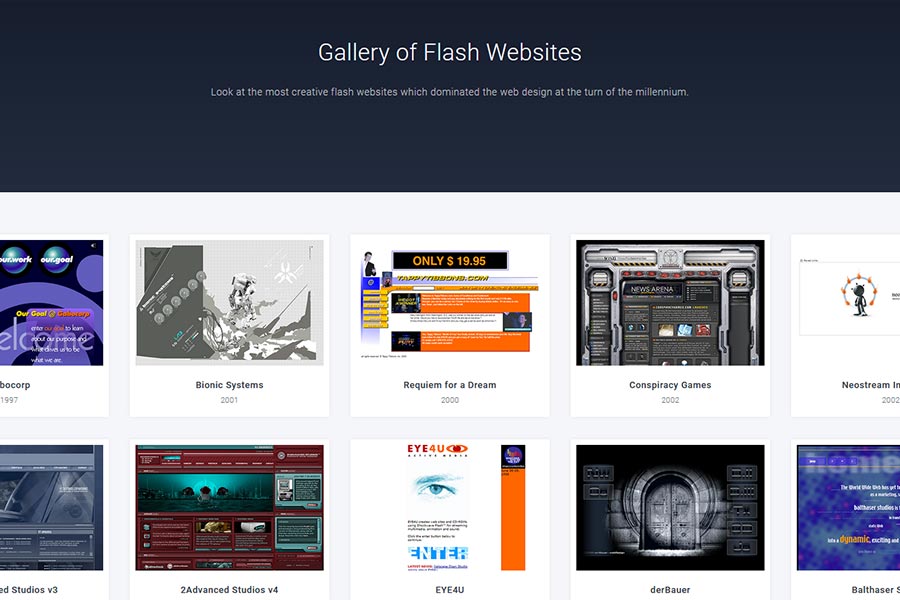
Flash had to have been one of the most divisive technologies of the early web. On the one hand, it allowed designers to create some incredible multimedia-driven content. But it also had plenty of drawbacks.
When entire websites were built with Flash, they often suffered from accessibility issues. In addition, long load times were common for users with a slow internet connection. And it was also known to crash a web browser or two.
Mobile compatibility was also a sticking point. Early iOS devices didn’t support Flash, which seemed to seal the format’s fate for good. Adobe finally stopped supporting it at the end of 2020 – long after its glory days were over.
Problems aside, Flash did demonstrate a user appetite for animation and interactive multimedia. It allowed these elements to become mainstream – even if the technology itself wasn’t quite there yet.
Everything from CSS animation to browser-based tools owes a debt of gratitude to Flash. It showed what the web of the future could look like. In time this led to a better way to implement multimedia and do so through open standards.

Relive the days of Flash at the Web Design Museum
Java & Vanilla JavaScript
While these two languages aren’t directly related, they combined to bring a new level of functionality to early websites. And both are still around, although the former has reached well beyond the web.
Java was designed to work on multiple devices. And before databases and content management systems (CMS) were common components of a website, the language provided a way to add application-like functions to a page.
For example, think of live sports scores or news headlines. Java applets could be embedded to allow this type of information to automatically update as needed. It did so independently from the page, meaning you didn’t have to hit the refresh button in your browser to see the latest version.
This paved the way for technologies like AJAX, which can perform similar tasks without the performance overhead. Speaking of performance, Java was incredibly slow to load back in those days. Even a relatively small applet could make your system’s hard drive grind incessantly.
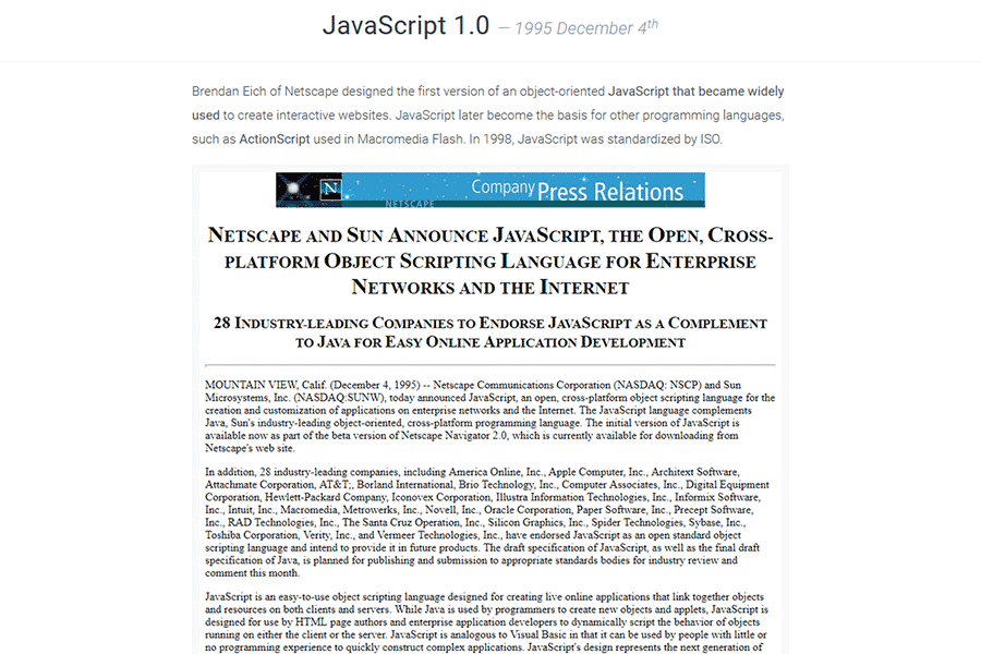
As for vanilla JavaScript, it first hit the scene in 1995. It served basic tasks like form validation and displaying alerts. But it also could be used to create what turned out to be among the first hover effects.
Hovering over an image, for instance, allowed a designer to substitute the original with a different one. This was commonly used in image-based navigation UIs. The popular Dreamweaver WYSIWYG editor came preloaded with a script for this very purpose.
This served as a hint of the future. Eventually, CSS3 would offer similar visual effects. And an explosion of JavaScript frameworks from jQuery to React would become staples of web development.
And vanilla JavaScript hasn’t gone anywhere. More powerful than ever, some developers have chosen it over specialized frameworks.
Each of these languages gave users a taste of what the dynamic web could be.

JavaScript 1.0 was a joint project between Netscape and Sun Microsystems
The Seeds of the Modern Web
The web began as very much a static medium. But a few years into its mainstream existence, web designers aimed to provide more functionality and a better user experience. They would become crucial factors in its growth.
The adoption of HTML standards, along with the advent of CSS and JavaScript, came along at exactly the right time. And advanced languages like Java helped to bridge an important gap before dynamic data was within everyone’s reach.
While those early implementations were rudimentary, they planted the seeds for what came next. Their quirks and drawbacks provided valuable lessons for the developers that built the next generation of tools. Technologies became more refined and have led to a nearly seamless mix of form and function.
So, the next time you use a modern web application, perhaps take a moment to remember how we got here. It’s been a long journey, but one that has turned out beautifully.
Historic screen captures are courtesy of the Web Design Museum. Also be sure to check out our interview with founder Petr Kovář!
The post The Web Design Concepts That Were Ahead of Their Time appeared first on Speckyboy Design Magazine.
