It’s no secret that graphic design and web design are different animals. And despite how far the web has come in terms of flexibility, there are still limitations.
For example, CSS has made it possible to create complex layouts. Yet responsiveness and accessibility must also be taken into account. Creating something that can withstand various devices and use cases requires a lot of care.
This can be difficult for seasoned web designers to manage. But if you’re coming from the world of print design, the challenge is even greater.
For those making the transition from print to the web, this article is for you. We’ll offer some tips on what subjects to study, potential pitfalls, and some key concepts to keep in mind.
Look under the Hood and Find Out What Makes the Web Work
The web is full of visual tools that allow for building websites without writing code. They make the design and build processes easier. It’s perfectly OK to use them.
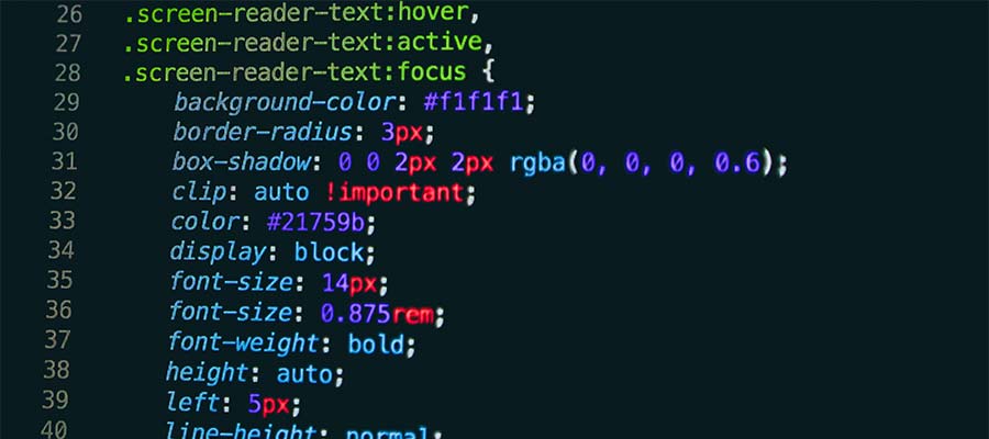
However, it’s also worth your time to get to know HTML and CSS. They’re foundational elements of web design. By understanding how they work, you’ll gain an advantage when using no-code tools.
As good as these tools are, they’re not perfect. And there will likely be occasions when the results aren’t what you expected. Working knowledge of these languages can be a huge help when troubleshooting.
For example, consider a layout that looks great on a desktop device but not on a phone. Having some background information on CSS Grid or Flexbox might lead you to diagnose and fix the issue.
Once you have a feel for the basics, you’re free to expand your horizons. Learning languages like JavaScript and PHP can also be beneficial. They may even help you think about design differently.
Thankfully, coding expertise isn’t a requirement. But a little knowledge can go a long way.

Keep Your Designs Simple to Start
A talented graphic designer can produce amazing work. Intricate layouts, elements that are positioned perfectly, layer upon layer of textures. The possibilities are endless.
These effects are possible on the web, just as they are in print. But if you’re just starting with web design, embrace simplicity first.
Effective web design needs to work on every device. It must also be easy to read and navigate – regardless of a user’s screen or physical abilities.
There’s a cost to being a bit too ambitious with web layouts. Sometimes, they don’t hold up on mobile devices. Or they may do more harm than good when it comes to accessibility.
Therefore, there’s no need to pressure yourself into building a complex design right off the bat. Starting small allows space for growth. You can always add those extra bells and whistles as you gain experience.

Get To Know Users
One of the biggest differences between print and web design is the intended audience. You could, for instance, design a business card and print 1,000 copies. Each person that receives your card will experience it in pretty much the same way.
That’s not so on the web. There are different devices, internet connection speeds, assistive technologies, and web browsers. Not to mention that people from all over the world can access your website. And let’s not forget about the search engines that will index your content.
In practice, we build websites for an untold number of use cases. We don’t necessarily know how every single user will access a site, but we can do some predictive analysis.
Data exists to help us know a bit more about how people use the web. In the broadest sense, it can tell us the most popular web browsers, screen sizes, and operating systems, among other useful stats.
For existing websites, tools such as Google Analytics can provide a snapshot of who’s visiting your website and how they found it.
The idea is that, once you know your users, you can build a website that gives them the best possible experience. The more you learn about them, the more you can cater to their needs.

Apply Your Talents to a New Medium
If you already have an eye for design, you’re in a great position to start building on the web. And knowledge of tools such as Figma and Photoshop will also come in handy.
But web design is indeed a different discipline. And you may run into roadblocks when trying to make sense of its unique challenges. But take heart in knowing that virtually every other web designer has gone through the same thing.
All told, the transition from print to the web is as much about perspective as it is about skills. That’s why it’s important to have a basic grasp of how web technologies work. By starting with a solid foundation, you’ll likely have an easier time understanding the differences.
From there, aim to start with a few simple projects. Experiment to see what works and what doesn’t. Determine how typical users will view your work and keep refining the experience to please them.
Most of all, take advantage of the myriad of available resources. Tutorials and code references can help you get past those rough spots. And there is an online community that you can lean on for guidance.
In time, designing for the web can become like second nature. It just takes practice!
The post Tips for Graphic Designers Who Want to Build Websites appeared first on Speckyboy Design Magazine.
