
Overcorrecting for one form of disability may unintentionally negatively impact the experience for other forms of disability. For example, partially visually hidden link names may work great for people who use screen readers, but this approach can be problematic for people who rely on voice control software. Because of this, your designs need to be flexible and adaptable, as well as accommodate the many different ways people can interact with them.
Digital accessibility tends to be taught through the lens of how your experience works (or fails to work) with a screen reader. It makes sense to think that, if it works for a screen reader, it will also work for a lot of other kinds of assistive technology.
However, this approach also indirectly reinforces the narrative that blindness is the majority experience. Within this narrative, there is also some subtlety in the fact that not everyone who uses a screen reader is blind.
The majority disability experience is actually depression, which is a complicated disability with highly variable symptoms. One of the most notable symptoms of depression is that it negatively impacts your cognition, which affects your ability to understand things.
The other salient bit is that the majority experience is not default. The point I’m getting at is that overcorrecting for one form of disability may unintentionally negatively impact the experience for other forms of disability — voice control software being one example.
Unique Link Names
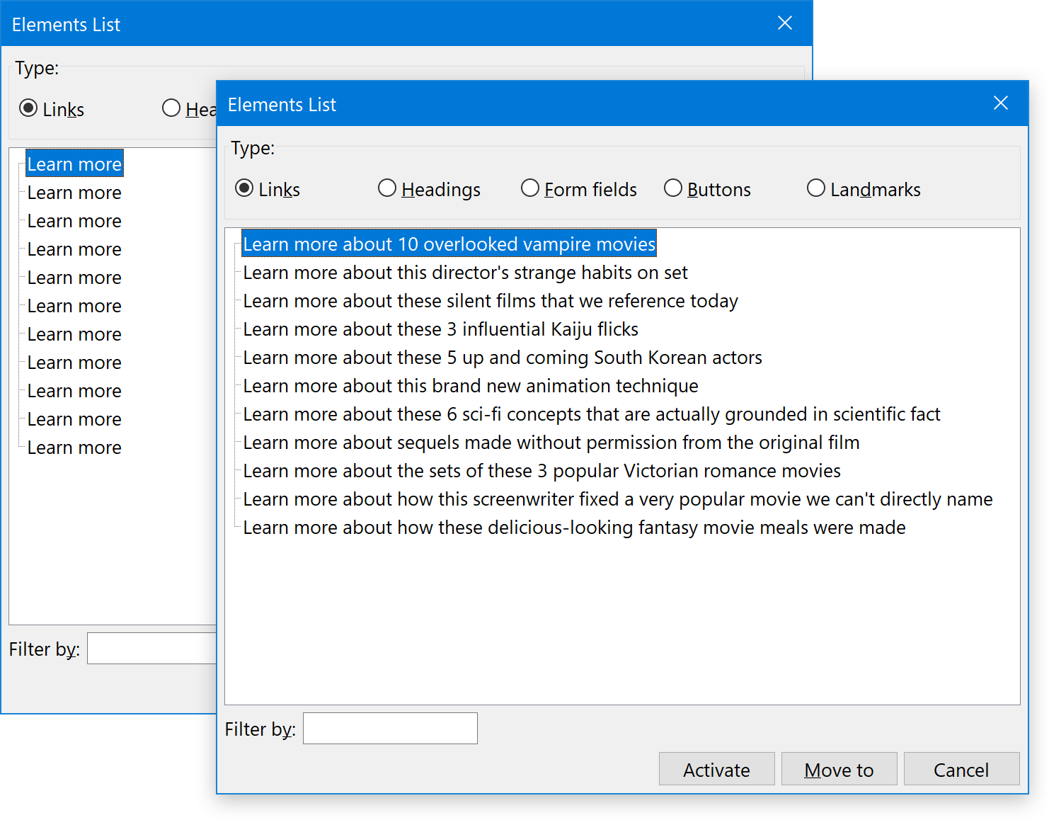
Making each link’s accessible name unique is an important thing to do. It helps clarify where each link goes to someone who is navigating via a specialized screen reader browsing mode. For example, all major screen readers have the ability to list all the links on the current page or view, with the links being removed from their surrounding text content and context.
Eleven links called “learn more” don’t make a lot of sense when separated from their surrounding context. It’s far better to tell the reader what they’ll be learning about:
Visually Hidden Text
If you use CSS libraries such as Bootstrap or Tailwind, you may be familiar with a specialized class that a screen reader can read, but is not displayed visually. These classes help provide additional context, such as supplying additional heading elements to help with way-finding.
<h2 class="sr-only"> Footer
</h2>
Partially Visually Hidden Text
Another thing visually hidden classes are commonly used for is to hide the portion of an interactive control that makes its name unique. A common pattern for this is a call-to-action (CTA) link in a card component:
See the Pen [Hidden link names](https://codepen.io/smashingmag/pen/gOvJOav) by Eric Bailey.
The typical reason the visually hidden text is inserted in the first place is that the designer of the card component decided that the truncated look of the CTA link looked “cleaner.” This aesthetic decision is made because of a historical lack of accessibility concerns in design education.
A common variant of this pattern is using ARIA in place of a visually hidden class:
<!-- Never do this -->
<a aria-label="Learn more about these 10 overlooked vampire movies" class="card-cta" href="/path/to/article">Learn more</a>
In this case, the aria-label declaration provides the unique, accessible name. Many developers are quick to use it, even though ARIA is something you should only use when there are no other alternatives. Misuse of aria-label:
Problems With Partially Visually Hidden Text
Partially visually hidden text — while helpful for people who use screen readers — can negatively impact others. Truncated CTA links can be problematic for people who:
- Are browsing using screen magnification or an increased default font size, where the CTA link might not have the context of the surrounding card content;
- Have cognitive and digital literacy concerns, where the phrase is not descriptive enough to indicate specifically where someone will navigate to;
- Aren’t fluent in the language used and may have difficulty constructing the larger context the rest of the card’s content provides;
- Use voice control software, where obscuring the full, accessible name of the link keeps them from easily activating it.
Voice Control on macOS and iOS both don’t support being able to directly say “Click learn more,” since they are listening for the full, accessible name of the link. This includes the visually hidden portion.
Since part of each link is visually hidden, there is no way to know each link’s actual accessible name, unless you’re augmenting your browsing experience with a screen reader, or with a developer tooling to inspect the underlying code.
More About Voice Control Software
The reason I am focusing on voice control software is because it presents a potential objective access barrier. Sadly, concerns around subjective barriers are commonly dismissed by people not immediately impacted by them.
If you are unfamiliar, voice control is one of the many ways you can use a device that doesn’t rely on a mouse, keyboard, or physical touch. As its name implies, you use your voice to issue commands, and specialized software will translate that into things like navigating, entering, and editing content.
The Landscape
Every major operating system provides some degree of voice control:
Voice assistants are another form of voice control software. Examples of this are Apple’s Siri, Microsoft’s Cortana, and Amazon’s Alexa. These voice assistants are interesting in sense that they can accomplish some, but not all, of the things that more full-featured voice control software can.
There are also third-party applications that provide specialized voice control functionality. Two notable examples are:
- Dragon, which offers long-form voice dictation and web browsing.
- Talon Voice, which offers powerful customization and scripting.

Who Uses It?
There are more people who use voice control than you’d think. If you’ve ever asked Siri to set a timer, congratulations! You’re a voice control user!
That being said, software like Voice Control, Dragon, and Talon are designed for more long-form, specialized use. People who use these applications may temporarily or permanently, and circumstantially or biologically be:
- Fully or partially paralyzed;
- Unable to use their hands;
- Unable to make fine motor movements;
- Unable to make repetitive movements over a long duration;
- Operating with lowered cognition.
Disability is also not a binary state, so it is entirely possible (and relatively common) that multiple disability conditions may be present at any given time.
Workarounds
Some voice control software has the functionality to work around this issue, the same way screen readers do. Dragon, for example, uses heuristics to identify links that contain the term “learn more.” It then lists a number for each link with that term, which you can then say “choose number” to activate.
Most other voice control software allows you to display numbers that map to all the interactive controls currently on the screen. If that doesn’t work, they can also display a grid and let you zoom into an area of the screen for precise selection and manipulation.
The Question And The Choice
The larger question is why do we force people to do all this extra work? Partially visually hidden link text isn’t necessarily a hard WCAG failure, but it is also not a good user experience.
For macOS and iOS, you can only activate partially visually hidden link text if you know the other commands to work around the issue. That means it is a question of digital literacy: how familiar you are with this specialized software, as well as technology in general.
For voice control software that offers heuristics, the question is why do we force a disabled audience to expend more effort per link than an abled one? Remember that this interaction can happen multiple times per session, as well as nearly every time someone browses the web. It’s a draining, exhausting experience.
When you learn about this, you need to make a choice:
- Do you keep honoring a misplaced sense of minimal aesthetics and keep the partially visually hidden text?
- Or do you remove a burden for those affected by it and show the full link name to everyone?
One vital aspect of user experience is making things work for anyone, regardless of circumstance, device, or ability. Or, as Billy Gregory puts it:
When UX doesn’t consider ALL users, shouldn’t it be known as “SOME User Experience” or… SUX? #a11y
— Billy Gregory (@thebillygregory) January 6, 2015
What About Truncated Text That Uses An Ellipses?
To quote Karen McGrane, “Truncation is not a content strategy.”
In addition to embarrassing issues that can crop up by truncating text that is longer than its container, an interactive control that has part of its name obscured by ellipses can be hard or impossible to activate without using showing numbers/grid functionality.
What About My Unlabeled Icon Button?
Another example of this is a button that doesn’t have the benefit of any visible text. The more obscure the icon and abstract and minimal visual treatment it uses, the harder it can be to understand.
You might think this is a contrived example, but remember that tech and language literacy, jargon, and an aesthetic treatment can all conspire to prevent someone from knowing what an icon represents.
Again, voice control software offers workarounds for this. However, I repeat the question asked earlier: Why do we force people to use them?
What About My Pixel-perfect Design?
Accessibility is a multidisciplinary, holistic concern. And so is Design.
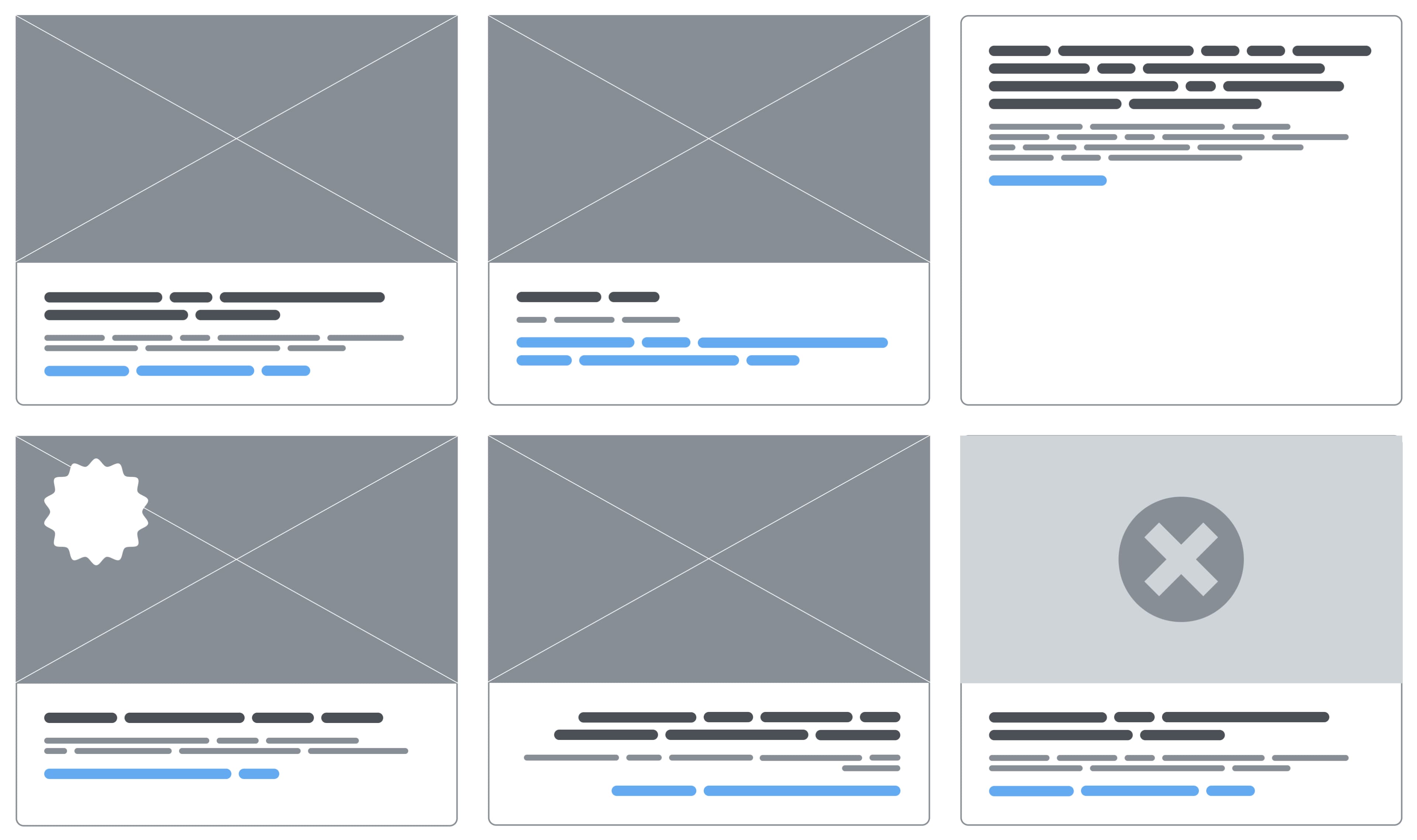
When you update your partially visually hidden link text, you may get link names that extend to more than one line. If the link is placed inside a card component, and there are multiple card components arranged in a grid, there is the chance that cards will have varying heights. And you know what? That’s totally okay.
A CTA link extending to multiple lines is one example of the sorts of things you should already be considering. How your components can handle things like:
- Varying lengths of content;
- Grid placement and negative space with variable content height;
- Different configurations (What if a badge is added? What if the description is removed?);
- Translation and localization;
- Failure states (What if the hero image doesn’t load?).
If you need to update your existing work to accommodate these kinds of real-world considerations, you’ll probably have to collaborate with content writers, developers, and project managers. Design thrives in this kind of collaborative environment, where you can identify and work with the limits of the systems you work inside of.
Sometimes you’ll be able to tweak what you already have. Sometimes you’ll have to create net-new content. Sometimes you’ll even have to throw it all out and go back to the drawing board. These efforts all speak to the value of a Shift Left methodology, where these kinds of considerations are named and dealt with early in the conception phase.
How Do We Make Sure Our Experiences Are Easy To Use By Voice Control Software?
For interactive controls such as links and buttons, you’ll want to:
- Show the full text of the control’s name,
- Use a unique, accessible name for each control on the current page or view,
- Avoid overriding accessible names with
aria-label, and - Avoid using just a cryptic or abstract icon — especially if the control’s functionality is exotic.
These steps will go a long way towards making using voice control software easier and more pleasant.
It’s Not Really About Voice Control Software
The three overarching themes that I hope you’re picking up on:
- Testing with a range of assistive technology is important to understanding actual support,
- Agency can be granted by letting go of control, and
- Design decisions carry a tremendous amount of power.
Your designs need to be flexible and adaptable, as well as be able to accommodate the many different ways people can interact with them. This includes voice control, as well as numerous other forms of assistive technology.
Further Reading On Smashing Magazine
(nl)