
So you need to design a logo. Where do you start? Shapes? Typography? A grid?
A logo grid or construction guide is a popular starting point for many designers looking to create a logo. The use of a grid system, especially for a design that might often render at extreme sizes – very large or small – can help you create something that has visual harmony, an organized aesthetic and purposeful design.
Are you in the middle of a logo design project? Learn about logo grids, typography, logo types and more in our in-depth guide on how to design a logo!
What Is a Logo Grid?
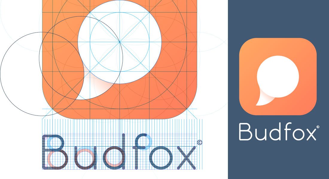
A logo grid is a tool used to help create shapes with geometric harmony in the process of building a logo. Logo grids are often called construction guides as well, depending on the shape of the grid (or guide) lines used.
Logo grids are often made from an actual square grid, such as those used for grid paper like you used in school. But the structure of a logo grid can be expanded to much more. Some designers use circular logo grids and others create a unique grid system for each project that includes “invisible” lines for heights, spacing between elements and whitespace.
The common factor in all logo grids is that they employ a sort of mathematical approach, where space and filled space is aided by placement along the grid in the design process.
Common Grid Styles
Grids are a common tool and have been used in various aspects of design for as long as designers have been creating art for printed projects and screens. There are old and time-tested grid concepts, as well as more modern or even custom grid choices available. (Think about your workflows. Do you create mini grids for different canvases? That’s a custom grid.)
Some of the most common grid systems are things you might not even consciously think about but use every day such as the rule of thirds, which is a very common photography tool; the golden ratio; or just a column and gutter grid.
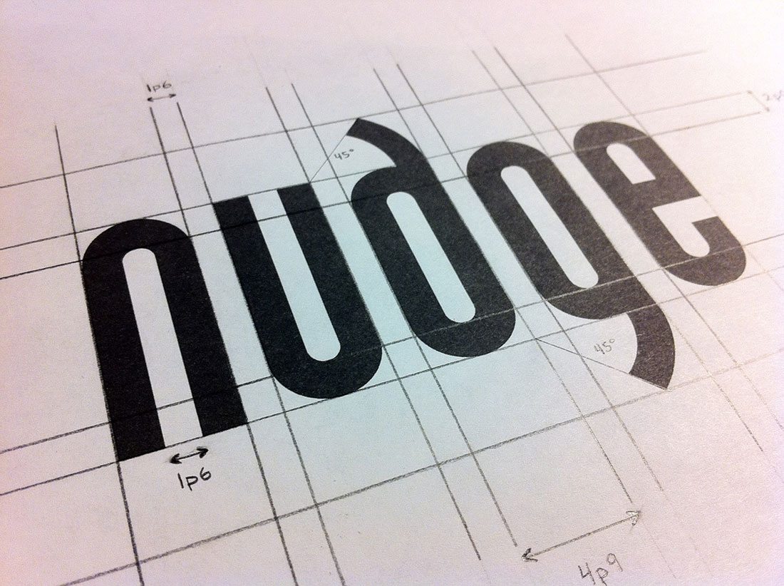
In the same way you use a grid for any other project, you can use it for construction of a logo. The big difference when it comes to logos is that the shapes are not dictated by a specific canvas, such as a rectangular postcard or billboard. For this reason, some logo are designed using construction guides that still follow the principles of working on a grid, but with more flexibility in the shapes of lines and even curves.
Using a Logo Grid
There are so many different options for creating and using a logo grid. The type of grid you select should be based on the project you are working on and your comfort level in working with grids.
- Do you feel comfortable in the structure of a grid?
- Have you designed a grid in the past?
- How do you feel about “breaking” the grid?
- What shapes and styles are you considering for your logo design?
Once you determine your comfort level with grids – most designers are accustomed to working with some type of grid – it’s time to look at some of the options. While you can create your own, there are some options that are more commonly found, as you can see from examples throughout this post.
Benefits of Using a Grid
I know what you are thinking: This looks complicated, why in the heck would I want to use a grid? Before you balk and just scribble something and call it a day, there are plenty of reasons to at least consider a logo grid or construction guide.
- Grids help create organization and focus.
- Grids can give you the focus to create something simple and timeless. Think of logos for companies such as Apple and Shell, which use super-simple, classic logo forms.
- A grid will help you create a logo with versatility. Think of the guidelines for something as small as designing an iOS icon, it starts with a grid that you are supposed to follow before submission.
- While some think of grids as constricting, they actually help you design with more flexibility. The lines of a grid can help you see more options for where to draw and move lines and how to put the pieces together in a way that makes visual sense.
- Grids can help you plan better for elements such as space and create harmony with ease.
- Grids can help you add polish to a design.
- Some grids just exist whether you use them or not based on the way people look at information. (The rule of thirds grid is a good example of this because of the way a person’s eyes move across a visual element.) So even when you don’t use a grid, some grid concepts will still apply.
Cautions When Using a Grid
There are some arguments against creating a logo using a grid system as well. You are likely to find that designers are often very for or very against the use of a logo grid system for these types of projects.
- Grids can restrict creativity because designers feel “locked in” to specific shapes or patterns. This can result in logos that end up having the same feel.
- Creating your own grid can be difficult and time-consuming. There can be a bit of a learning curve when it comes to using grids for the unfamiliar.
- It’s easy to get caught up in the mathematical nature of the grid, resulting in a very grid-like geometric outline, rather than a true logo.
- Designers can get stuck in the grid and not know when to break grid rules, limiting the design process.
Should You Use a Logo Grid?
Now back to the question posed in the title: Should you use a logo grid?
Well… maybe. Every designer is different. I work first from gut and put together an outline and then put it on a grid. This process gives me an idea of how “sound” the logo is structurally and helps me think about potential changes moving forward.
The idea of starting with a grid, even if just for simplicity of scale, shape and planning is a good idea. Building a logo from scratch is a lot like constructing a building. Something with a solid foundation will last and be useful for years to come. If you are thinking about corporate branding or something that will be a part of a brand identity, at least consider a logo grid when looking at the structural integrity of the design.
That does not mean you have to stick to all the invisible lines and curves in the design, but it will help you think about the logo creation process. You might even see something about the design that could benefit from the help of a grid along the way.
Conclusion
Logo grids are a touchy subject for a lot of designers, but it is a topic that’s fun to debate. Just Google “logo grid” and you’ll find hundreds of deconstructions of logos debating whether they fit a grid or are designed freehand. Even Apple’s signature logo has been long the subject of debate.
As with any design technique, logo grids are perfect for some designers and a pain for others. Depending on your experience in working with logos, you may love the idea of a custom option and hate working from a basic set of gridlines. Whichever camp you belong to, we can all agree that Graham Smith put it best: “The idea for a logo often comes from the mind or pencil in a hand, and not a startlingly large quantity of guides, grids and pretty circles.”