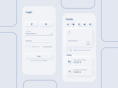
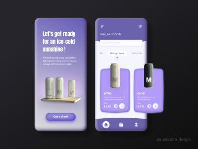
This fresh new design trend has been picking up steam with the rising popularity of colorful inflated 3D graphics in web illustrations and with the latest Virtual Reality projects like “Horizon Worlds”. Let’s see if there is room for Claymorphism on the UI, and how we can create this effect with CSS.
Design trends come and go, and just a fraction sticks around longer than others. Flat design and its more popular successor, Material design, have been dominating the web UI for quite some time, featuring a minimalistic aesthetic that eliminates visual clutter and favors user experience.
This approach is very utilitarian at its core as it eliminates most decorative elements and features, leaving room only for subtle shadows and gradients to achieve some visual depth and add a floating effect for elements that should sit on top of others. Visual hierarchy is usually achieved by using color and typography to make the specific elements more prominent.


Skeuomorphism And Flat Design
In the early days of personal computers, the learning curve had to be as soft as possible, so users could easily find their way around the new digital space. This was achieved with Skeuomorphism which relies on real-world aesthetics to make the UI intuitive and familiar. For example, delete functionality was represented by a realistic-looking trash can icon.
Skeuomorphism was used similarly in the early days of smartphones in the mid-2000s to easily onboard new users. On Apple’s iPhone OS 1, the YouTube app icon is a television instead of the iconic logo we know today! By leveraging this link between the real world and digital world in form of Skeuomorphism, these new devices managed to garner a wide audience right away.

Regardless of the success that Skeuomorphism achieved on these devices, it didn’t find its place on the web. Realistic and elaborate UI elements weren’t a good fit for websites that thrived on simplicity, clean layout, and straightforward usability. Additionally, as responsive web design grew in popularity and mobile performance became a concern, the visually rich and detailed graphics were being slowly phased out.
As a result, minimalistic Flat design and its successor, Material design, took the web design scene by storm by providing a highly customizable, performant, and easy-to-implement aesthetic that can easily adapt to virtually any screen size and resolution. Even Apple moved away from Skeuomorphism around 2013 and fully embraced the widely-popular Flat design.


Neumorphism
The dream of a more tactile-looking 3D web UI lived on, and it resurfaced in 2020 as Neumorphism. It draws inspiration from both Skeuomorphism and Flat design, and it takes a different approach to soft 3D UI instead of trying to mimic realistic graphics. Instead of making UI elements float above the background like in Material UI, it makes them extrude from the background.
This is achieved by using a light and a dark shadow, and a background color that needs to be the same as the color of the element behind it. Optionally, gradients with darker and lighter background colors can be used to create a convex or concave surface, but I haven’t seen it used on web UI as much as a more simple flat surface.
See the Pen [Neumorphic Variations [forked]](https://codepen.io/smashingmag/pen/jOagGJv) by Geoff Graham.

Despite this fresh new take, Neumorphism came with considerable drawbacks. The severe background color limitation made it difficult to achieve visual hierarchy and draw user attention using color. Website branding couldn’t be featured more prominently, and customization was severely limited as a result of that limitation.
I’ve talked about Neumorphism during its early days, and I’ve concluded that flat UI was still significantly better and more effective at creating usable and prominent call-to-action elements. As a result of that, Neumorphism got visually boring and old pretty quickly, as it was difficult to create a distinct visual style due to these limitations.

Neumorphism also has serious accessibility flaws. The poor contrast made the UI unusable for users with poor vision or color blindness, and it’s difficult to perceive visual hierarchy if the effect is overused. In the end, Neumorphism could only serve as an addition to Flat design. More specifically, a different take on achieving depth for non-interactable elements like cards and containers.
2D And 3D Illustrations On The Web
Over the past several years, digital illustrations have become increasingly popular, and we saw them used in many different styles like hand-drawn, isometric, abstract, and others. Some major brands and companies even started including illustrations in their style guidelines, making them a core part of their design identity.

With the advent of web-focused 3D design tools like Spline, web designers would start exploring the world of 3D illustrations. One of the results from this experiment stood out above the rest — the soft and inflated 3D style. The result was astonishing — when combined with Flat design or Material design, these colorful soft 3D illustrations would inject a fresh, energetic, and playful new look into the UI.

Many soft 3D design sets like Humans 3.0, 3D hands, 3DIcons, Homies, and others were picking up steam as this fresh 3D direction was making rounds around the Internet. Some design agencies even started specializing in web 3D illustrations and pushed the limits of this design direction. More recently, projects like Meta’s “Horizon Worlds” have fully embraced this soft and colorful 3D look to create a vibrant and delightful VR experience.

Claymorphism
It was inevitable that this trend will start spilling into the UI itself. This is where the idea of Claymorphism was born.
What’s with all the “morphisms”, anyway? This suffix seems to be a pet peeve for some, and they think that it shouldn’t just be slapped on every new art direction. We won’t concern ourselves too much with naming at the moment, and we’ll focus on exploring this design trend and its potential. With all that in mind, this term was coined by Michal Malewicz, who was also behind the Neumorphism trend a few years before.

Claymorphism builds on top of Neumorphism foundations. Although both use rounded corners, they differ in how they use backgrounds and shadow. Instead of using light and dark outer shadow to achieve the extrusion effect, Claymorphism uses two inner shadows (dark and light) and an outer (usually darker) shadow to achieve a soft 3D and floating effect. This allows for Claymorphism to have any background color, independent of the background which was a major drawback with Neumorphism.
On a quick personal note — I adore this style. It’s charming, delightful, and vibrant without being overwhelming when used correctly. It also reminds me of one of my favorite cartoon series from my childhood — Wallace and Gromit by Aardman. After working with Flat design for years, it’s refreshing to experiment and play around with different design styles for a change. If you are a designer or a developer, and also like this trend and think it has potential, give it a try and see what you can come up with!
One of the major points of criticism is that overusing Claymorphism and going overboard with colors and typography can give off a somewhat childish feel to the UI. Michał Malewicz acknowledged this drawback and gives a few suggestions on how to avoid that.
“The friendliness of those shapes, along with the 3d imagery creates a slightly child-like interface. To counter it, it’s good to use minimal typography, strong accent colors good contrast.”
— Michał Malewicz
The best use-case scenario for this design trend is, in a similar vein as Neumorphism, as an enhancement to the Flat design, but with a wider use-case than the more restrictive Neumorphism style.
Potential Use-cases
More Prominent Call To Action Elements

See the Pen [Flat button & Claymorphism button comparison [forked]](https://codepen.io/smashingmag/pen/zYPgRyg) by Adrian Bece.
Select Elements And Toggle Elements

Charts

Cards And Containers

Claymorphism Effect In CSS
Let’s dive into the individual Claymorphism design features and see how we can achieve a similar effect with CSS:
- Background
We’ll usebackgroundorbackground-color; - Rounded corners
We can useborder-radius; - Shadows
We’ll usebox-shadowwith 3 values,- 2 inset shadows
- 1 outset shadow;
- Inflated effect
It cannot be easily achieved with CSS, so we’ll avoid this, as it’s not crucial.
Our CSS will look something like this. Of course, these values can be changed to fit the design and element dimensions.
.box { background: rgb(249, 174, 1); border-radius: 48px; box-shadow: 8px 8px 16px 0 rgba(0, 0, 0, .25), /* Outset shadow */ inset -8px -8px 12px 0 rgba(0, 0, 0, .25), /* Dark inset shadow */ inset 8px 8px 12px 0 rgba(255, 255, 255, 0.4); /* Light inset shadow */
}
Repeating these three rules for multiple elements can become tedious and bloat the codebase, so let’s simplify this set of CSS rules by creating a utility CSS class and allowing for customization without resorting to increasing specificity or using complex overrides.
.clay { background: var(--clay-background, rgba(0, 0, 0, 0.005)); border-radius: var(--clay-border-radius, 32px); box-shadow: var(--clay-shadow-outset, 8px 8px 16px 0 rgba(0, 0, 0, 0.25)), inset var(--clay-shadow-inset-primary, -8px -8px 12px 0 rgba(0, 0, 0, 0.25)), inset var(--clay-shadow-inset-secondary, 8px 8px 12px 0 rgba(255, 255, 255, 0.4));
}
With this handy utility micro-class, we can easily apply Claymorphism styles, customize them, and extend them without bloating the markup with repeated style snippets.
<button class="clay button button--cta">Add to cart</button>.button { /* Customize Claymorphism styles */ --clay-border-radius: 1rem; /* Extend base styles */ padding: 1.5rem 3rem; color: #f5f5f5;
} .button--cta { /* Customize Claymorphism styles */ --clay-background: hsl(360, 100%, 27%); .button--cta:hover,
.button--cta:active { /* Customize Claymorphism styles */ --clay-background: hsl(360, 100%, 20%);
}}
I’ve created clay.css as an easy way to include this fully customizable micro CSS class in your projects either via CDN link or NPM package.
<link rel="stylesheet" href="https://unpkg.com/claymorphism-css/dist/clay.css"
/>
npm i claymorphism-css
yarn add claymorphism-cssAlternatively, you can use it as a SASS mixin and easily apply this effect to pseudo-elements or any other element.
@import "claymorphism-css/dist/clay.scss"; @import @include clay( $background: [value], $border-radius: [value], $shadow-outset: [value], $shadow-inset-primary: [value], $shadow-inset-secondary: [value]
);
Claymorphism And Accessibility
Although Claymorphism doesn’t introduce glaring accessibility issues out-of-the-box as Neumorphism does, it’s important to keep the standard best practices in mind.
Keep a clear and logical visual hierarchy. Depending on the use case, Claymorphism makes elements more prominent with the soft 3D effect, so we need to be careful not to disrupt visual hierarchy in the process.
Color is an important part of the Claymorphism design style. We need to be careful with contrast and color combinations, so we are able to provide the best possible user experience for people with less contrast sensitivity and for people with color blindness.
Additionally, Claymorphism’s floating effect allows for motion animations and transitions. For example, clicking a button can be animated with scale transformation to achieve the effect of a 3D button being pushed. We should always respect user motion preferences to either prevent overwhelming animations from running or provide a safer alternative.
Conclusion
Flat and Material design has dominated the web UI landscape since the early days of responsive design, and with a good reason — it is easy to implement, flexible, robust, and easy to make responsive.
Although new design trends like Neumorphism picked up steam initially as a refreshing new alternative to the flat and Material designs, it fell short due to accessibility issues and design constraints.
With the rising popularity of 2D and soft 3D illustrations and in VR projects like Meta’s “Horizon Worlds”, Claymorphism was created as a result. It offers more flexibility in customization, and it doesn’t suffer from the issues that prevented Neumorphism from taking off. However, we will see if this design trend persists and picks up steam. We can already see some examples of soft 3D used on charts and buttons, and it is backed up by the already popular soft 3D illustration trend.
I want Claymorphism to stick around and become an enhancement or even a great alternative to the run-of-the-mill Flat design and Material Design. I hope designers and developers pick up on it and create amazing work. Let’s make the Web a bit more vibrant and fun!
What are your thoughts on Claymorphism as an emerging design trend? How would you use it in your design or dev work? Happy to hear your thoughts!
References
(vf, yk, il)
