Tables are one of the most popular ways to visualize data. Presenting data in tables is so ubiquitous — and core to the web itself — that I doubt many of you reading this have any trouble with the basics of the <table> element in HTML. But building a good complex table isn’t an easy task.
Though, I’d even go so far as to say that tables are an integral part of our daily life.
That’s why we need to start thinking about making tables more inclusive. The web is supposed to be designed for everybody. That includes those with impairments that may prevent access to the information in the tables we make and rely on assistive technology to “read” them.
For the last several months, I’ve been working on this scientific project around inclusive design for people with cognitive disorders for my university degree. I’ve mostly focused on developing guidelines to help educational platforms adapt to such users.
I also work for a company that has developed a JavaScript library for creating pivot tables used for business analysis and data visualizations. At one point in my research, I found that tables are a type of popular data representation that can simultaneously be a lifesaver and a troublemaker, yes, for people with learning and cognitive problems, but for everyone else as well. Remember, we are all temporarily “abled” and prone to lose abilities like eyesight and hearing over time.
Plus, a well-executed inclusive table design is a pathway to improving everyone’s productivity and overall experience, regardless of impairment.
Table Of Contents
What We Mean By Cognitive Disorders
Cognitive disorders are defined as any kind of disorder that significantly impairs an individual’s conscious intellectual activity, such as thinking, reasoning, or remembering.
ADHD is one example that prevents a person from remaining focused or paying attention. There’s also dyslexia , which makes it tough to recognize and comprehend written words. Dyscalculia is specific to working with numbers and arithmetic.
For those without this condition, it is difficult to understand what exactly can be wrong with the perception of written information. But based on the descriptions of people with the relevant deviations, simulators were created that imitate what people with dyslexia see.
Currently, you can even install a special browser extension to estimate how difficult your site will be to perceive by people with this deviation. It is much more difficult to understand the condition of people with ADHD, but certain videos with ADHD simulations do exist, which can also allow you to evaluate the level of difficulty in the perception of any information by such people.
These are all things that can make it difficult for people to use tables on the web. Tables are capable of containing lots of information that requires a high level of cognitive work.
- The first stage toward helping users with such deviations is to understand their condition and feel its details on themselves — in other words, practicing empathy.
- The second stage is to systematize the details and identify specific usability problems to solve.
Please indulge me as we dive a bit into some psychological theory that is important to understand when designing web pages.
Cognitive Load
Cognitive load relates to the amount of information that working memory can hold at one time. Our memory has a limited capacity, and instructional methods should avoid overloading it with unnecessary activities and information that competes with what the individual needs to complete their task.
UX professionals often say complex tasks that require the use of external resources may result in an increased cognitive load. But the amount of the load can be affected by any additional information, unusual design, or wrong type of data visualization. When a person is accustomed to a particular representation of certain types of data — like preferred date format or where form input labels are positioned — even a seemingly minor change increases the processing time of our brain.
Here’s an example: If a particular student is from a region where content is presented in a right-to-left direction and the software they are provided by their university only supports a left-to-right direction, the amount of mental work it takes to comprehend the information will be greater compared to other students.
If you still want another example, Anne Gibson explains this exceptionally well in a blog post that uses ducks to illustrate the idea.
Cognitive Biases
I also want to call special attention to cognitive biases, which are systematic errors in thinking that become patterns of deviation from rationality in judgment. When people are processing and interpreting information around them, it often can influence the decisions a person makes without even noticing.
For example, the peak-end rule says that people judge an experience by its “peak” and last interactions. It’s easy to prove. Try to reflect on a game you used to play as a kid, whether it’s from an arcade, a computer console, or something you played online. What do you remember about it? Probably the level that was hardest for you and the ending. That’s the“peak” of your experience and the last, most “fresh” one, and they create your overall opinion of the game. For more examples, there is a fantastic resource that outlines 106 different types of cognitive biases and how they affect UX.
Signal-to-noise Ratio
Last but not least, I’d like to touch on the concept of a signal-to-noise ratio briefly. It is similar to the engineering term but relates to the concept that most of the information we encounter is noise that has nothing to do with a user’s task.
- Relevant and necessary information is a signal.
- The ratio is the proportion of relevant information to irrelevant information.
A designer’s goal is to achieve a high signal-to-noise ratio because it increases the efficiency of how information is transmitted. The information applied to this ratio can be anything: text, illustrations, cards, tables, and more.
The main idea about cognitive disabilities I want you to take away is that they make individuals very sensitive to the way the information is presented. A font that’s too small or too bright will make content unperceivable. Adding gratuitous sound or animation may result in awful distractions (or worse) instead of nice enhancements.
I’ll repeat it:
Focusing on individuals with specific considerations only gives you a more detailed view of what you need to solve for everybody to live a simpler life.
Considering Cognitive Disorders In UX Design
Now that we have defined the main problems that can arise in a design, I can sum up our goals for effective UX:
- Reduce the cognitive load.
- Maximize the signal-to-noise ratio.
- Use correct cognitive biases to boost the user experience.
“Design” is a loaded term meaning lots of different things, from colors and fonts to animations and sounds and everything in between. All of that impacts the way an individual understands the information that is presented to them. This does not mean all design elements should be excluded when designing table elements. A good table design is invisible. The design should serve content, not the other way around.
With the help of lots of academic, professional, and personal research, I’ve developed a set of recommendations that I believe will result in cognitive-friendly and easy-to-perceive table designs.
Color Palettes And Usage
We should start by talking about the color because if the colors used in a table are improperly implemented, subsequent decisions do not really matter.
Many people consider colors to have their meanings, which differ from culture to culture. That’s certainly true in a sociological sense, but as far as UX is concerned, the outcome is the same — colors carry information and emotions and are often unnecessary to mean something in a design.
Rule 1: Aim For A Minimalist Color Palette
When you see a generous use of color in a table, it isn’t to make the table more functional but to make a design stand out. I won’t say that using fewer colors guarantees a more functional table, but more color tends to result in individuals losing attention from the right things.
Accordingly, bright colors and accents should highlight information that has established meaning. This isn’t to say that interesting color schemes and advanced color palettes are off-limits. This means using colors wisely. They are a means to an end rather than a splash of paint for attention.
Adam Wathan & Steve Schoger offer a perfect example of color usage in a design study of customized Slack themes. Consider the two following interfaces. It may not seem like it at first, but the second UI actually has a more extensive color palette than the first.
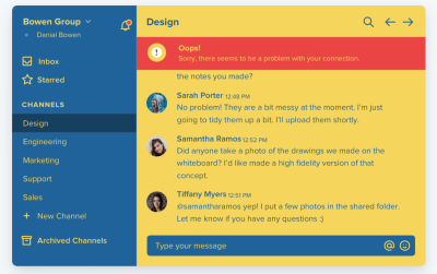
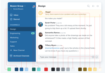
The difference is that the second interface applies shades of the core color defined in the palette and that brighter and more vibrant shades are only used to highlight the important stuff.
You can explore this phenomenon by yourself and test your perception of the colors in the design by changing the look of your messenger. For example, Telegram has some interface customization options, and while playing with that, I noticed I read and navigate between my chats in the “Night Accent” mode rather than the plain “System” mode.
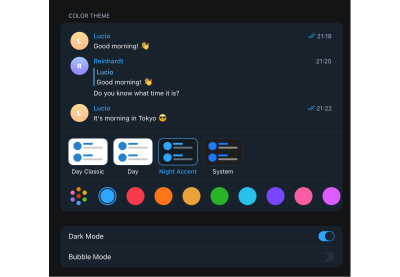

Of course, both designs were designed for people with different preferences and characteristics, but such a personal experiment led me to the following thought. Even though the second option uses fewer colors, the uniformity of information is a bit confusing. From this, I concluded that too few colors and too minimal a design is also a bad choice. It is necessary to find a balance between the color palette and its usage.
The best option is to pick from one to three primary colors and then play with their shades, tints, and tones. To combine the colors wisely, you can use complementary, split complementary, or analogous approaches.
That said, I suggest using a “shading” monochromatic approach for tables. It means defining a base color in a palette, then expanding it with different shades in dark and light directions. In other words:
- Choose a primary color.
- Define an evenly darker and lighter shade of that primary color.
This produces two more colors to which you can apply the previous technic to create colors that are a perfect compromise between the shades on either side. Repeat this process until you reach the number of colors you need (generally, 7–9 shades will do).

Rule 2: Embrace The Power Of Whitespace
I find that it’s good to offer a fair amount of “breathing room” around elements rather than trying to crowd everything in as close as possible. For example, finding a balance of space between the table rows and columns enhances the legibility of the contents as it helps distinguish the UI from the information.
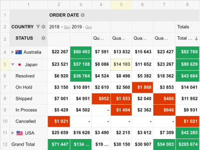

I’ll qualify this by noting that “breathing room” often depends on the type of data that’s being presented, as well as the size of the device on which it’s being viewed. As such, it sometimes makes sense to enhance a table’s functionality by allowing the user to adjust the height and width of rows and columns for the most optimal experience.
If you are worried about using too few or too many colors, apply the 60/30/10 rule. It’s a basic pattern for any distribution selection. People use this strategy when budgeting assets like content and media, and it’s applicable to design. The rule says the color usage should be distributed as follows:
- 60% for neutral colors,
- 30% for primary colors,
- 10% for secondary colors (e.g., highlights, CTAs, and alerts).
Rule 3: Avoid Grays
Talking about neutral colors, in color theory, gray represents neutrality and balance. Its color meaning likely comes from being the shade between white and black and often is also perceived as the absence of color. You can not overdo it; its light shades do not oppress, so gray is just “okay.”
However, gray does carry some negative connotations, particularly when it comes to depression and loss. Its absence of color makes it dull. For this reason, designers often resort to it to de-emphasize an element or certain bits of data.
But maintaining such a philosophy of gray color will only work in black and white designs, such as on the Apple website. Though, as I mentioned before, it actually works really well as grey is the tone of black or a shade of white.

The problem, however, comes up when other colors are added to the color palette, which leads to a change in a color’s roles and functions. In the case of gray, putting it next to brighter colors makes the design pale and dull.
Having no color of its own, gray seems to eat away the brightness of neighboring elements. Instead of maintaining balance, gray makes the design cloudy and unclear. After all, against the background of already illuminated elements, gray makes the elements not just less significant but unnecessary for our perception.

That does not mean you should totally give up gray. But highlighting some information inherently de-emphasizes other information, negating the need for gray in the first place.
The easy way out is to replace gray with lighter shades of a palette’s base color on a table cell’s background. The effect is the same, but the overall appearance will pop more without adding more noise or cognitive load.

Rule 4: Know What’s Worthy Of Highlighting
Designers are always looking for a way to make their work stand out. I get the temptation because bold and bright colors are definitely exciting and interesting.
Blogs can be considered a good example of this problem as their variety is wide and growing, and a lot of platforms prioritize exclusive design over inclusive design.
For example, Medium uses only black and shades of it for a color palette, which significantly facilitates even simple tasks like reading titles. Hackernoon, although looking interesting and drawing attention, requires more concentration and does not allow you to “breathe” as freely as on Medium.


In analytical software, that only leads to a table design that emphasizes a designer’s needs ahead of the user’s needs.
Don’t get me wrong — a palette that focuses on shades rather than a large array of exciting colors can still be exciting and interesting. That provides a discussion about which grid elements benefit from color. Here are my criteria for helping decide what those are and the colors that add the most benefit for the given situation.
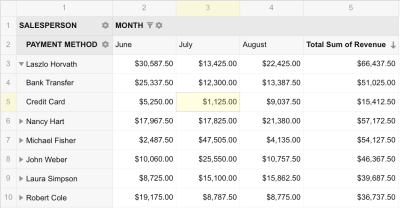
Active cells: If the user clicks on a specific table cell or selects a group of cells, we can add focus to it to indicate the user’s place in the data. The color needs to call attention to the selection without becoming a distraction, perhaps by changing the border color with a base color and using a light shade of it for the background so as to maintain WCAG-compliant contrast with the text color.
Tip! It’s also good to highlight the row and column that a focused cell belongs to, as this information is a common thing to check when deciphering the cell’s meaning. You can highlight the entire row and column it belongs to or, even better, just the first cell of the row and column.
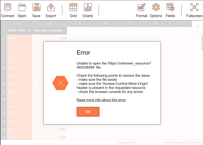
Error messaging: Error messages definitely benefit from color because, in general, errors contain critical feedback for the user to take corrective action.
A good example might be an injected alert that informs the user that the table’s functionality is disabled until an invalid data point is fixed. Reds, oranges, and yellows are commonly used in these situations but bear in mind that overly emphasizing an error can lead to panic and stress. (Speaking of error messaging, Vitaly Friedman has an extensive piece on designing effective error messages, including the pitfalls of relying too heavily on color.)
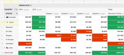
Outstanding data: I’m referring to any data in the table that is an outlier. For example, in a table that compares data points over time, we might want to highlight the high and low points for the sake of comparison. I suggest avoiding reds and greens, as they are commonly used to indicate success and failure. Perhaps styling the text color with a darker shade of a palette’s base color is all you need to call enough attention to these points without the user losing track of them.
The key takeaway:
Tip! Remember the main goal when designing a table: reliability, not beauty. Always check your final decisions, ideally with a variety of target users. I really recommend using contrast checkers to spot mistakes quickly and efficiently correct them.
Typographical Considerations
The fonts we use to represent tabular data are another aspect of a table’s look and feel that we need to address when it comes to implementing an inclusive design. We want the data to be as legible and scannable as possible, and I’ve found that the best advice boils down to the typography of the content — especially for numerics — as well as how it is aligned.
Rule 1: The Best Font Is A “Simple” Font
The trick with fonts is the same as with colors: simplicity. The most effective font is one that takes less brainpower to interpret rather than one that tries to stand out.
No, you don’t need to ditch your Google Fonts or any other font library you already use, but choose a font from it that meets these recommendations:
- Sans-serif fonts (e.g., Helvetica, Arial, and Verdana) are more effective because they tend to take up less space in a dense area — perfect for promoting more “breathing room” in a crowded table of data.
- A large x-height is always easier to read. The X-height is the height of the body of a lowercase letter minus any ascenders or descenders. In other words, the height of the lowercase “x” in the font.
- Monospace fonts make it easier to compare cells because the width of each character is consistent, resulting in evenly-spaced lines and cells.
- Regular font weights are preferable to bolder weights because the boldfacing text is another form of highlighting or emphasizing content, which can lead to confusion.
- A stable, open counter. The counter is a space in the letter “o” or the letter “b.” Fonts with distorted counters render poorly in small sizes and are hard to read.
Fonts that fulfill these criteria are more legible and versatile than others and should help whittle down the number of fonts you have to choose from when choosing your table design.
Rule 2: Number Formatting Matters
When choosing a font, designers often focus on good legible letters and forget about numbers. Needless to say, numbers often are what we’re displaying in tables. They deserve first-class consideration when it comes to choosing an effective font for a good table experience.
As I mentioned earlier, monospace fonts are an effective option when numbers are a table’s primary content. The characters take up the same width per character for consistent spacing to help align values between rows and columns. In my experience, finding a proportional font that doesn’t produce a narrow “1” is difficult.
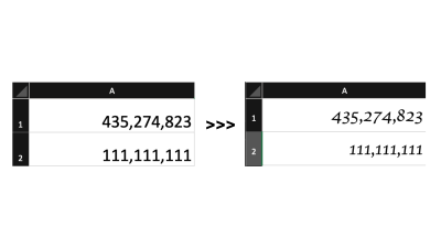
If you compare the two fonts in the figure above, it’s pretty clear that data is easier to read and compare when the content is aligned and the characters use the same amount of space. There’s less distance for the eye to travel between data points and less of a difference in appearance to consider whether one value is greater than the other.
If you are dealing with fractions, you will want to consider a font that supports that format or go with a variable font that supports font-variant-numeric features for more control over the spacing.
Rule 3: There Are Only Two Table Alignments: Left And Right
Technically there are four alignments: left, right, center, and justify. We know that because the CSS text-alignment property supports all four of them.
My personal advice is to avoid using center alignment, except in less-common situations where unambiguous data is presented with consistently-sized icons. But that’s a significant and rare exception to the rule, and it is best to use caution and good judgment if you have to go there.
Justified content alters the spacing between characters to achieve a consistent line length, but that’s another one to avoid, as the goal is less about line lengths than it is about maintaining a consistent amount of space between characters for a quick scan. That is what monospaced fonts are effective for.
Data should instead be aligned toward the left or right, and which one is based on the user’s language preference.
Then again, at school, we’re taught to compare numbers in a right-to-left direction by looking first at single units, then tens, followed by hundreds, then thousands, and so forth. Accordingly, the right alignment could be a better choice that’s universally easier to read regardless of a person’s language preference. You may notice that spreadsheet apps like Excel, Sheets, and Notion align numeric values to the right by default.
There are exceptions to that rule, of course, because not all numbers are measurements. There are qualitative numbers that probably make more sense with left alignment since that is often the context in which they are used. They aren’t used for comparison and are perceived as a piece of text information written in numbers. Examples include:
- Dates (e.g., 12/28/2050),
- Zip/Postal code (e.g., 90815),
- Phone number (e.g., 555-544-4349).
Table headings should be aligned to the same edge as the data presented in the column. I know there could be disagreement here, as the default UA styling for modern browsers centers table headings.
See the Pen [Table Heading UA Styles [forked]](https://codepen.io/smashingmag/pen/rNqRGby) by Geoff Graham.
Though in big data grids, less difference in the header and data design is better as it automatically adjusts to a certain perception.
Rule 4: Pictures Help Convey Meaning
As I mentioned, numbers and text are not the only way to present data. Icons and colors can enhance it with added meaning.
For example, you can use conditional formatting and heat mapping to recreate data patterns in a way that helps the user’s brain process the information in a more efficient manner. This Flexmonster demo is a good example of the effective use of color shading and styled points to make the data easier to interpret at a quick glance.
Icons can be a good way to show a decline or increase in indicators or a change in status. Depending on your dataset, you can define measures that can be shown in a more visual way. It will allow users to pay attention to the values that are still to be decoded — text and numbers.
I’ve seen lots of examples that use bold, bright colors or exaggerated font styling to differentiate table headings from the data. It’s perfectly fine — and even encouraged — to distinguish the two, but not to the extent that the headings overshadow the data.
My advice, though, is to de-emphasize table headers to allow the data to pop. And if there is any secondary information, try to consolidate it and de-emphasize it as well.
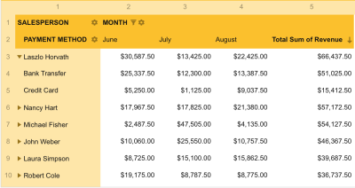
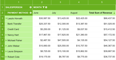
The screenshots above are examples of bad and good headers. When looking at the first screenshot, your initial focus is likely drawn to the column headers, which is good! That allows you to understand what the table is about quickly. But after that initial focus, the bold text is distracting and tricks your brain into thinking the header is the most important content.
The header in the second screenshot also uses bold text. However, notice how changing the color from black to white emphasizes the headers at the same time. That negates the impact bolding has, preventing potential cognitive load.
At this point, I should include a reminder to avoid gray when de-emphasizing table elements. For example, notice the numbers in the far left column and very top row. They get lost against the background color of the cells and even further obscured by the intense background color of surrounding cells. There’s no need to de-emphasize what is already de-emphasized.
I also suggest using short labels to prevent them from competing with the data. For example, instead of a heading that reads “Grand Total of Annual Revenue,” try something like “Total Revenue” or “Grand Total” instead.
Table Layout Considerations
There once was a time when tables were used to create webpage layouts because, again, it was a simple and understandable way to present the information in the absence of standardized CSS layout features. That’s not the case today, thankfully, but that period taught us a lot about best practices when working with table design that we can use today.
Rule 1: Fewer Borders = More White Space
Borders are commonly used to distinguish one element from one another. In tables, specifically, they might be used to form outlines around rows and columns. That distinction is great but faces the same challenge that we’ve covered with using color: too much of a layout can steal focus from the data, making the design busy and cluttered. With the proper design and text alignment, however, borders can become unnecessary.
Borders help us navigate the table and delimit individual records. At the same time, if there are many of them in a grid, it becomes a problem in large tables with a lot of rows and columns. To prevent the cells from being too densely connected, try adding more space between them with padding. As I have mentioned before, negative space is not an enemy but a design saver.
That said, the law of diminishing returns applies to how much space there should be, particularly when considering a table’s width. For example, a table might not need to flex to the full width of its parent container by default. It depends on the content, of course. Avoiding large spacing between columns will help prevent a reader’s eyes from having to travel far distances when scanning data and making mistakes.
I know that many front-enders struggle with column widths. Should they be even? Should they only be as wide as the content that’s in them? It’s a juggling act that, in my mind, is not worth the effort. Some cells will always be either too wide or too narrow when table cells contain data points that result in varying line lengths. Embrace that unevenness, allowing columns to take up a reasonable amount of space they need to present the data and scale down to as little as they need without being so narrow that words and numbers start breaking lines.
Lines should be kept to a minimum. Add them if adjusting the alignment, joining cells, and increased spacing is not enough to indicate the direction — or keep them as light as possible.
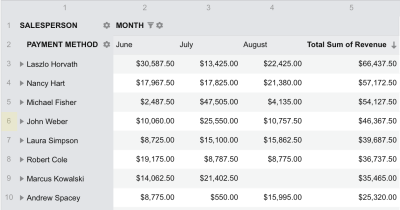
Allow multi-line wrapping when you really need it, such as when working with longer data points with just enough room around them to indicate the alignment direction. But if you caught yourself thinking of using multi-line wrapping in a grid, then first of all, analyze whether there is a more practical way to visualize the data.
Rule 2: Stylish rows, stylish columns
When deciding how to style a table’s rows, it’s important to understand the purpose of the table you are developing. Reducing visual noise will help to present a clear picture of the data on smaller datasets but not for large datasets.
It’s easy for a user to lose their place when scrolling through a table that contains hundreds or thousands of rows. This is where borders can help a great deal, as well as zebra striping, for a visual cue that helps anchor a user’s eyes enough to hold focus on a spot while scanning.
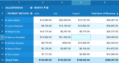
Speaking of zebra striping, it’s often used as a stylistic treatment rather than a functional enhancement. Being mindful of which colors are used for the striping and how they interact with other colors and shades used for highlighting information will go a long way toward maintaining a good user experience that avoids overwhelming color combinations. I often use a slightly darker shade of the table’s default background color on alternating rows (or columns) when establishing stripes. If that’s white, then I will go with the lightest shade of my palette’s base color. The same choice should be made while maintaining the borders — they should be marked but remain invisible.
Typically, row density gravitates around 40px-56px with a minimum padding of 16px on both the right and left edges of each column.
Feature Enhancements
Tables are often thought of as static containers for holding data, but we’ve all interacted with tables that do lots of other things, like filtering and reordering.
Whatever features are added to a table, it’s important to let users customize the table themselves based on their preferences. Then the user experience you create can become even better by conforming to the user’s comfort level. As with everything else, there is a line. Smaller datasets may not need the same enhancements for filtering data that large datasets do, for example, because they may wind up causing more confusion than convenience and raise the threshold for understanding the data.
In addition to the ability to customize a table’s elements, such as colors, fonts, conditional formatting, value formatting, and cell sizing, there are a few questions you can ask to help determine the enhancements a table might need for a better experience.
Could A User Lose Context When Scrolling?
We’ve already discussed how a table with hundreds of rows or columns can lead to many user scrolling and cognitive errors. Striping is one way to help users remain focused on a particular spot, but what if there’s so much scrolling that the table’s headers are no longer available?
If that’s a possibility, and the headers are important for establishing the context of the presented data, then you might consider sticky positioning on the headers so they are always available for reference. Chris Coyier has a nice demo that implements sticky headers and a sticky first column.
See the Pen [Table with Sticky Header and Sticky First Column [forked]](https://codepen.io/smashingmag/pen/MWPxOap) by Chris Coyier.
Sticky headers ought to retain their existing styles rather than receive a new style while they are in a fixed position. Again, an unexplained change in style is likely to contribute to an increased cognitive load, harming the user experience.
Are There Anchored Links In The Table?
If so, then it’s possible that clicking on one in a table with a large dataset will navigate the user to a new location, possibly resulting in a loss of context which, in turn, increases the user’s cognitive load.
Rather than jumping the user to the anchor, consider a smooth scrolling implementation, perhaps with scroll-behavior: smooth in CSS. That indicates how the user got from Point A to Point B. That context is an incredibly useful hint to the user for how to return to their previous location if they need to. This is in line with Apple’s “HumanInterfact Guidelines” on Motion best practices, which remind us that:
“Motion can be a great way to enhance feedback and understanding by showing how things change, what will happen when people act, and what they can do next.”
If we are already talking about scrolling as a feature, then it’s worth recalling that in tables with a large number of records and attributes, scrolling should be enabled on all axes. In addition to simplifying the process of adapting the table for responsive design, it will also improve the user experience at any screen size, particularly smaller ones.
And remember, while smooth scrolling may be an effective feature for promoting an inclusive design in some cases, it has its own accessibility concerns. It’s another case where respecting a user’s reduced motion preferences comes into play.
Is There Enough Data To Support Sorting, Filtering, And Search Functionality?
These three functions characterize the overall usability of the grid. The question here is not about improving UX but about the possibility of using the table in general. Each of these functions serves a common task — discarding records that do not require analysis or searching for those that should be given more attention.
Does The Order Of Columns And Rows Matter?
The goal of any tabular data is to present it in the most logical order. Sometimes the order of the data matters. Sometimes it doesn’t. If allowing a user to re-order columns and rows doesn’t affect the data’s integrity, then drag-and-drop functionality might be a worthwhile enhancement. It recreates a re-ordering process of a sequence of items in real life, so this feature is intuitive and useful. It also removes our cognitive biases of what we think is best and allows the user to make the data more meaningful and understandable according to their needs.
Should A User Be Allowed To Resize Rows And Columns?
One can endlessly measure the best cell size and distance between rows and columns, but this indicator will, in any case, differ from person to person. Therefore, the best solution is to let the user configure it for themselves while leaving the default state that is most convenient for the general average user.

Who Can Have Problems Using My Design? (Accessibility Support)
Of all the points, this is the most difficult to implement, but at the same time, in our context, it is the most important. People with diagnosed abnormalities and disorders have a much stronger impact on their work process due to their condition. Therefore, supporting an additional — and optional — accessibility mode is necessary. Each element must be adapted for screen readers, navigable via keyboard, and contain the most semantic markup possible. This will help people who use assistive technology without a loss in performance.
Conclusion
Thanks for letting me share my best practices for presenting tabular data on the web. It’s amazing how something as seemingly simple as a table element can quickly grow in scope when we start considering user needs and enhancements to include as many of those needs as possible.
We discussed a great number of things that get in the way of an inclusive table design, including our own cognitive biases and design choices. At the same time, we covered strategies for tackling those obstacles from a wide range of considerations, from design choices all the way to determining possible features for enhancing a user’s experience when interacting with the table and the data it contains.
There can be a lot of headwork that goes into a table implementation, but not everything in this article has to be considered for every situation. A lot of the advice I’ve shared — like so many other things on the web — simply depends on the specific case. That’s why we spent a good amount of time defining the goals for an effective table experience:
- Reduce the cognitive load.
- Maximize the signal-to-noise ratio.
- Use correct cognitive biases to boost the user experience.
But if you only take one thing away from this, I’d say it is this: in data analytics data > than everything else. Keeping that idea in mind throughout the development process prevents spoiling your design with frivolous designs and features that work against our goals.
Further Reading on Smashing Magazine
(cc, yk, il)
